Jim Nielsen’s Blog
Preferences
Theme: This feature requires JavaScript as well as the default site fidelity (see below).
Fidelity:

Controls the level of style and functionality of the site, a lower fidelity meaning less bandwidth, battery, and CPU usage. Learn more.

Jim Nielsen’s Blog

You found my HTML feed — I also have an XML feed and a JSON feed.

I ♄ HTML

Subscribe to my blog by copy-pasting this URL into your RSS reader.

(Learn more about RSS and subscribing to content on the web at aboutfeeds.)

Recent posts

You Are What You Read, Even If You Don’t Always Remember It

View

Here’s Dave Rupert (from my notes):

the goal of a book isn’t to get to the last page, it’s to expand your thinking.

I have to constantly remind myself of this. Especially in an environment that prioritizes optimizing and maximizing personal productivity, where it seems if you can’t measure (let alone remember) the impact of a book in your life then it wasn’t worth reading.

I don’t believe that, but I never quite had the words for expressing why I don’t believe that. Dave’s articulation hit pretty close.

Then a couple days later my wife sent me this quote from Ralph Waldo Emerson:

I cannot remember the books I've read any more than the meals I have eaten; even so, they have made me.

YES!

Damn, great writers are sO gOOd wITh wORdz, amirite?

Emerson articulates with acute brevity something I couldn’t suss out in my own thoughts, let alone put into words. It makes me jealous.

Anyhow, I wanted to write this down to reinforce remembering it.

And in a similar vein for the online world: I cannot remember the blog posts I’ve read any more than the meals I’ve eaten; even so, they’ve made me.

It’s a good reminder to be mindful of my content diet — you are what you eat read, even if you don’t always remember it.


Reply

Implementing Netlify’s Image CDN

View

tl;dr I implemented Netlify’s new image transformation service on my icon gallery sites and saw a pretty drastic decrease in overall bandwidth. Here are the numbers:

Page Requests Old New Difference
Home 60 1.3MB 293kB ▌ 78% (1.01MB)
Colors 84 1.4MB 371kB ▌ 74% (1.04MB)
Designers 131 5.6MB 914kB ▌ 84% (4.71MB)
Developers 140 2.5MB 905kB ▌ 65% (1.62MB)
Categories 140 2.2MB 599kB ▌ 73% (1.62MB)
Years 98 4.7MB 580kB ▌ 88% (4.13MB)
Apps 84 5.2MB 687kB ▌ 87% (4.53MB)

For more details on the whole affair, read on.

A Quick History of Me, Netlify, and Images

This post has been a long time coming. Here’s a historical recap:

Phew.

Ok, so now let’s get into the details of implementing Netlify’s image CDN.

How It Works

The gist of the feature is simple: any image you want transformed, just point it at a Netlify-specific URL and their image service will take care of the rest.

For example: instead of doing this:

<img src="/assets/images/my-image.png">

Do this:

<img src="/.netlify/images?url=/assets/images/my-image.png">

And Netlify’s image service will takeover. It looks at the headers of the browser making the request and will serve a better, modern format if supported. Additionally, you can supply a bunch of parameters to exercise even greater control over how the image gets transformed (such as size, format, and quality).

How I Use It

Given my unique setup for delivering images, I spent a bit of time thinking about how I wanted to implement this feature.

Eventually I settled on an implemntation I’m really happy about. I use Netlify’s image CDN in combination with their redirects to serve the images. Why do I love this? Because if something breaks, my images continue to work. It’s kind of like a progressive enhancement use of the feature.

Previously, I had multiple sizes for each of my icons, so paths to the images looked like this:

<img src="/ios/512/my-icon.png">
<img src="/ios/256/my-icon.png">
<img src="/ios/128/my-icon.png">

Using Netlify’s redirects rules, I kept the same URLs but added a single query param:

<img src="/ios/512/my-icon.png?resize=true">
<img src="/ios/256/my-icon.png?resize=true">
<img src="/ios/128/my-icon.png?resize=true">

Now, instead of serving the original PNG, Netlify looks at the size in the URL path, resizes the image, and converts it to a modern format for supported browsers.

There’s more going on here as to why I chose this particular setup, but explaining it all would require a whole different blog post. Suffice it to say: I’m really happy about how this new image CDN feature composes with other features on Netlify (like the redirects engine) because it gives me tons of flexibility to implement this solution in a way that best suites the peculiarities of your project.

How It Turned Out

To test out how much bandwidth this feature would save me, I created a PR that implemented my changes. It was basically two lines of code.

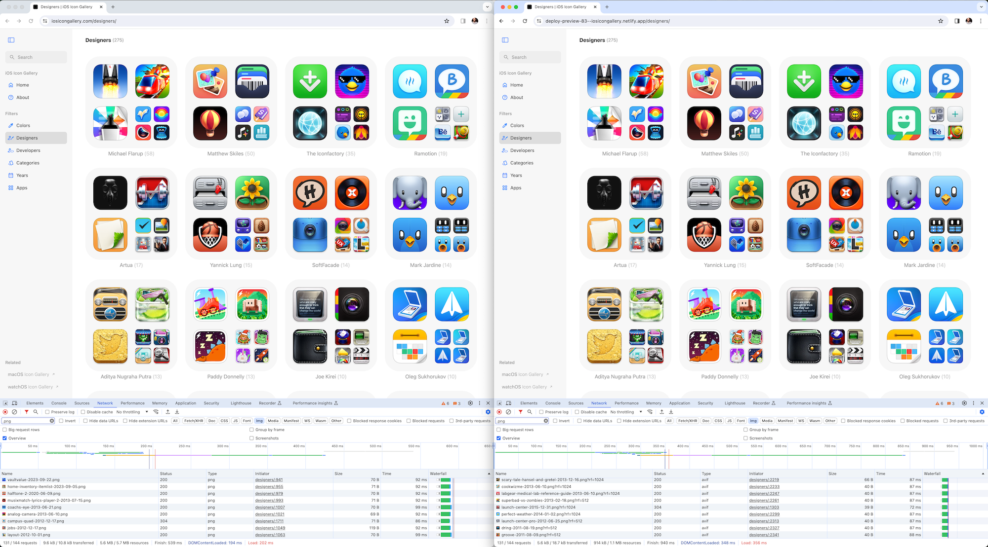
From there, Netlify created a preview deploy where I could test the changes. I put the new preview deploy up side-by-side against what I had in production. The differences were pretty drastic.

For example, the site’s home page has 60 images on it, each displayed at 256px if you’re on a retina screen. It resulted in a 78% drop in bandwidth.

Additionally, the index pages for icon metadata (such as the designers page) can have up to 140 image on them. On a retina screen, 60 of those are 256px and 80 are 128px. They also a huge reduction in overall bandwidth.

A side-by-side screenshot of the designers index page for iOS Icon Gallery. On the left is the “old” page and on the right is the “new” page. Both websites look the same, but both also have the developer tools open and show a drastic drop in overall resources loaded.

Here’s the raw data showing the difference in overall resources loaded across different pages of the old and new sites (the old serving the original PNGs, the new serving AVIFs).

Page Requests Old New Difference
Home 60 1.3MB 293kB ▌ 78% (1.01MB)
Colors 84 1.4MB 371kB ▌ 74% (1.04MB)
Designers 131 5.6MB 914kB ▌ 84% (4.71MB)
Developers 140 2.5MB 905kB ▌ 65% (1.62MB)
Categories 140 2.2MB 599kB ▌ 73% (1.62MB)
Years 98 4.7MB 580kB ▌ 88% (4.13MB)
Apps 84 5.2MB 687kB ▌ 87% (4.53MB)

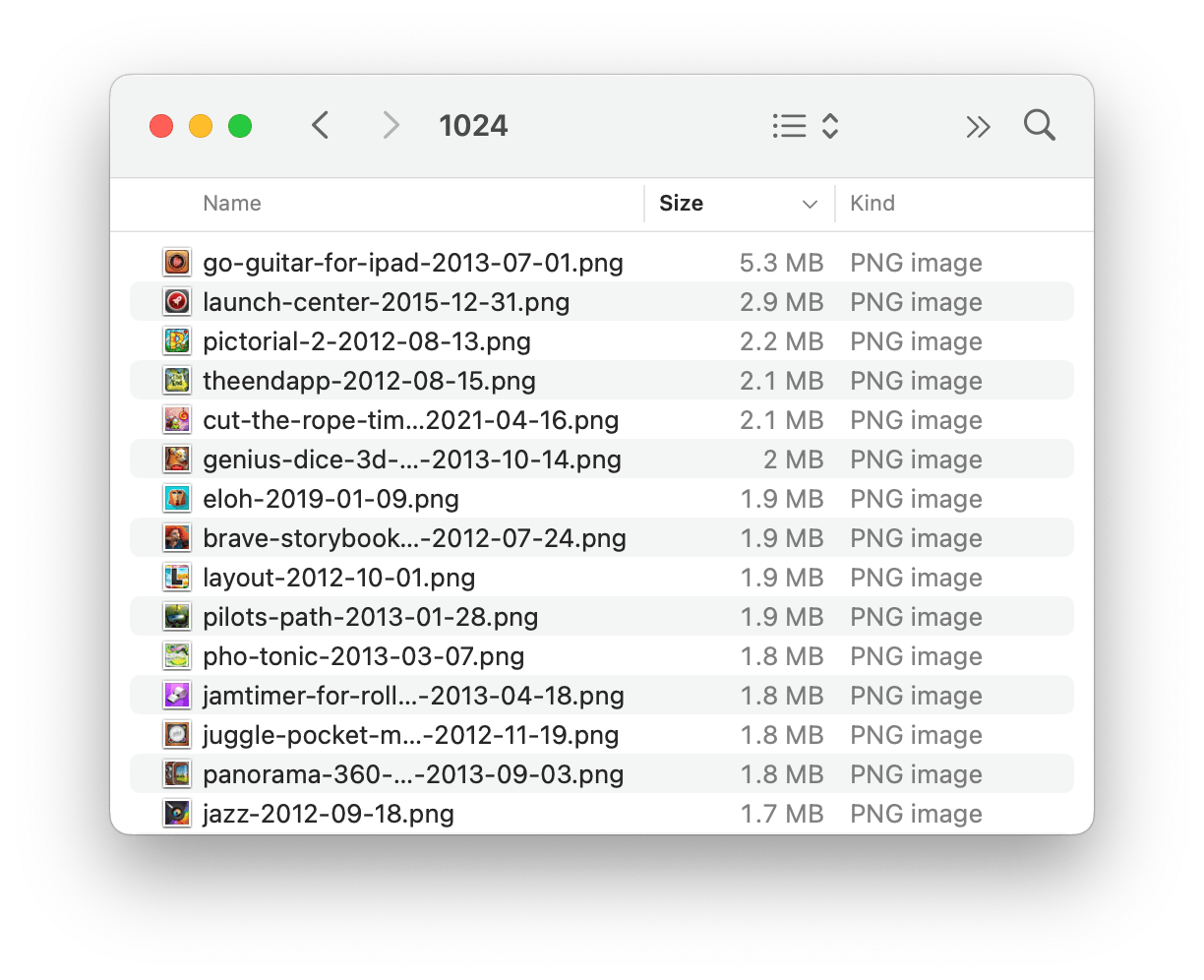
Out of curiosity, I wanted to see what icon in my collection had the largest file size (at its biggest resolution). It was a ridiculous 5.3MB PNG.

Screenshot of macos finder showing a list of PNG files sorted by size, the largest one being 5.3MB.

Really I should’ve spent time optimizing these images I had stored. But now with Netlify’s image service I don’t have to worry about that. In this case, I saw the image I was serving for that individual icon’s URL go from 5.3MB to 161kB. A YUGE savings (and no discernible image quality loss — AVIF is really nice).

When something is “on fire” in tech, that’s usually a bad thing — e.g. “prod is on fire” means “all hands on deck, there’s a problem in production” — but when I say Netlify’s new image CDN is on fire, I mean it in the positive, NBA Jam kind of way.


Reply
Tags

Expose Platform APIs Over Wrapping Them

View

From Kent C. Dodds’ article about why he won’t be using Next.js:

One of the primary differences between enzyme and Testing Library is that while enzyme gave you a wrapper with a bunch of (overly) helpful (dangerous) utilities for interacting with rendered elements, Testing Library gave you the elements themselves. To boil that down to a principle, I would say that instead of wrapping the platform APIs, Testing Library exposed the platform APIs.

I’ve been recently working in a Next.js app and a lot of Kent’s critiques have resonated with my own experience, particularly this insight about how some APIs wrap platform ones rather than exposing them.

For example, one thing I struggled with as a n00b to Next is putting metadata in an HTML document. If you want a <meta> tag in your HTML, Next has a bespoke (typed) API dedicated to it.

I understand why that is the case, given how Next works as an app/routing framework which dynamically updates document metadata as you move from page to page. Lots of front-end frameworks have similar APIs.

However, I prefer writing code as close as possible to how it will be run, which means staying as close as possible to platform APIs.

Why? For one, standardized APIs make it easy to shift from one tool to another while remaining productive. If I switch from tool A to tool B, it’d be a pain to relearn that <div> is written as <divv>.

Additionally, you don’t solely write code. You also run it and debug it. When I open my webpage and there’s a 1:1 correspondence between the <meta> tags I see in the devtools and the <meta> tags I see in my code, I can move quickly in debugging issues and trusting in the correctness of my code.

In other words, the closer the code that’s written is to the code that’s run, the faster I can move with trust and confidence. However, when I require documentation as an intermediary between what I see in the devtools and what I see in my code, I move slower and with less trust that I’ve both understood and implemented correctly what is documented.

With Next, what I write compiles to HTML which is what the browser runs. With plain HTML, what I write is what the browser runs. It’s weird to say writing plain HTML is “closer to the metal” but here we are ha!

That said, again, I realize why these kinds of APIs exist in client-side app/routing frameworks. But with Next in particular, I’ve encountered a lot of friction taking my base understanding of HTML APIs and translating them to Next’s APIs. Allow me a specific example.

An Example: The Metadata API

The basic premise of Next’s metadata API starts with the idea that, in order to get some <meta> tags, you use the key/value pairs of a JS object to generate the name and content values of a <meta> tag. For example:

export const metadata = {
  generator: 'Next.js',
  applicationName: 'Next.js',
  referrer: 'origin-when-cross-origin',
}

Will result in:

<meta name="generator" content="Next.js" />
<meta name="application-name" content="Next.js" />
<meta name="referrer" content="origin-when-cross-origin" />

Simple enough, right? camelCased keywords in JavaScript translate to their hyphenated counterparts, that’s all pretty standard web API stuff.

But what about when you have a <meta> tag that doesn’t conform to this simple one-key-to-one-value mapping? For example, let’s say you want the keywords meta tag which can have multiple values (a comma-delimited list of words):

<meta name="keywords" content="Next.js,React,JavaScript" />

What’s the API for that? Well, given the key/value JS object pattern of the previous examples, you might think something like this:

export const metadata = {
  keywords: 'Next.js,React,JavaScript'
}

Minus a few special cases, that’s how Remix does it. But not in Next. According to the docs, it’s this:

export const metadata = {
  keywords: ['Next.js', 'React', 'JavaScript'],
}

“Ah ok, so it’s not just key/value pairing where value is a string. It can be a more complex data type. I guess that makes sense.” I say to myself.

So what about other meta tags, like the ones whose content is a list of key/value pairs? For example, this tag:

<meta
  name="format-detection"
  content="telephone=no, address=no, email=no"
/>

How would you do that with a JS object? Initially you might think:

export const metadata = {
  formatDetection: 'telephone=no, address=no, email=no'
}

But after what we saw with keywords, you might think:

export const metadata = {
  formatDetection: ['telephone=no', 'address=no', 'email=no']
}

But this one is yet another data type. In this case, content is now expressed as a nested object with more key/value pairs:

export const metadata = {
  formatDetection: {
    email: false,
    address: false,
    telephone: false,
  },
}

To round this out, let’s look at one more example under the “Basic fields” section of the docs.

export const metadata = {
  authors: [
    { name: 'Seb' },
    { name: 'Josh', url: 'https://nextjs.org' }
  ],
}

This configuration will produce <meta> tags and a link tag.

<meta name="author" content="Seb" />
<meta name="author" content="Josh" />
<link rel="author" href="https://nextjs.org" />

“Ah oh, so the metadata keyword export isn’t solely for creating <meta> tags. It’ll also produce <link> tags. Got it.” I tell myself.

So, by solely looking at the “Basics” part of the docs, I’ve come to realize that to produce <meta> tags in my HTML I should use the metadata keyword export which is an object of key/value pairs where value can be a string, an array, an object, or even an array of objects! All of which will produce <meta> tags or <link> tags.

Ok, I think I got it.

Not So Fast: A Detour to Viewport

While you might think of the viewport meta tags as part of the metadata API, they’re not. Or rather, they were but got deprecated in Next 14.

Deprecated: The viewport option in metadata is deprecated as of Next.js 14. Please use the viewport configuration instead.

[insert joke here about how the <meta> tag in HTML is never gonna give you up, never gonna let you down, never gonna deprecate and desert you]

Ok so viewport has its own configuration API. How does it work?

Let's say I want a viewport tag:

<meta
  name="viewport"
  content="width=device-width, initial-scale=1, maximum-scale=1, user-scalable=no"
/>

What’s the code for that? Given our knowledge of the metadata API, maybe we can guess it.

Since it gets its own named export, viewport, I assume the content part of the tag will represent the key/value pairs of the object?

And yes, that’s about right. Here's the code to get that tag:

export const viewport = {
  width: 'device-width',
  initialScale: 1,
  maximumScale: 1,
  userScalable: false,
}

Ok, I guess that kinda makes sense. false = no and all, but I see what’s going on.

But the viewport export also handles other tags, not just <meta name="viewport">. Theme color is also under there. You want this tag?

<meta name="theme-color" content="black" />

You might’ve thought it’s this:

export const metadata = { themeColor: 'black' }`

But according to the docs it's part of the viewport named export:

export const viewport = { themeColor: 'black' }

And what if you want multiple theme color meta tags?

<meta
  name="theme-color"
  media="(prefers-color-scheme: light)"
  content="cyan"
/>
<meta
  name="theme-color"
  media="(prefers-color-scheme: dark)"
  content="black"
/>

Well that’s the viewport named export but instead of a string you give it an array of objects:

export const viewport = {
  themeColor: [
    { media: '(prefers-color-scheme: light)', color: 'cyan' },
    { media: '(prefers-color-scheme: dark)', color: 'black' },
  ],
}

Ok, I guess this all kind of makes sense — in its own self-consistent way, but not necessarily in the context of the broader web platform APIs


Back to Our Regularly Scheduled Programming: Next’s Metadata API

Ok so, given everything covered above, let’s play a little game. I give you some HTML and you see if you can guess its corresponding API in Next. Ready?

<link
  rel="canonical"
  href="https://acme.com"
/>
<link
  rel="alternate"
  hreflang="en-US"
  href="https://acme.com/en-US"
/>
<link
  rel="alternate"
  hreflang="de-DE"
  href="https://acme.com/de-DE"
/>
<meta
  property="og:image"
  content="https://acme.com/og-image.png"
/>

Go ahead, I’ll give you a second. See if you can guess it...

Have you tried? I’ll keep waiting...

Got it?

Ok, here’s the answer:

export const metadata = {
  metadataBase: new URL('https://acme.com'),
  alternates: {
    canonical: '/',
    languages: {
      'en-US': '/en-US',
      'de-DE': '/de-DE',
    },
  },
  openGraph: {
    images: '/og-image.png',
  },
}

That’s it. That’s what will produce the HTML snippet I gave you. Apparently there’s a whole “convenience” API for prefixing metadata fields with fully qualified URLs.

You’ve heard of CSS-in-JS? Well this is HTML-in-JS. If you wish every HTML API was just a (typed) JavaScript API, this would be right up your alley. No more remembering how to do something in HTML. There’s a JS API for that.

And again, I get it. Given the goals of Next as a framework, I understand why this exists. But there’s definitely a learning curve that’s feels divergent to the HTML pillar of the web.

Contrast that, for one moment, with something like this which (if you know the HTML APIs) requires no referencing docs:

const baseUrl = 'https://acme.com';

export const head = `
  <link
    rel="canonical"
    href="${baseUrl}"
  />
  <link
    rel="alternate"
    hreflang="en-US"
    href="${baseUrl}/en-US"
  />
  <link
    rel="alternate"
    hreflang="de-DE"
    href="${baseUrl}/de-DE"
  />
  <meta
    property="og:image"
    content="${baseUrl}/og-image.png"
  />
`;

I know, I know. There’s tradeoffs here. But I think what I'm trying to get at is what I expressed earlier: there’s a clear, immediate correspondence in this case between the code I write and what the browser runs. Plus this knowledge is transferable. This is why, to Kent’s point, I prefer exposed platform APIs over wrapped ones.

Conclusion

I only briefly covered parts of Next’s metadata API. If you look closer at the docs, you’ll see APIs for generating <meta> tags related to open graph, robots, icons, theme color, manifest, twitter, viewport, verification, apple web app, alternates, app links, archives, assets, bookmarks, category, and more.

Plus there’s all the stuff that you can use in “vanilla” HTML but that’s unsupported in the metadata API in Next.

This whole post might seem like an attempt to crap on Next. It’s not. As Kent states in his original article:

Your tool choice matters much less than your skill at using the tool to accomplish your desired outcome

I agree.

But I am trying to work through articulating why I prefer tools that expose underlying platform APIs over wrapping them in their own bespoke permutations.

It reminds me of this note I took from an article from the folks building HTMX:

Whenever a problem can be solved by native HTML elements, the longevity of the code improves tremendously as a result. This is a much less alienating way to learn web development, because the bulk of your knowledge will remain relevant as long as HTML does.

Well said.


Reply
The Case for Design Engineers, Pt. III

View

Previously:

I wrote about the parallels between making films and making websites, which was based on an interview with Christopher Nolan.

During part of the interview, Nolan discusses how he enjoys being a “Writer/Director” because things that aren’t in the original screenplay are uncovered through the process of making the film and he sees the incredible value in adapting to and incorporating these new meanings which reveal themselves.

In other words, making a film (like making a website) is an iterative, evolutionary process. Many important motifs, themes, and meanings cannot be in the original draft because the people making it have not yet evolved their understanding to discover them. Only through the process of making these things can you uncover a new correspondence of meaning deeper and more resonant than anything in the original draft — which makes sense, given that the drafts themselves are not even developed in the medium of the final form, e.g. movies start as screenplays and websites as hand drawings or static mocks, both very different mediums than their final forms.

Nolan embraces this inherent attribute of the creation process by calling himself a “Writer/Director” and indulging in the cross-disciplinary work of making a film. In fact, at one point in the interview he noted how he extemporaneously wrote a scene while filming:

I remember sitting on LaSalle Street in Chicago filming The Dark Knight. We flipped the [truck and then] I sat down on my laptop, and I wrote a scene and handed it to Gary Oldman. You’re often creating production revisions under different circumstances than they would normally track if you were in a writers’ room, for example, or if you weren’t on set.

If you live in a world where you think people can only be “Writers” or “Directors” but not both, this would be such an unusual and unnatural state of affairs. “Why is he writing on set? He should be directing! We’re in the process of filming the movie, we should be done with all the writing by now!”

But the creative process is not an assembly line. Complications and in-process revisions are something to be embraced, not feared, because they are an inherent part of making.

Nolan notes how, when making a film, you can have an idea in one part of the process and its medium (like writing the screenplay on paper or filming the movie on set) but if that idea doesn’t work when you get to a downstream process, such as editing sequences of images or mixing sound, then you have to be able to adapt or else you’re completely stuck.

Given that, you now understand the value of having the ability to adapt, revise, and extemporaneously improve the thing you’re creating.

Conversely, you can see the incredible risk of narrowly-defined roles in the creation process. If what was planned on paper doesn’t work in reality, you’re stuck. Or if a new, unforeseen meaning arises, you can’t take advantage of it because you’re locked in to an assembly line process which cannot be halted or improvised.

Over the course of making anything, new understandings will always arise. And if you’re unable to shift, evolve, and design through the process of production, you will lose out on these new understandings discovered through the process of making — and your finished product will be the poorer because of it.


Reply
Tags

The Allure of Local-First Sync Engines

View

On the localfirst.fm podcast episode with Kyle Matthews they drew a parallel: jQuery was to React what REST APIs are to local-first sync engines.

jQuery was manual DOM manipulation. You were in charge of writing the instructions to create, read, update, and delete DOM nodes.

Then React came along with virtual DOM and said no more writing imperative instructions for DOM manipulation. Just declare what you want and, as state changes, we’ll figure out the imperative instructions for reconciling changes on your behalf.

This move from imperative to declarative was a tall, refreshing glass of koolaid (though admittedly not without its trade-offs).

Similar to jQuery, REST APIs represent manual manipulation — but of data not the DOM. You are in charge of writing the instructions to create, read, update, and delete the data that models your application.

But sync engines (in the context of local-first software) aim to do for data what React did for the DOM.

Sync engines say no more writing imperative instructions for data manipulation. Just declare what you want and, as state changes, the sync engine will figure out how to reconcile your changes across the network.

This move from imperative to declarative is compelling, especially when you factor in reactivity within an application: changes to data are reactive and reflected instantly in your application, then synced from node to node across the network without any imperative instructions written by you.

Now that is tall, refreshing glass of koolaid I’ll drink.

Speaking of koolaid, allow me to expand on this idea with notes from a talk from Martin Kleppman at a Local-First meetup.

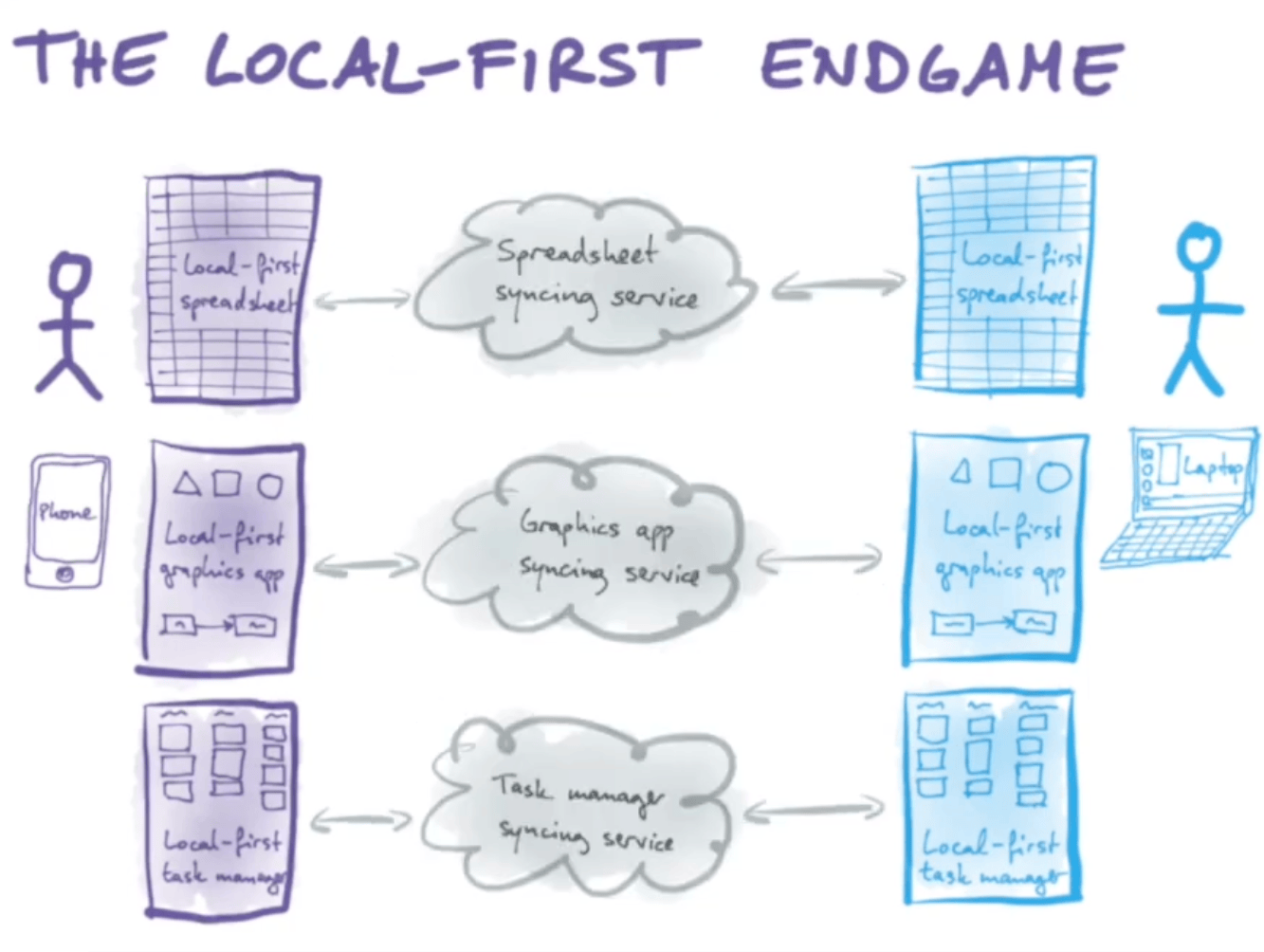
In traditional web development, you have different applications and each one needs its own bespoke API with imperative instructions for how to create, read, update, and delete data specific to that application.

Hand drawn slide showing different kinds of applications (like a spradsheet, a graphics app, a task manager) all with their own bespoke clouds for syncing data from one client to another.

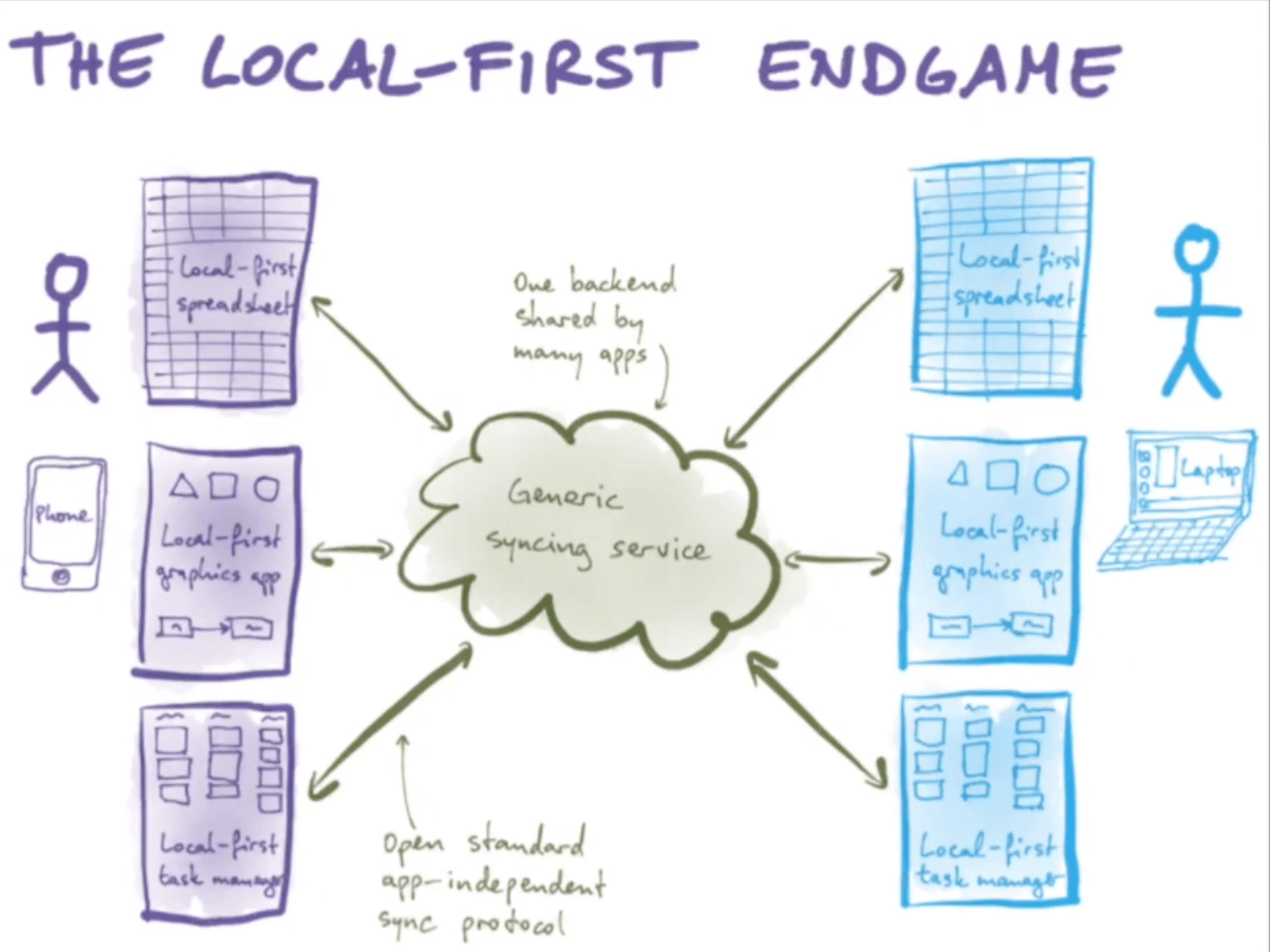
With a local-first approach, all the interesting, domain-specific logic lives with the application on the client which means all that’s left for the sync engine is to shuffle bytes from one location to another. This enables the ability to have generic syncing services: one backend shared by many different applications.

Hand drawn slide showing different kinds of applications (like a spradsheet, a graphics app, a task manager) sharing one cloud for syncing data from one client to another.

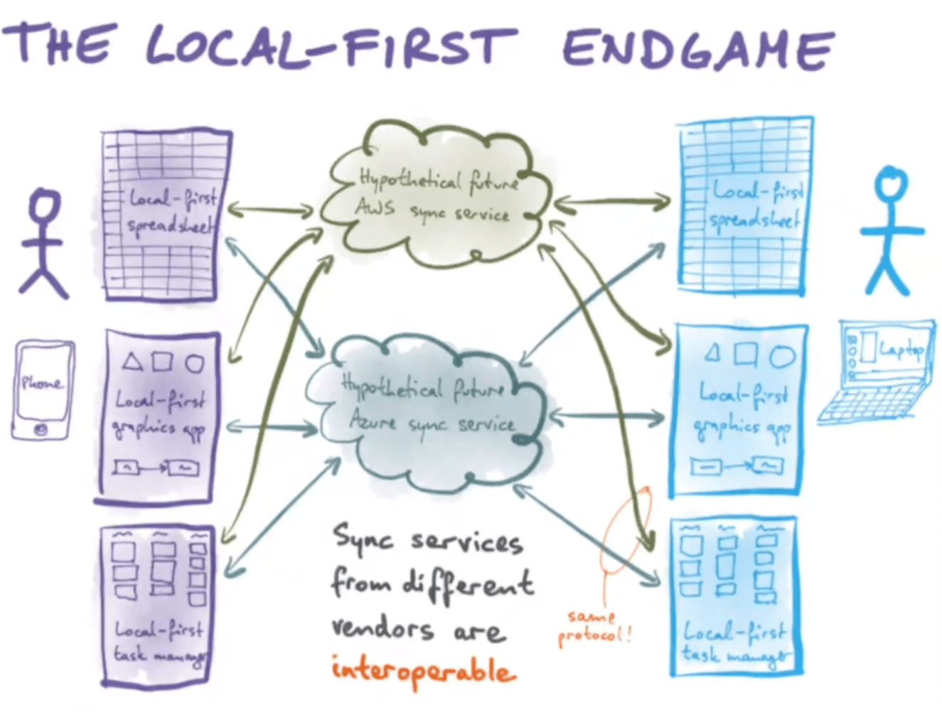
Generic sync engines means the protocols for these engines can be built on open standards and be application-agnostic. This becomes very valuable because now you can have many “sync engines” — e.g. imagine “AWS Sync Engine”, “Azure Sync Engine” etc. — and when one becomes too expensive, or you stop liking it, or they change their terms of service, you can simply switch from one syncing service to another.

Hand drawn slide showing different kinds of applications (like a spradsheet, a graphics app, a task manager) using many differeng vendor clods for syncing data from one client to another.

Excuse me while I go get some ice for all this koolaid I’m been drinking.


Reply
Tags

Making Films and Making Websites

View

I recently listened to an episode of the Scriptnoes podcast interviewing Christopher Nolan, director of films such as The Dark Knight, Inception, and Oppenheimer.

Generally, it’s fascinating look at the creative process. More specifically, I couldn’t help but see the parallels between making websites and making films.

Coincidentally, I recently read a post from Baldur Bjarnason where he makes this observation:

Software is a creative industry with more in common with media production industries than housebuilding.

As such, a baseline intrinsically-motivated curiosity about the form is one of the most powerful assets you can have when doing your job.

You definitely hear Nolan time and again express his fascination and curiosity with the form of film making.

As someone fascinated with the form of making websites, I wanted to jot down what stuck out to me.

Screenplays Are Tools, Not Films

Here’s Nolan talking about the tension between what a film starts as (a script, i.e. words on paper) and what the film ends up as (a series of images on screen).

Everyone’s struggling against, “Okay, how do I make a film on the page?” I’m fascinated by that...I enjoy the screenplay format very much
but there are these endless conundrums. Do you portray the intentionality of the character? Do you portray a character opens a drawer looking for a corkscrew?

There’s a delicate balance the screenplay form must strike: what needs to be decided upon and communicated up front and what is left up to the interpretation of the people involved in making the film once the process starts?

The problem is you have to show the script to a lot of people who aren’t reading your screenplay as a movie. They’re reading it as a screenplay. They’re reading it for information about what character they’re playing or what costumes are going to be in the film or whatever that is. Over the years, it varied project to project, but you try to find a middle ground where you’re giving people the information they need, but you’re not violating what you consider your basic principles as a writer.

However, as much as you want the screenplay to be great and useful, moviegoers aren’t paying to read your screenplay. They’re paying to watch your film. Nolan notes how he always re-centers himself on this idea, regardless of what is written in the screenplay.

I always try to view the screenplay first and foremost as a movie that I’m watching. I’m seeing it as a series of images. I’m imagining watching it with an audience.

Interestingly, Nolan notes that the screenplay is a medium that inherently wants the editing process to be intertwined in its form. If you don’t leverage that, you’re not taking advantage of the screenplay as a tool.

[movies are] a medium that enjoys this great privilege of Shot A plus Shot B gives you Thought C...that’s what movies do. That’s what’s unique to the medium.

A script is words on paper. A film is an interpretive realization of those words as a series of images.

But it’s even more than that. Just think of what it takes for words on paper to become a film:

  • The interpretation of the meaning of those words by the actors who deliver them (through not only the words themselves, but body language and other non-verbal cues).
  • Sound, which includes music, sound effects, etc.
  • Visuals, which includes special effects, costume designers, makeup folks, etc.
  • Much, much more.

It may seem obvious, but a screenplay is not a film. It’s a tool in service of making a film.

Software Artifacts Are Tools, Not Websites

In other words, what you use to make a website is not the website itself.

The “Source of Truth”

When a movie is released in theaters, it would be silly to think of its screenplay as the “source of truth”. At that point, the finished film is the “source of truth”. Anything left in the screenplay is merely a reflection of previous intention.

So do people take the time to go back and retroactively update the screenplay to accurately reflect a finished film?

No, that would be silly. The finished film is what people pay to see and experience. It is the source of truth.

Similarly, in making websites, the only source of truth is the website people access and use. Everything else — from design system components to Figma mocks to Miro boards to research data et. al. — is merely a tool in service of the final form.

That’s not to say there’s no value in keeping things in sync. Does the on-set improvisation of an actor or director require backporting their improvisations to the screenplay? Does cutting a sequence in the editing process mean going back to the screenplay to make new edits? Only when viewed through the lens of the screenplay as a working tool in service of a group of people making a film.

Figma Mocks

The screenplay is an evolving document. A screenplay is not a film, but a tool that allows disparate groups of talented individuals to get what they need to do their job in service of making a film.

Nolan emphasizes this a few times, noting that the screenplay is not what moviegoers ultimately experience. They come to watch a film, not read a script.

As individual artisans involved in the process of making websites, it’s easy to lose sight of this fact. Often more care is poured into the deliverable of your specialized discipline, with blame for quality in the final product impersonalized — “It’s not my fault, my mocks were pixel perfect!”

Too often websites suffer from the situation where everyone is responsible for their own little part in making the website but nobody’s responsible for the experience of the person who has to use it.

Nolan: writing words on paper (screenplay) in service of making a series of images people experience (a film).

Me: designing visuals in Figma (mocks) in service of making interactive software people experience (a website).

Takeaways

  • There’s an art to the screenplay and its form, but that shouldn’t be lost on why it exists in the first place: to make a film. Same for the disciplines involved in making websites.
  • Too much care and craft can be sunk into the artifacts of our own craft while forgetting the whole they serve.
  • Artifacts made in service of the final form are not to be confused with the final form itself. People come to watch films, not read scripts. People come to use websites, not look at mocks.

Reply
Other posts that link here

Following Links

View

I loved this post from Chris Enns (via Robb Knight) where he outlines the rabbit hole of links he ventured down in writing that post.

It felt fun and familiar, as that’s how my own browsing goes, e.g.

“I saw X and I clicked it. Then I saw Y, so I clicked that. But then I went back, which led me to seeing Z. I clicked on that, which led me to an interesting article which contained a link to this other interesting piece. From there I clicked on
”

Browsing the web via hyperlinks is fun! That’s surfing!

Discovering things via links is way more fun than most algorithmically-driven discovery — in my humble opinion.

As an analogy, it’s kind of like going on vacation to a new place and staying/living amongst the locals vs. staying at a manicured 5-star hotel that gives you no reason to leave. Can you really say you visited the location if you never left the hotel?

I suppose both exist for a reason and can be enjoyed on their own merits. But personally, I think you’re missing out on something if you stay isolated in the walled garden of the 5-star hotel.

Similarly, if you never venture outside a social media platform for creation or consumption — or automated AI browsing and summaries — it’s worth asking what you’re missing.

Have you ever ventured out via links and explored the internet?


Reply

Is Making Websites Hard, Or Do We Make It Hard? Or Is It Some of Both?

View

Johan Halse has a post called “Care” where he talks about having to provide web tech support to his parents:

My father called me in exasperation last night after trying and failing to book a plane ticket. I find myself having to go over to their house and do things like switch browsers, open private windows, occasionally even open up the Web Inspector to fiddle with the markup, and I hate every second of it.

Yup. Been there, done that.

Why is making websites so hard?

the number one cause of jank and breakage is another developer having messed with the browser’s default way of doing things

So in other words, making websites isn’t hard. We make making websites hard. But why?

In my experience, using default web mechanics to build websites — especially on behalf of for-profit businesses — takes an incredible amount of disciple.

Self-discipline on behalf of the developer to not reach for a JavaScript re-implementation of a browser default.

But also organizational discipline on behalf of a business to say, “It’s ok if our implementation is ‘basic’ but functional.” (And being advocate for this approach, internally, can be tiring if not futile.)

You think people will judge you if your website doesn’t look and feel like a “modern” website.

But you know what they’ll judge you even more for? If it doesn’t even work — on the flip side, they’ll appreciate you even more for building something that “just works”.

At least that’s my opinion. But then again, I’ve never built a business. So what do I know.


Reply

My Guest Appearance on ShopTalk Show #605

View

Here’s the link: https://shoptalkshow.com/605/

I sat down (again) with Chris and Dave to talk all things web.

The conversation was fun and casual, mostly around topics I’ve written about recently — which is good, since those are topics I should (presumably) be able to speak on at least somewhat knowledgeably.

Big thanks to Chris and Dave for having me on the show!

After recording, I actually started to think more about this idea of “mouth-blogging”. And, should they ever decide to have me back on the show, here’s my pitch to Chris and Dave for the next episode (or, really, any episode with a future guest):

  • We reach into our list of blog post drafts.
  • We pull out a couple drafts — maybe the oldest ones by date? — that we know we’ll never publish but haven’t had the heart to delete.
  • We mouth-blog them on the show.
  • We then either 1) feel encouraged to finish the draft and publish it, or 2) cathartically delete the draft permanently, knowing we got out what we wanted to say.

Until then, go check out episode 605.


Reply

AI Is Like a Lossy JPEG

View

That’s something I’ve heard before — ChatGPT Is a Blurry JPEG of the Web — and it kind of made sense when I read it. But Paul Ford, writing in the Aboard Newsletter, helped it make even more sense in my brain.

[AI tools] compress lots and lots of information—text, image, more—in a very lossy way, like a super-squeezed JPEG. Except instead of a single image, it’s “The Web” or “five million images.”

The nice thing about lossy compression in a JPEG is that it’s obvious. You can see the compression artifacts. But with AI? Not so much:

because of the way AI works, constantly guessing and filling in blanks, you can’t see the artifacts. It just keeps going until people have twelve fingers, stereotypes get reaffirmed, utter nonsense gets spewed, and so forth. You can see the forest, but the trees are all weird.

What you end up with is text that looks like knowledge, but like a lossy JPEG, upon closer inspection you will find a lack of clarity. As Paul notes, you end up seeing the forest but zoom in to the details of any tree and stuff doesn’t looks right.

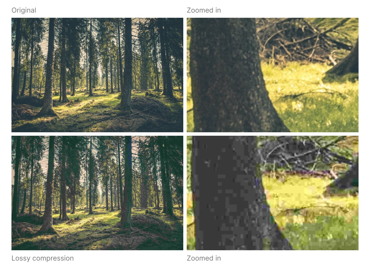
Side by side view of an image of a forest. On the top is the original and a zoomed view. On the bottom is the compressed version and a zoomed in view. Zoomed out you can't really see the difference, but zoomed in on the details and there's a huge difference. The one with compression has huge blocks of solid colors.

AI is that: lossy compression, but on the level of knowledge not pixels.

Meme-like photo of the the universe with the caption “What you think you know when you use AI” and below it is a zoomed in part of the same photo with really bad lossy compression artifacts and the caption “What you actully know of any one detail”

It follows that, as Paul notes, you end up with not only a tool whose output is akin to the lossy, visual artifacts of a JPEG, but a tool whose output introduces into the world the cognitive and social equivalent of those big blocky compression artifacts of a JPEG.

As more and more people create, consume, and communicate with AI, more and more people will begin to understand themselves through a lens of lossyness — a lack of clarity. As Marshall McLuhan said: we shape our tools and then our tools shape us.

Paul raises one last parallel of AI, it’s like a “slightly high intern”:

You can’t really trust their output, but they do help you move things along. They’re good at using the web to gather stuff. They’re bright [but their] teen brains can’t quite figure out why you want this stuff, just that they have to do it...So they do what you ask, but they fill in the blanks with whatever comes to mind and hope you don’t get too annoyed about it.

AI is basically that—a perpetually cotton-mouthed undergrad who doesn’t really need the job—but, thank God, many hundreds of times faster. We wanted a smart robot that does our laundry and maintains our jetpacks, but we got a 19-year-old accelerated hyperstoner with no respect for copyright. But as always, we’ll work with what shows up.

Indeed. We work with what shows up.

But when people start saying these “slightly high interns” should and will replace us all (and our best systems) in the immediate future — I take pause.


Reply