Home Page Redesign of kindlingapp.com
I recently redesigned the kindlingapp.com home page. The old home page jumped right into talking about APIs and security features without ever describing what the software was actually for. In contrast, the new design strives to more clearly and succinctly articulate what Kindling is and what real-life problems it solves.
Communicating Clearly
There’s an article stating how the simple reason products fail is because consumers don’t understand what they do. To create a new, successful product you have to be able to communicate to customers what it is your product does and how it can solve their problems.
Upon first impression that may sound easy, but it’s harder than you might think. Genuinely original and innovative products don’t fall into existing product categories. As a result, these innovations are often difficult to describe because there is no current framework for understanding them. Things that are difficult to describe will be even more difficult to understand, and that’s where the problem begins for businesses: when consumers don’t understand a product’s purpose they immediately lose interest.
One of the best places to communicate what your business is all about is your website. Communicating an entire product’s purpose on the homepage requires lots of focus and discipline.
The new disciplined design for kindlingapp.com focuses on narrating how Kindling is useful in discovering, sharing, and realizing ideas within an organization. My wife, after seeing the new page, said, "oh, I actually know what the company you work for does now".
The Design
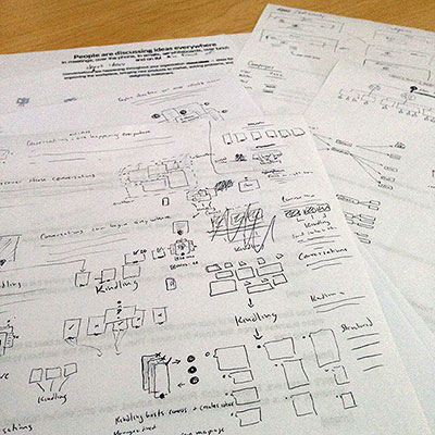
The design started with a collaborative Google doc for the page’s copy. Though not visual, creating and crafting the copy was one of the most difficult tasks of the design. After innumerable edits the copy provided enough substance to get started on devising visuals for the narrative. I started with various sketches to determine how and where the visuals could aid in communicating Kindling’s purpose.

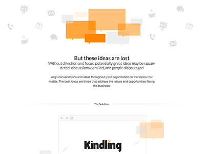
The artwork was then created in Photoshop. I dribbled a few previews of the work for historical sake:
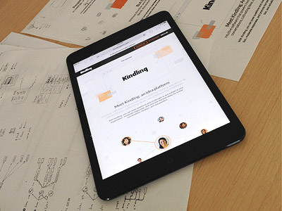
After drawing up the graphics and reviewing them with stakeholders, it was time to turn the design elements into markup and responsively test the designs across devices:
Final Product

It seems rather simple but forming the narrative and accompanying graphics took a lot of work. It is difficult to take everything an entire company stands for and distill it into a page that’s clear and simple enough for an anyone to understand.
Iteration on the narrative will continue to take place, but this new home page was a great leap forward in explaining the problems Kindling’s software can solve.


