Kindling Marketing Site 2.0
In an eariler post this year, I wrote about our plan to redo the marketing site at Kindling. In the post, I described our efforts in defining the “redesign” of the site and how it all began with sketches, wireframes, and meetings. It was everything but the visual design.
After sweat and tears, we’ve now shipped our brand-new, shiny site at kindlingapp.com. In this post, I want to give a brief, visual overview of my process towards bringing M2 (as I will be calling it) to life.
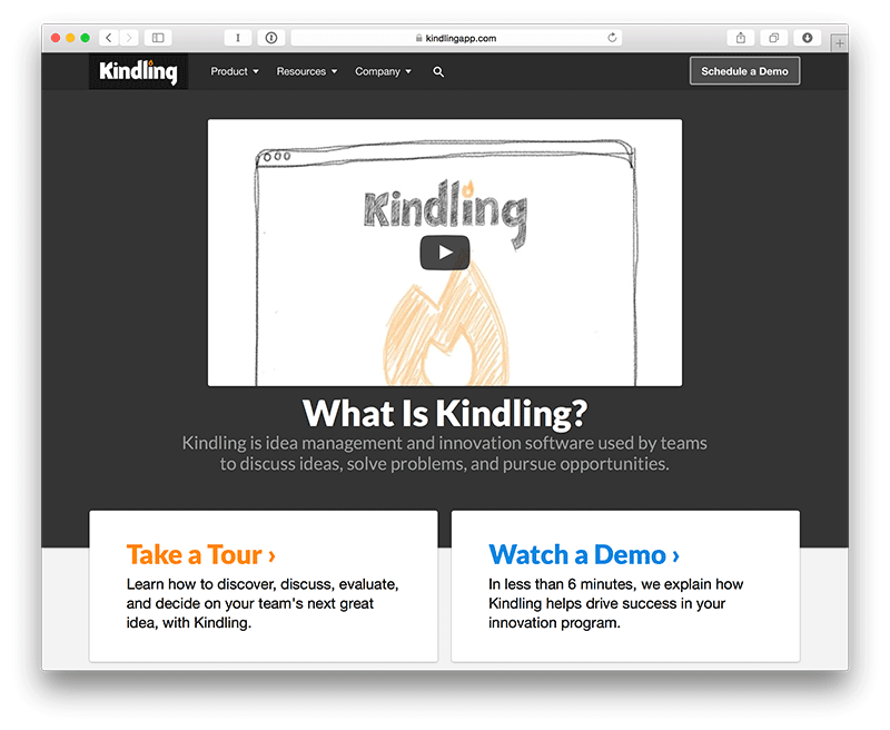
Note: what i’ll be showing are desktop-size mocks. The site itself is responsive so you can always check it out on your phone or tablet to see what it looks like. There’s just so many different ways to represent the design of the site that I just chose one and went with that (there’s already too many images in this post).
Information Architecture (IA)
Before talking about what the site might look like, we had to first determine how it would function. This part of the process required we ask questions like these:
- How does each individual page relate to all the others as a whole?
- What is the information architecture of the site as whole?
- What URL structure would most effectively mirror the IA?
- What sections of the site require a consistent, inter-weaving narrative and flow amongst pages?
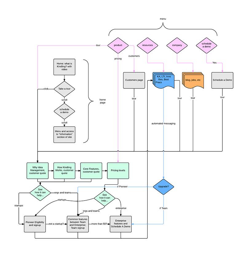
We went through various iterations before finally arriving at a specific architecture and flow. For the “Tour” part of the site, a colleague created a flowchart which served as a conversation piece for communicating purpose and design direction towards stakeholders.
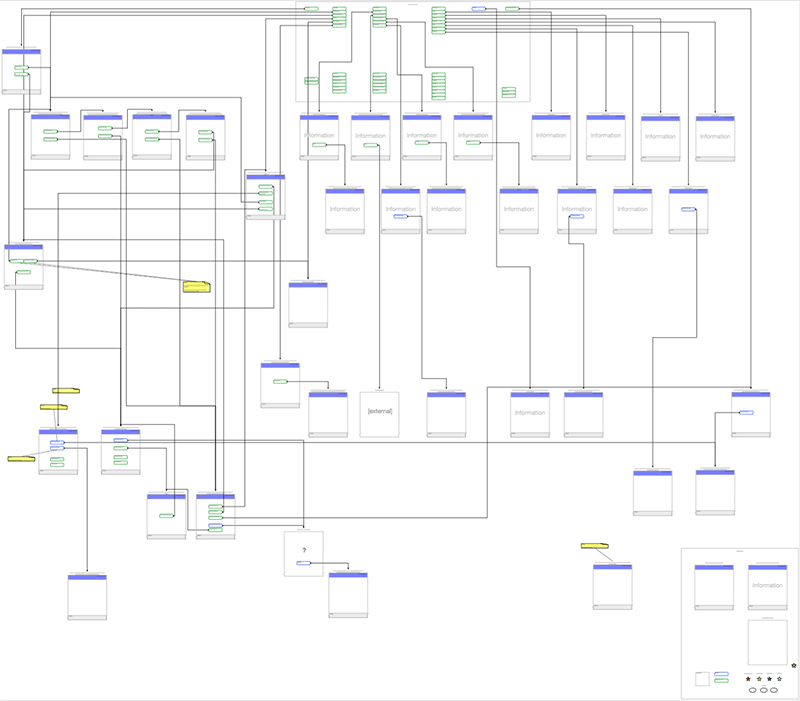
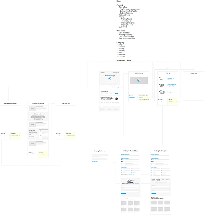
Additionally, we created an IA diagram specifying each page of the site with its corresponding URL and <title> tag. This helped provide a bird’s eye view of the site and get a sense of scope and page relationship.
Wireframes
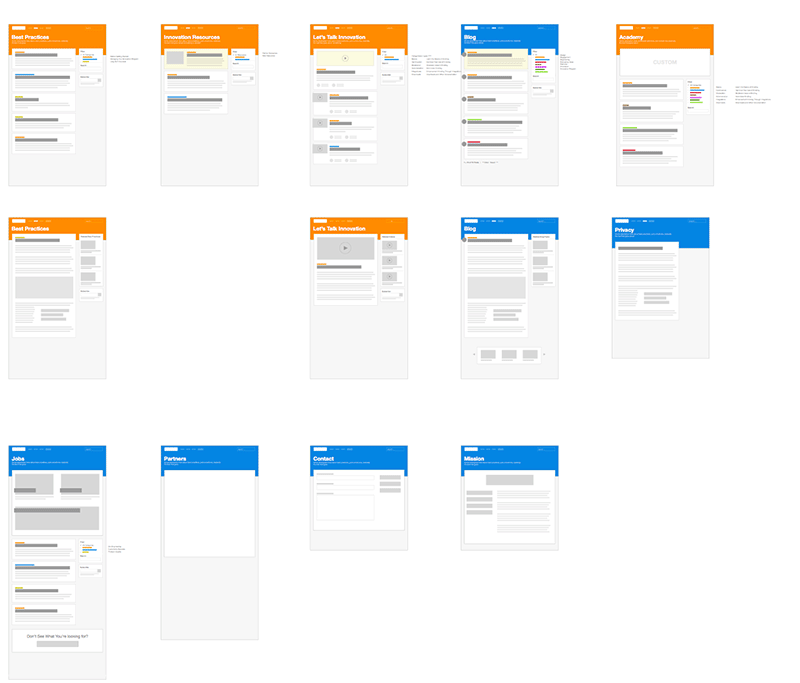
Once we had a good sense of the scope of the site and it’s IA, the flowchart and diagram served as the foundations for the rough wireframes I created around content. These helped convey flow and a sense of architecture to stakeholders, as sometimes simple IA diagrams and flowcharts aren’t enough for non-design or non-software people. They need more concrete visuals to get a real sense of the design direction.
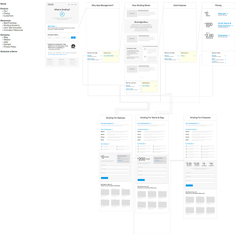
These wireframes were constantly in flux as we would create them, talk about them internally as a design team, and iterate.
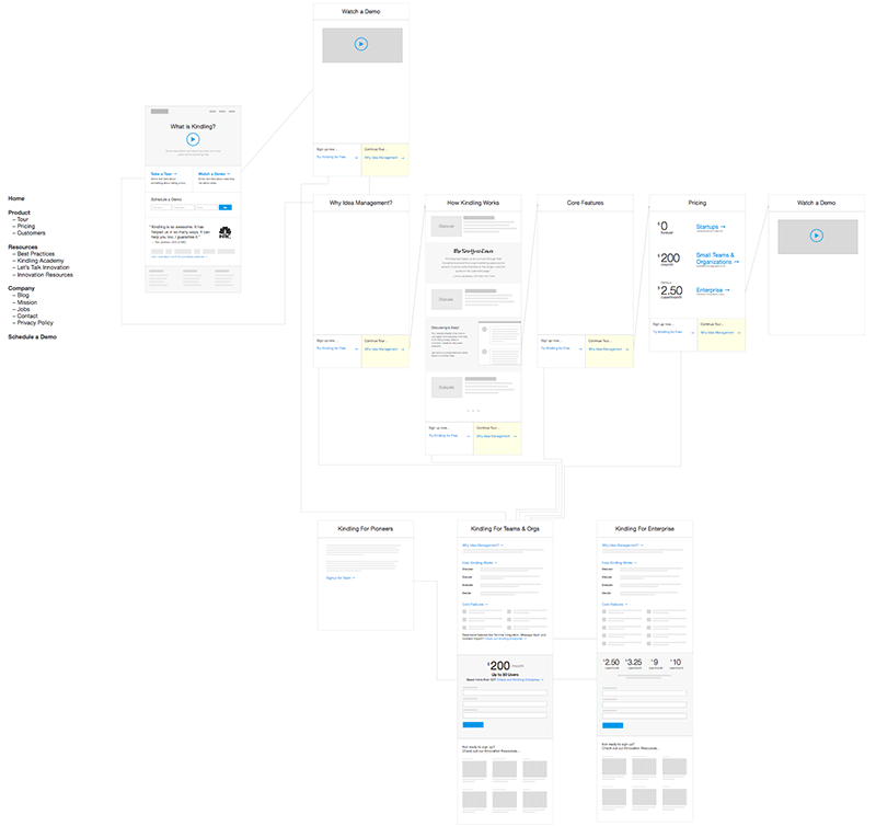
After internal iteration and discussions as a design team, we would move the conversation to a larger group of stakeholders to get buy-in on overall direction. If things needed to be tweaked, we went back to iterating on these flows until we got them all right.
Sketches
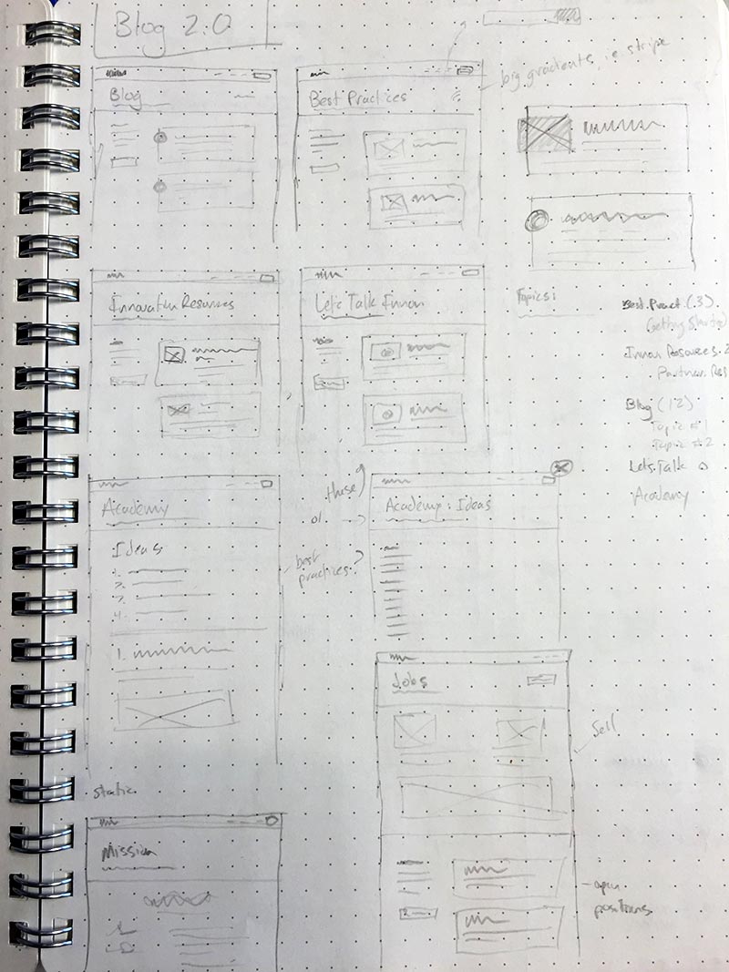
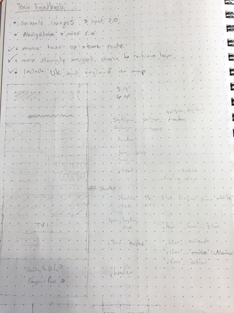
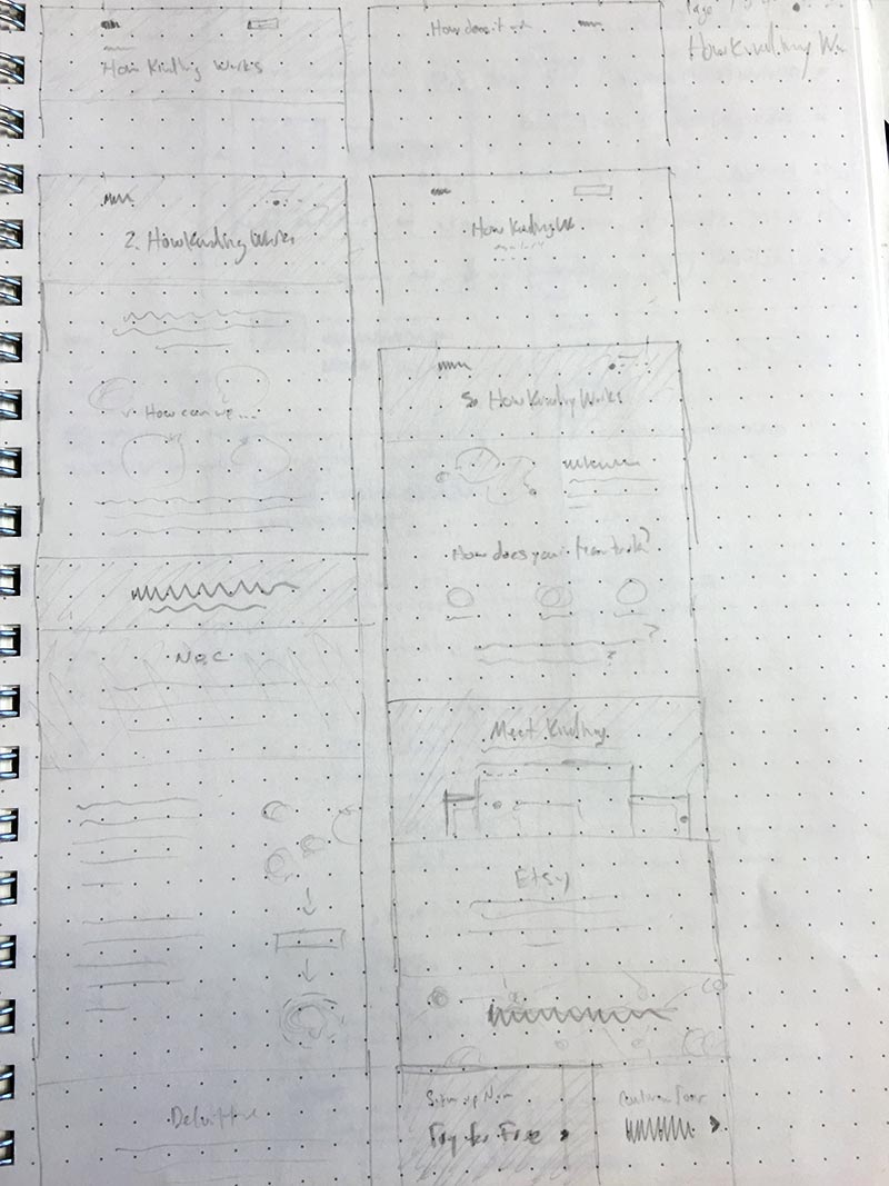
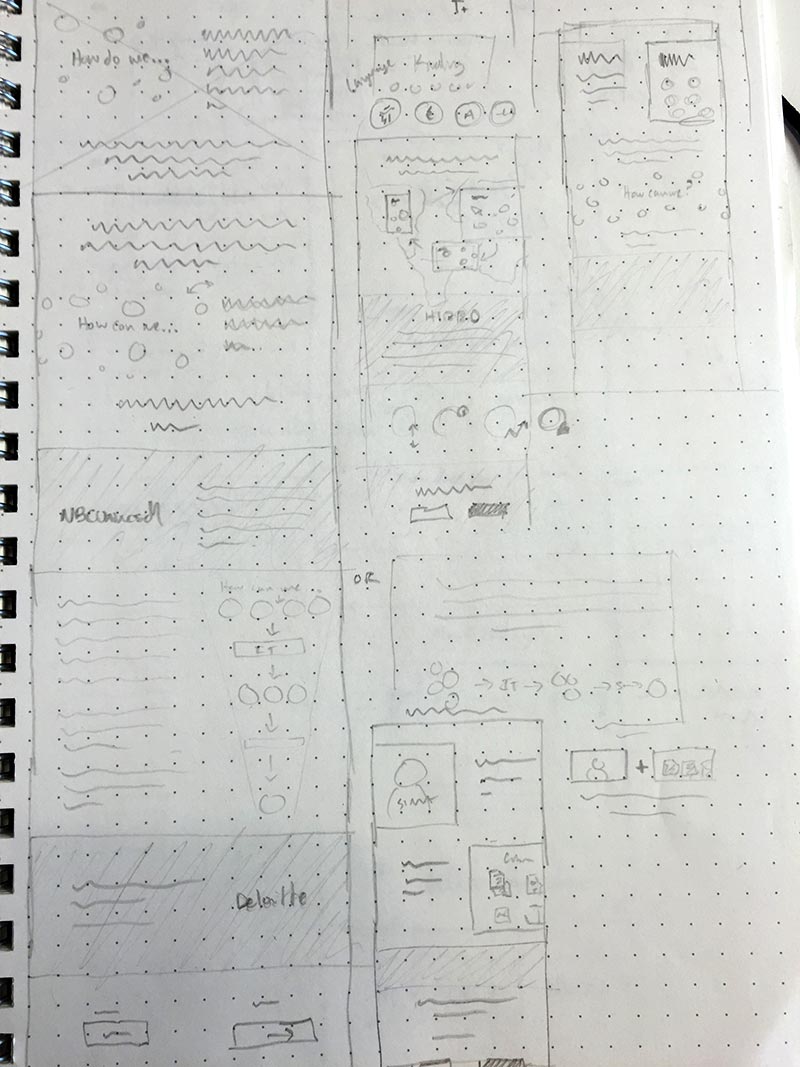
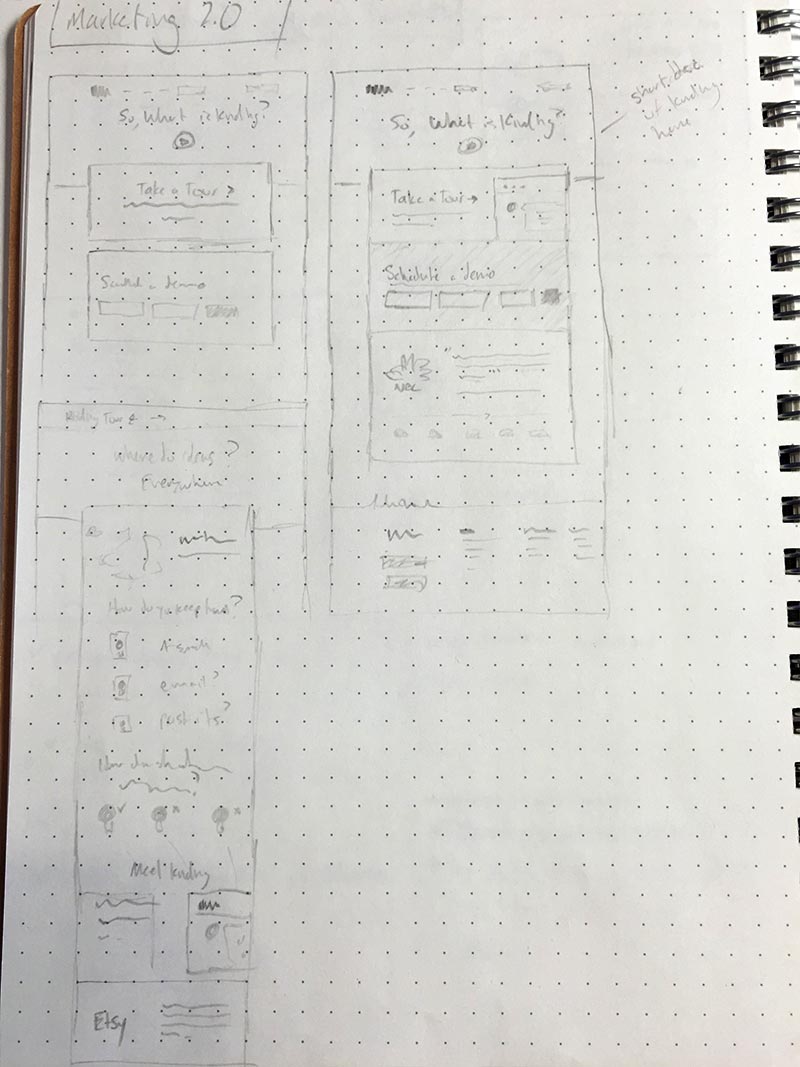
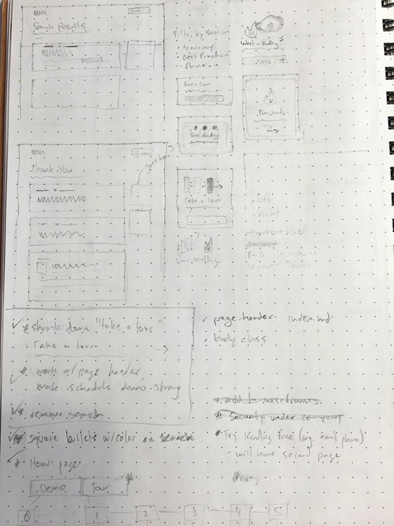
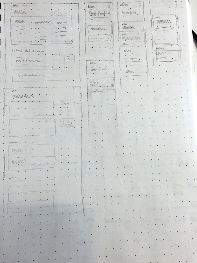
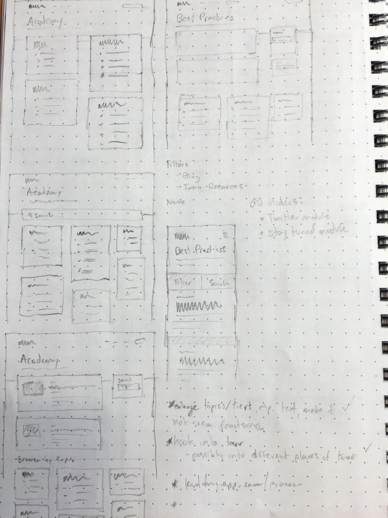
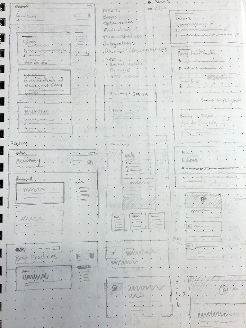
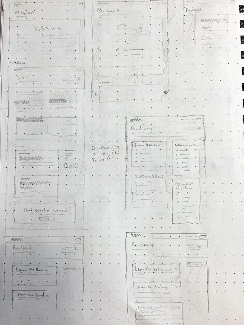
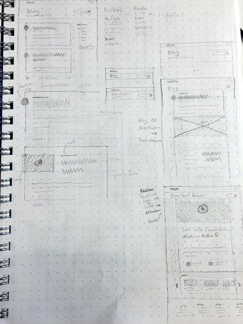
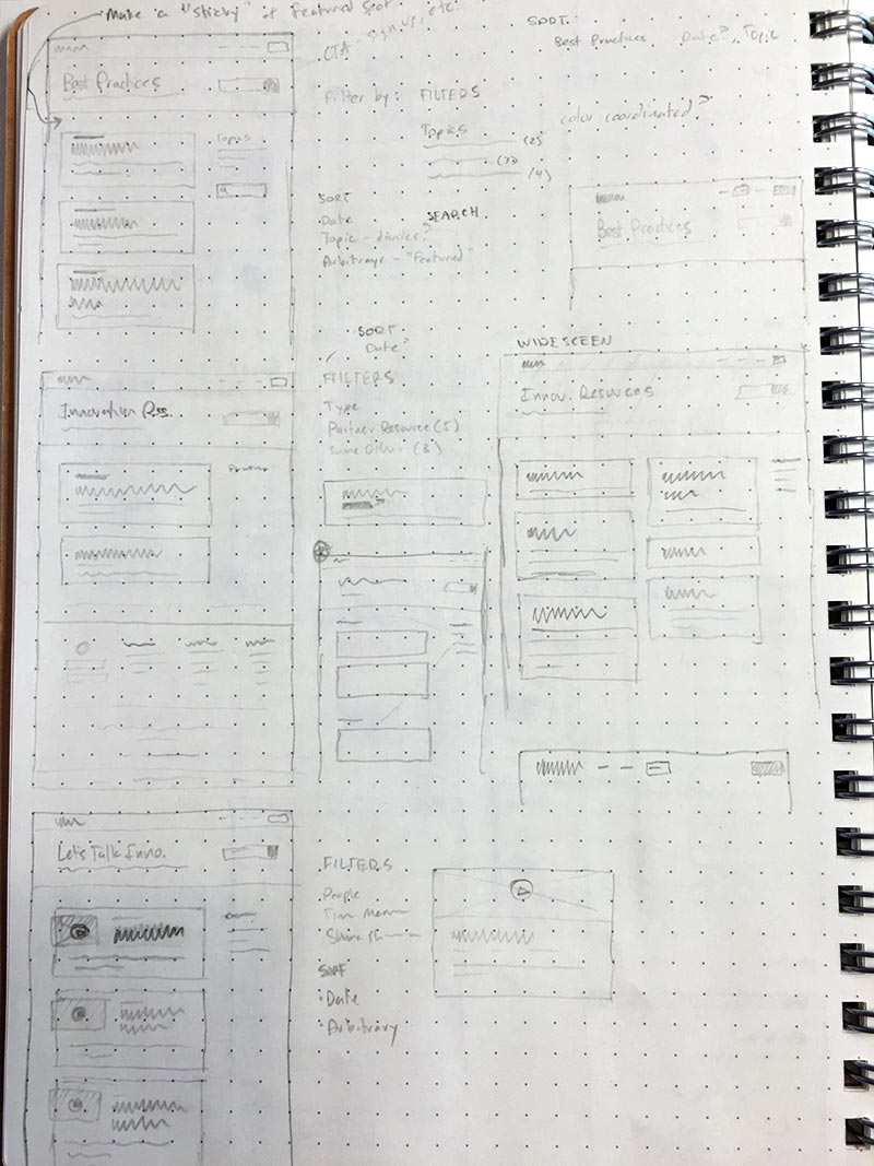
It should be noted that all along this journey there were paper sketches — lots of sketches. Sketches of everything from IA to flow to page structure to page patterns to you name it. Oh, and along with these sketches were notes, insights, feedback, and much more.
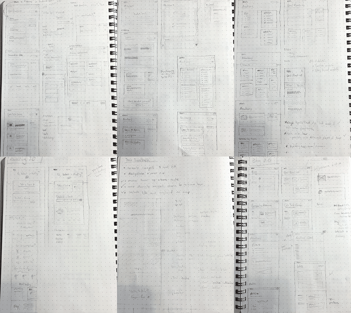
I want to reinforce the number of sketches I produced. For me, pencil and paper is a great way to quickly prototype ideas and come up with good solutions in rough form, which I can then refine. Perhaps even more importantly, pencil and paper is the best tool I’ve found for burning through all the bad ideas in my mind. I can quickly iterate with litle friction. That’s why there are so many sketches around M2. Here are a few:
Patterns and Mocks
One of the design elements I tried to develop most during the sketch and wireframe stage on through the production of high-fidelity mocks was page and information patterns. I asked myself, “self: how can I represent navigation, content, and other design elements in a consistent, unified manner?” Developing a card pattern quickly showed itself to be an advantageous solution. As I iterated through various versions of page patterns, I tweaked and adjusted typography, color, and shape patterns to create something that felt unified and coherent.
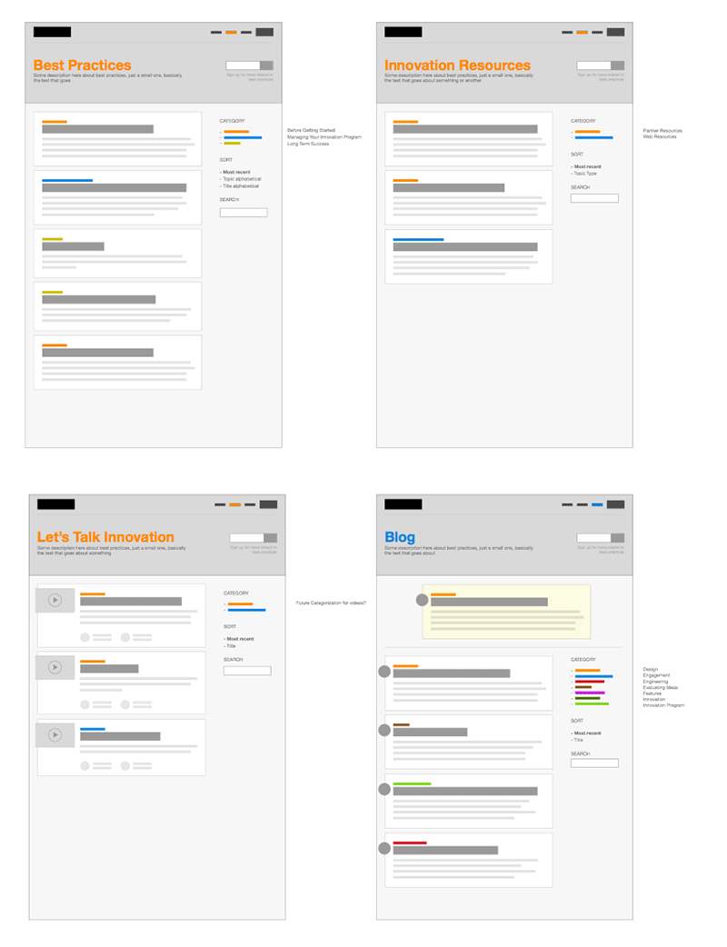
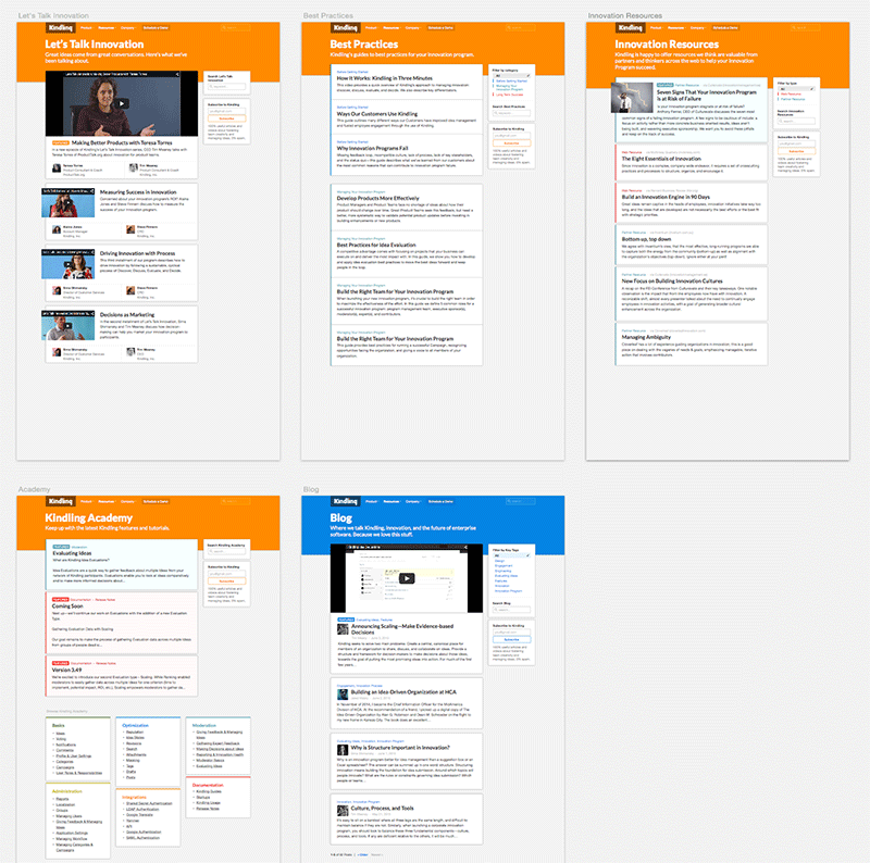
For example, here's a shot of the page patterns mock I worked on in two versions:
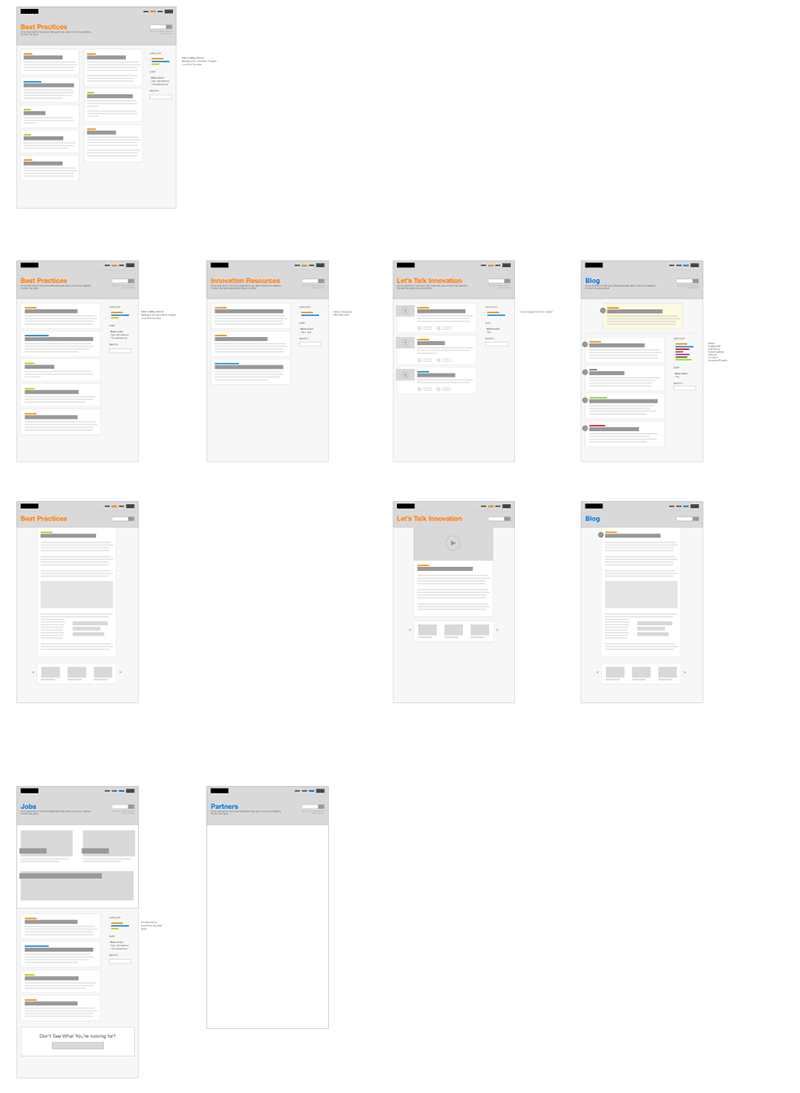
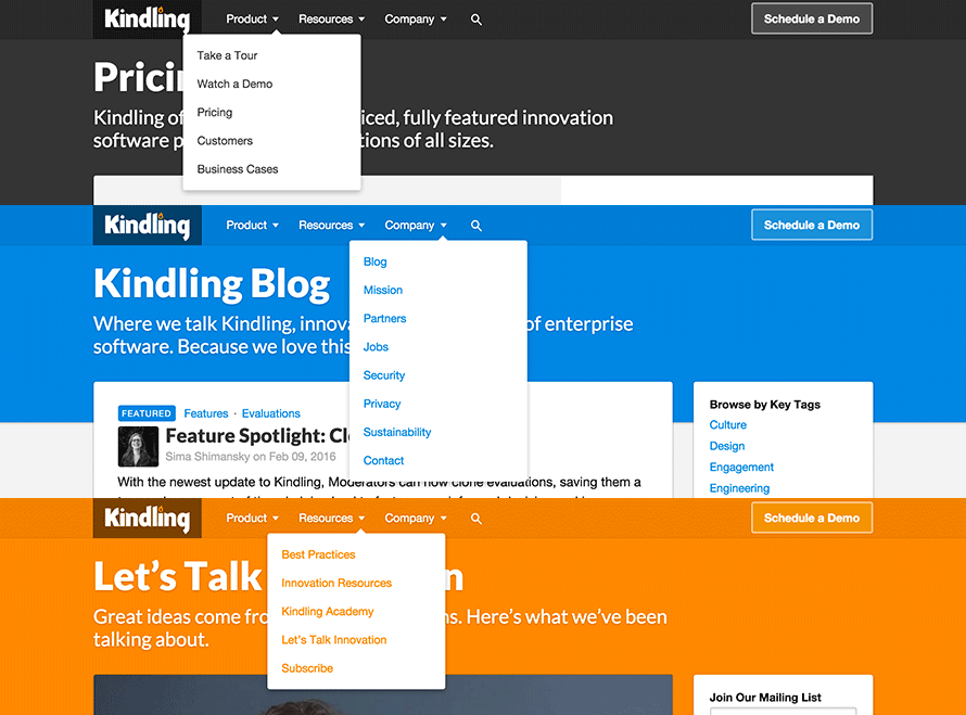
As you can see, in the second iteration we moved towards a stronger brand representation with colors representing different hierarchical parts of the site.
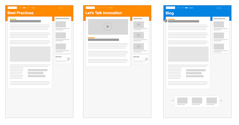
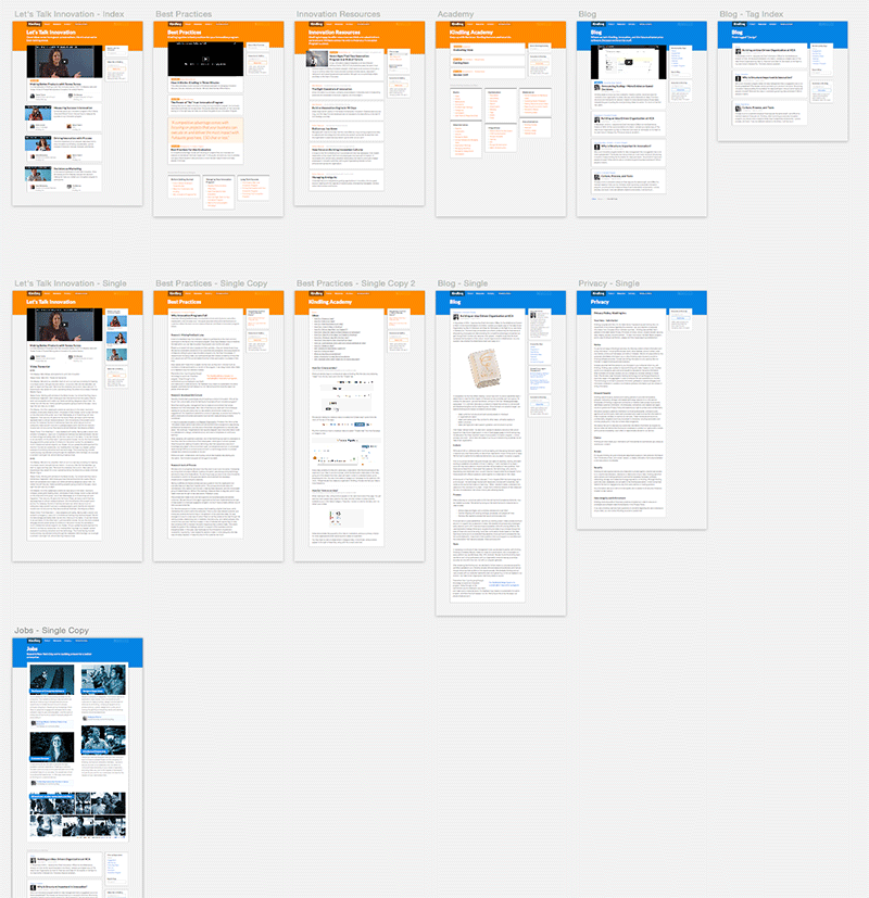
Once I began to get a grasp on the general layout and scaffolding patterns, I moved on to figuring out unique layout subtleties across the different content index pages. For example, /blog would be an index page that consisted of a list of blog posts while /best-pracitces would be an index page that consisted of a list of Best Practices posts. Each post type had common attributes that could share design styles. For example, each had a title and description which could be set in the same font size and color. However, each content type also had its own unique attributes. For example, Best Practices posts didn’t have an author while Blog posts did. Additionally, other content types had unique attributes like video preview thumbnails or featured speakers. Each of these had to be accommodated in a way that could share templating and layout patterns, but accommodate unique styling that would help differentiate each post type from its relatives.
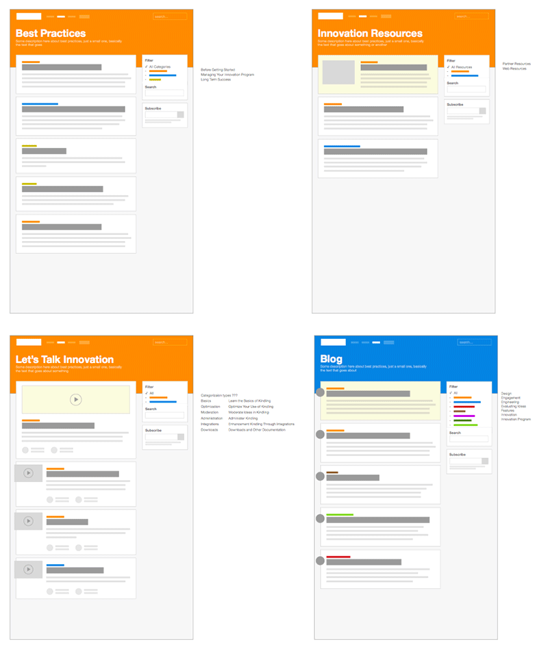
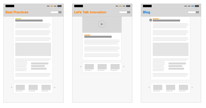
As you can see, each page shares patterns around overall layout as well as content-specific layout with subtle differences. In this same vein, I created mocks around how we could share patterns on individual post pages, as each post would consist of markup turned into HTML content along with the unique attributes of each content type like featured images or video.
Of course, there were parts of the site that didn’t fit into any of these patterns because they were individual pages with their own logic and structure apart from the more regularly updated content of the site. For example, the /jobs page consisted not only of a list of content (like /blog) but also a content area where we would “sell” working at Kindling. In the end, this page still borrowed from the patterns I developed around content types and became a kind of hybrid page.
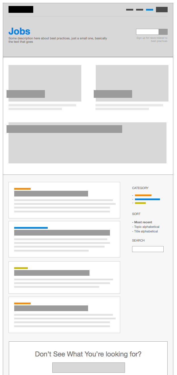
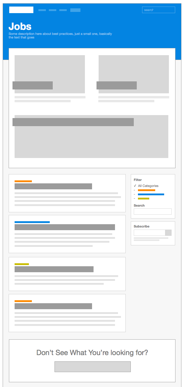
Thinking hard about these patterns made writing the CSS and HTML templates much easier. I could easiliy share class names and HTML structure across pages while making it easy to change once and see changes reflected everywhere.
High-Fidelity Mocks
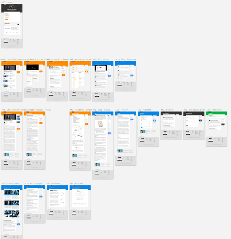
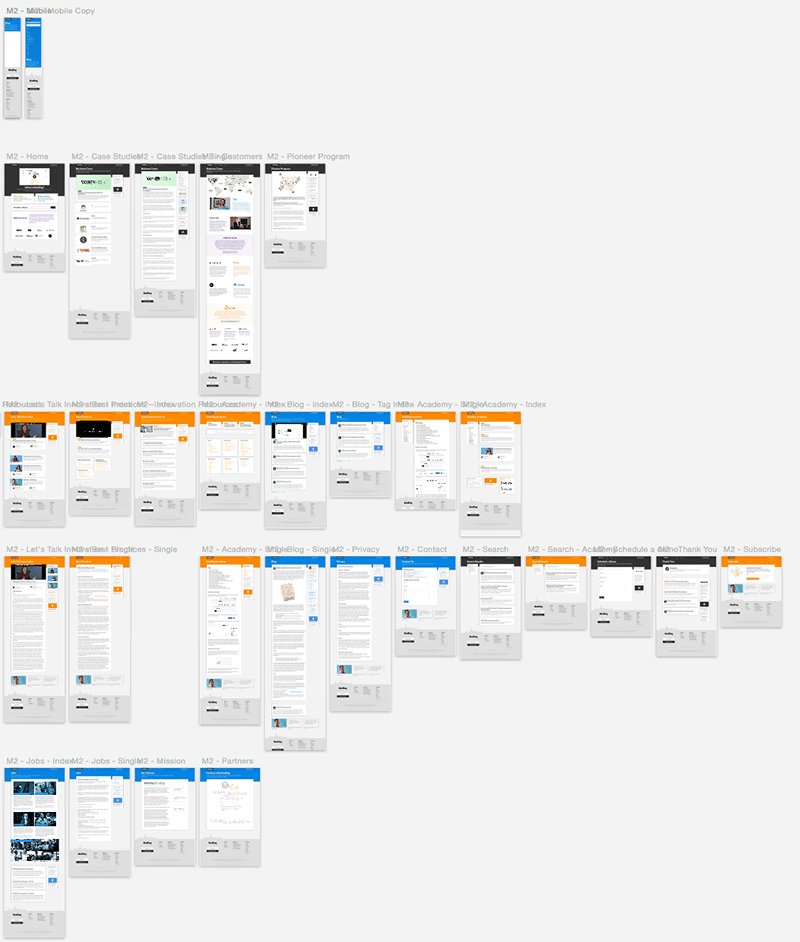
Once I nailed down the shared structure and patterns of the site as a whole, I began creating more high-fidelity mocks of each individual page. As I developed each component of the page, I kept in mind how I might share those styles across related pages. For example, each content type had its own index page which shared a set of components like sidebar modules and a paging module. These were designed to share similar styles for each type of index page, whether it be an index page of the same content type (like /blog/tags/design) or a different content type (like /jobs/full-stack-engineer).
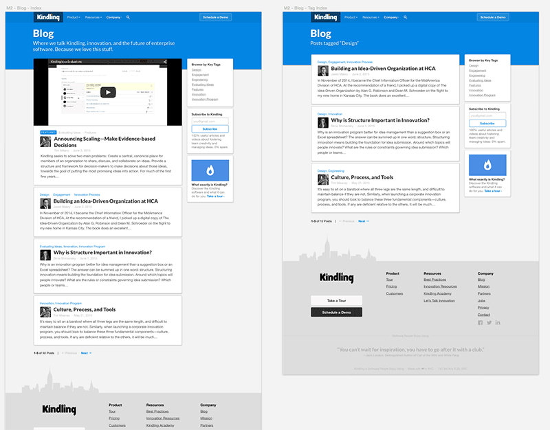
As I worked through each individual page, I found myself easily being able to share styles, layout, and structure across page types. Sometimes, pages were already created based off previously-designed patterns. All I had to do was change the name of the page and the raw content. It’s a great feeling to see all the thought you put in beforehand begin to payoff as your individual page mocks increase in number.
A Few Words on the Technical Implementation
As I began to get most of the pages nailed down visually, I began to concurrently build out the site in HTML, CSS, and Javascript. Because our previous site had run on Wordpress and our dissatisfaction with that platform had peaked, we decided to go a different route and choose to build the new site using a static site generator. Selling this idea to the development team was easy because it had many benefits from the perspective of the developer experience. But a static site generator also made many intriguing arguments from a business standpoint. For starters, the entire site would be hosted statically on S3 which meant no more worries about running and managing an Wordpress environment (which would be vulnerable to attacks). But that also meant a drastic decrease in cost! Hosting an environment for a Wordpress stack was much more expensive than hosting static files on S3. In the end, our choice for a static site generator not only made developers happy, but it saved the company hundreds of dollars a month in computing costs.
Based off the decisions we made while making our flowcharts and wireframes, I explored what kind of project structure we could use for categorizing and organizing content and code. I came up with a project structure based on our needs that looked something like this:
.
├── src
|   └── academy
|   |   ├── img
|   |   └── posts
|   |       ├── basics
|   |       |   ├── ideas.md
|   |       |   └── ideas.md
|   |       └── optimization
|   |           ├── reputation.md
|   |           └── idea-states.md
|   ├── blog
|   |   ├── img
|   |   └── posts
|   |       ├── 2014-05-03-blog-post.md
|   |       └── 2014-05-06-another-post.md
|   ├── lets-talk-innovation
|   |   ├── img
|   |   └── posts
|   |       ├── making-better-products.md
|   |       └── measuring-success-in-innovation.md
|   ├── best-practices
|   |   ├── img
|   |   └── posts
|   |       ├── kindling-in-three-minutes.md
|   |       └── ways-our-customers-use-kindling.md
|   ├── innovation-resources
|   |   ├── img
|   |   └── posts
|   |       ├── eight-essentials-of-innovation.md
|   |       └── build-an-innovation-engine.md
├── templates
└── assets
    ├── img
    ├── styles
    ├── fonts
    └── scripts
Based on this structure, we began exploring which static site generators could support this kind of structure. In the end, we chose to use generator named Metalsmith for two primary reasons:
- It was built on javascript, which kept language consistency within our company (the Kindling application front-end is built on javascript)
- It was completely and entirely pluggable, which gave us the flexibility we needed for our unique needs
Unfortunately, the actual tricks and techniques behind the technical implementation of this site deserve an entire blog post by themselves. So I will have to write that some other time. Ping me if you’d like to know more about how we built this site in Metalsmith.
Page Views & Screenshots
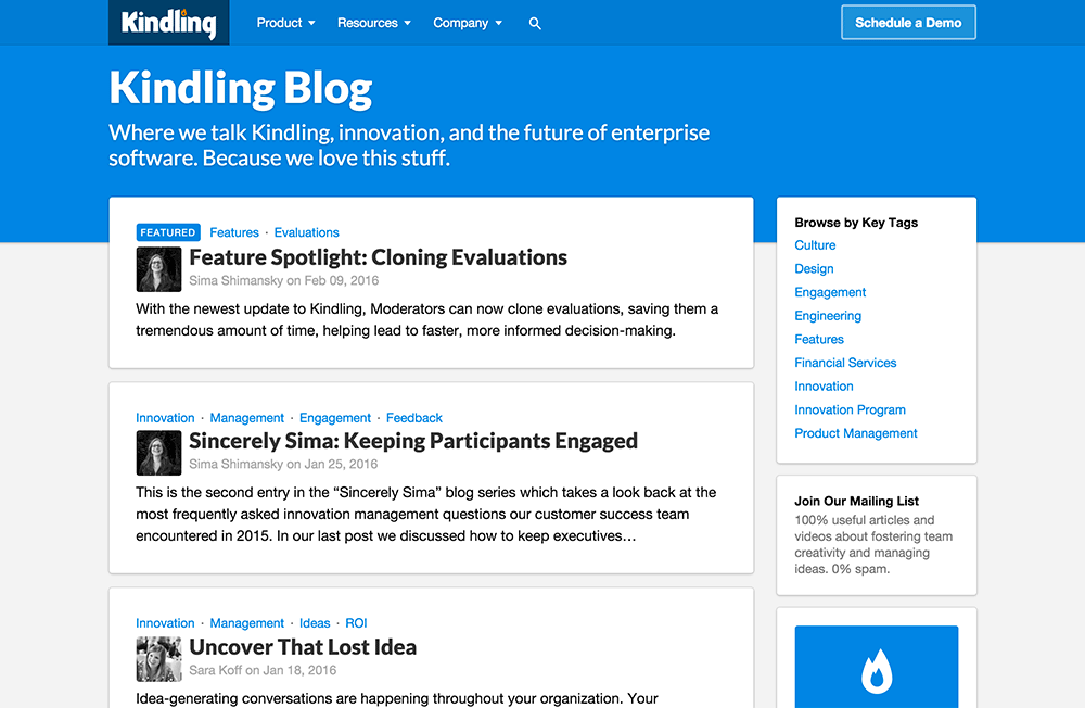
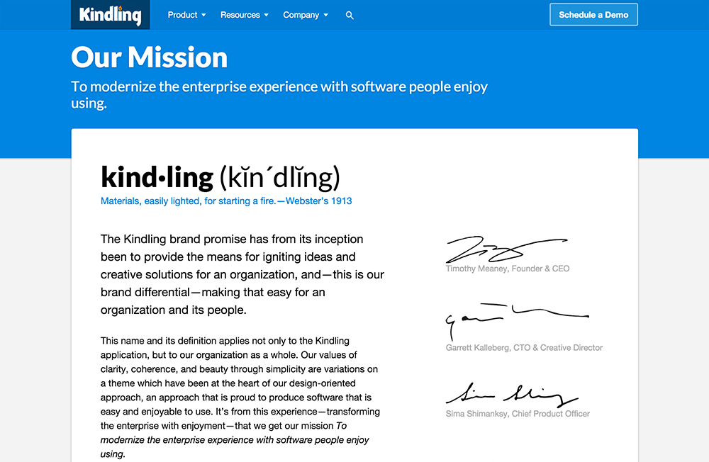
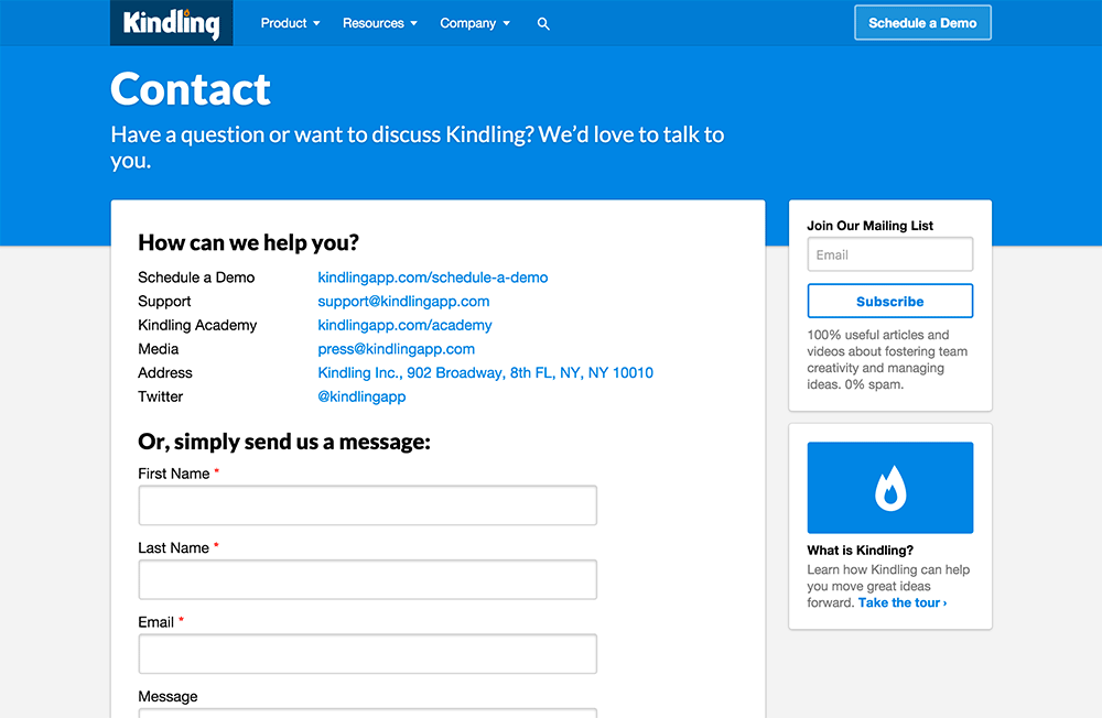
In the visual design process, we broke the site down into categorized sections (Product, Resource, Company) and color coordinated each section accordingly using HTML classes on the parent <body> element. This afforded us the power to easily cascade each section’s color down through the page’s design.
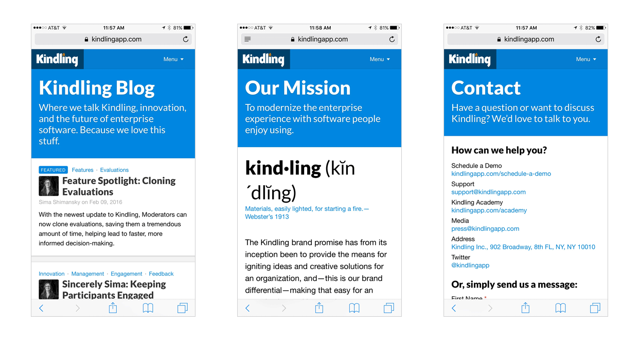
“Company” Section
Here’s a view at the colored section “Company”, which contained different page and content patterns:
And not to forget, this was a responsive page so these pages and patterns flowed down to mobile screen sizes. Here are those same pages on an iPhone:
“Product” Section
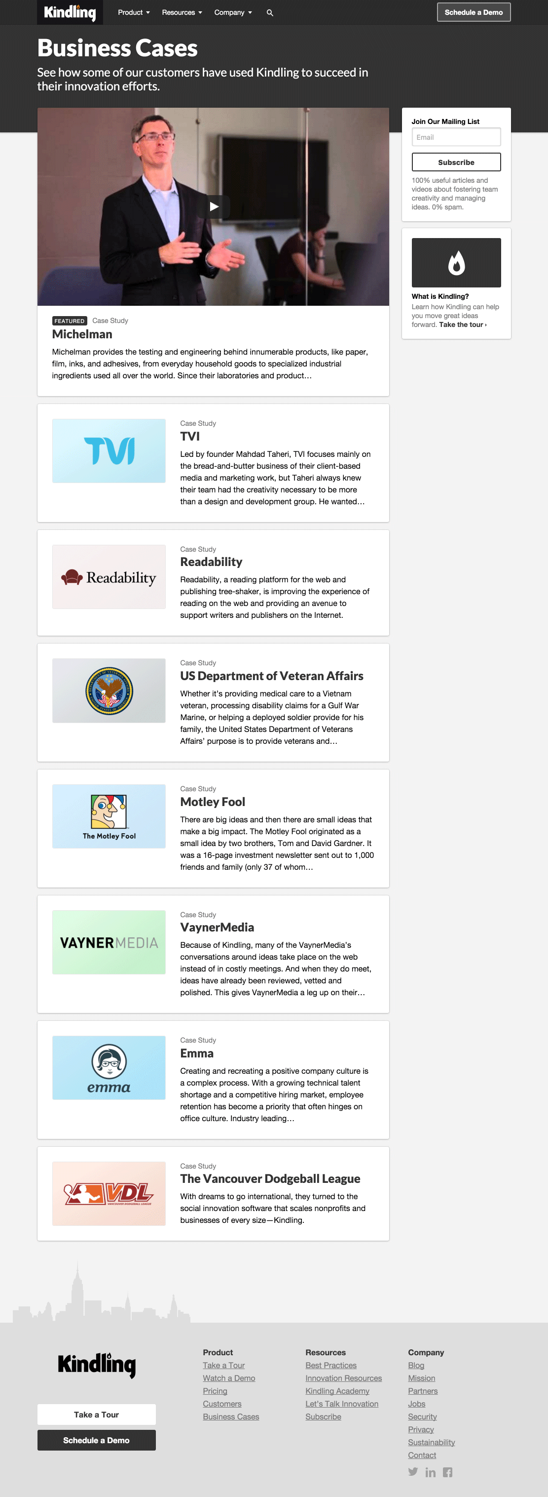
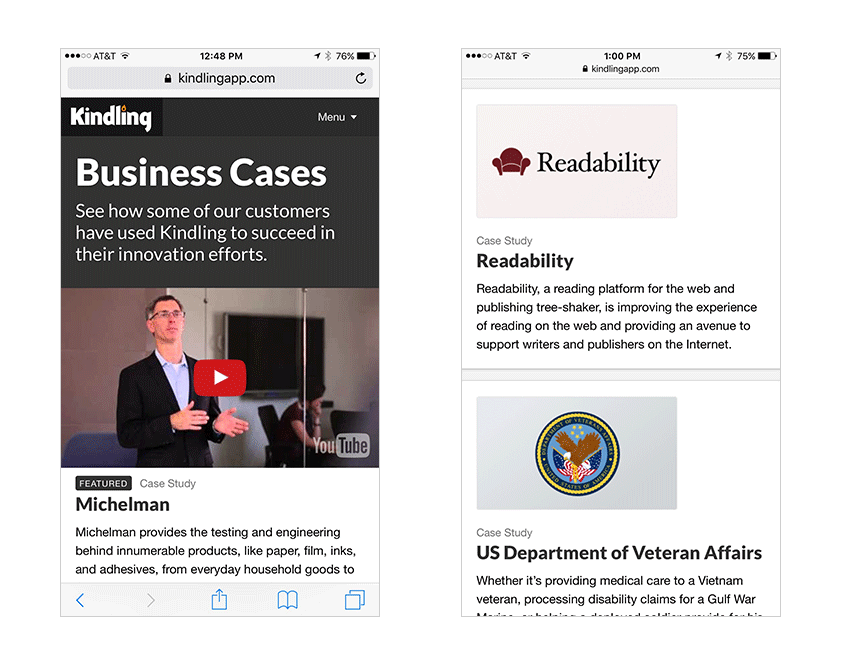
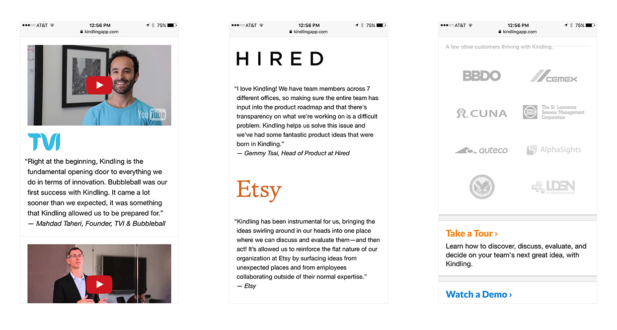
Here’s a look at the colored “Product” section. Some pages in this section shared exact patterns with pages from other sections of the site (like content index views) while other pages were more nuanced in their content and required custom designs within the full-width page pattern:

Let’s not forget that these were responsive designs which accounted for mobile screen sizes. Here are a few excerpts from those same pages on a more narrow screen:
“Resources” Section
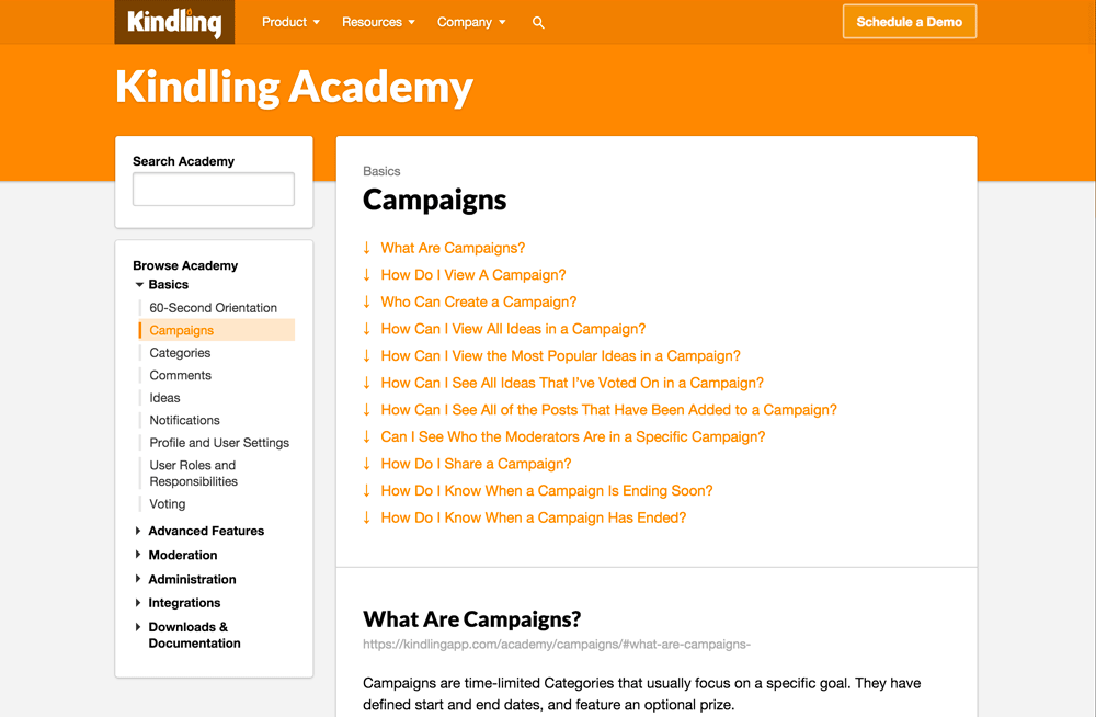
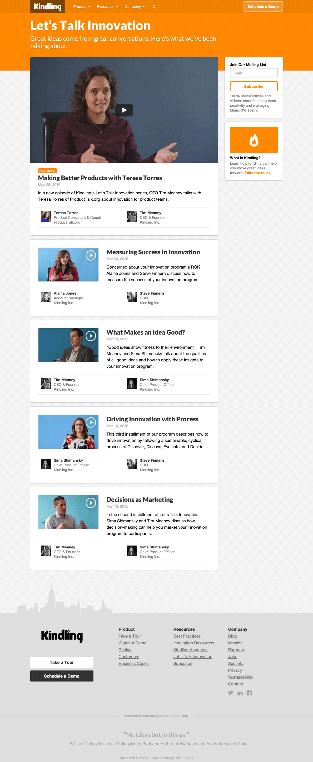
Here's a look at the colored section “Resources” which, again, contained different page and content patterns. Notice how the “Kindling Academy” article views had a reversed left/right layout pattern. These pages were primarily about navigating between help articles, so we stuck the slimmer navigation on the left and the content on the right, a directly opposite to the regular content pattern, which helped suggest and reinforce the concept of a different navigation and browsing behavior to the user.
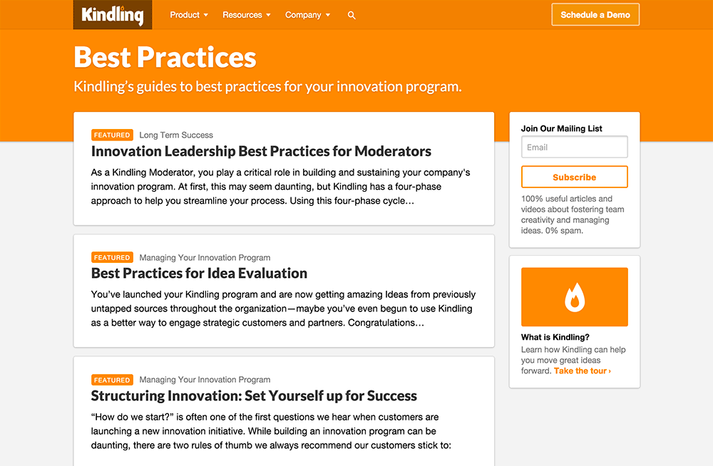
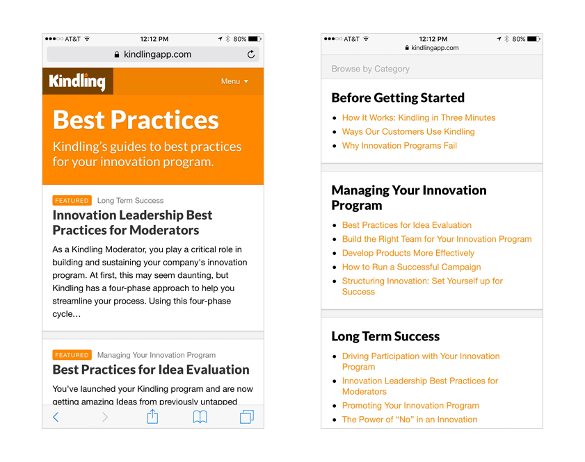
Of course, we can’t forget that these were responsive designs and their patterns flowed down to smaller screen sizes. Let’s take a look at each of the views and how they scaled down responsively. First, there was the “Best Practices” page, which elevated previews of featured Best Practices articles first, then an index of all Best Practices articles grouped by category.
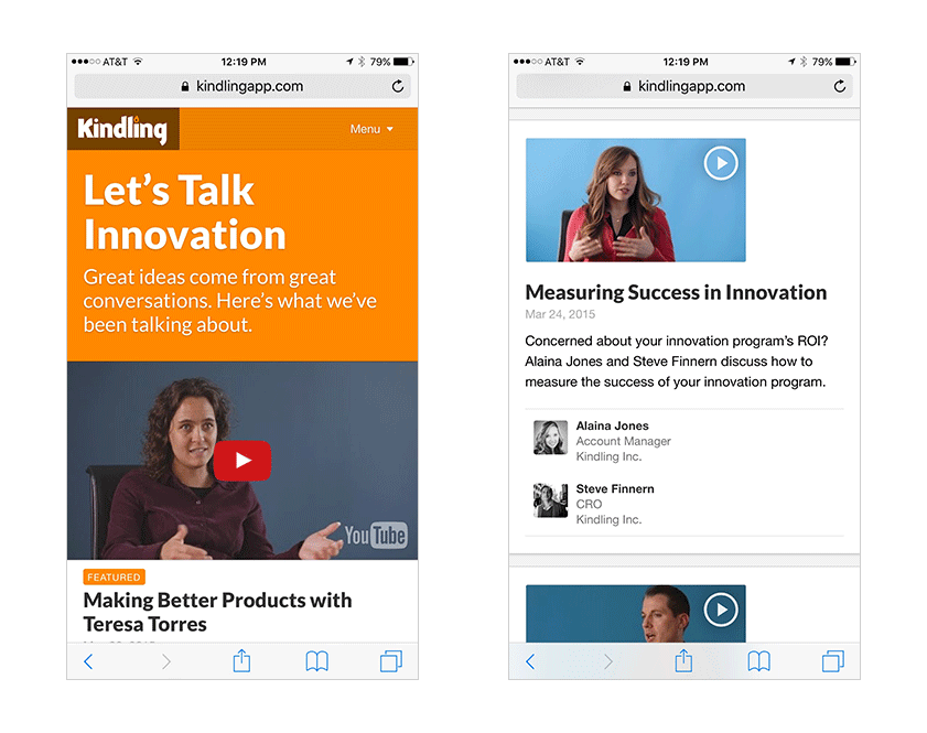
The “Let’s Talk Innovation” page flowed down in a similar manner. Featured “Let’s Talk Innovation” videos were previewed at the top and then an index listing of all other videos came after it.
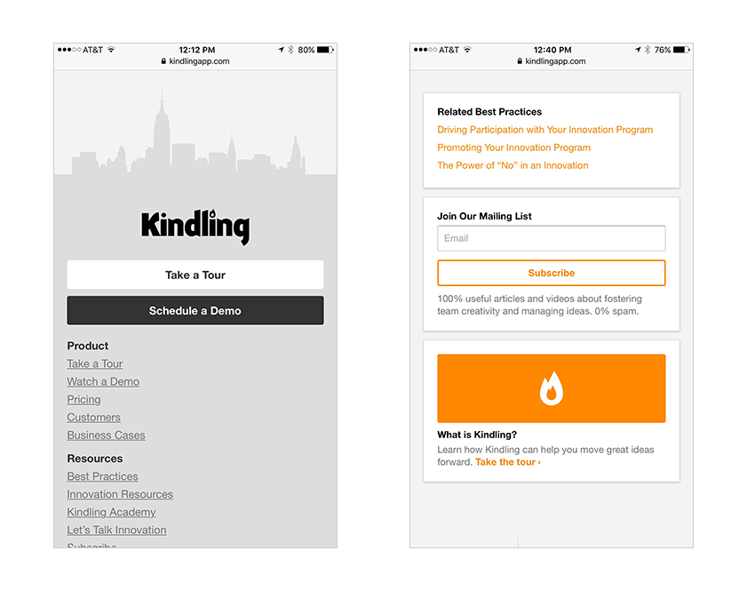
It’s worth noting that all aspects of the site flowed down responsively, not just the content sections. Here’s an example of what the footer and sidebar modules looked like on smaller screens:
Conclusion
This was a fun project to work on. By really thinking through structure, layout, patterns, and data from the beginning, we made our job of implementation in HTML/CSS/JS the easiest part of the whole process :) Be sure to check it out at kindlingapp.com.