Skinning the Idea Poster Anew
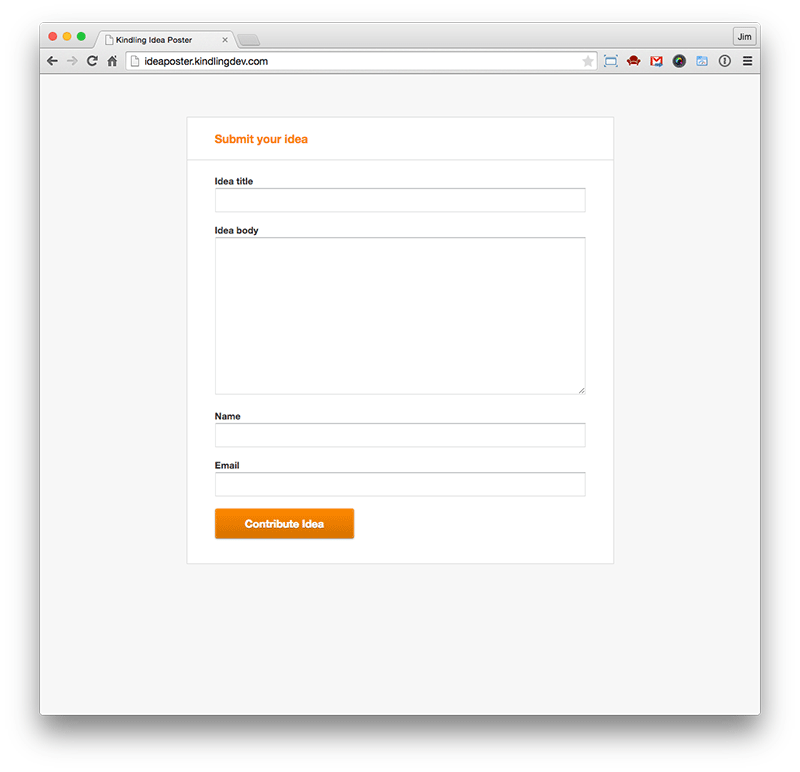
A few years ago, we somewhat hastily released a side project to Kindling called “the idea poster” (obviously we were very thoughtful about its naming). It was a one-off type of project, built almost more as a proof-of-concept rather than as any kind of customer-facing product. However, as time has gone by, more and more people are voicing their need for a tool like the prototype “idea poster” we built because it allows soliciting ideas from a user base outside of Kindling.
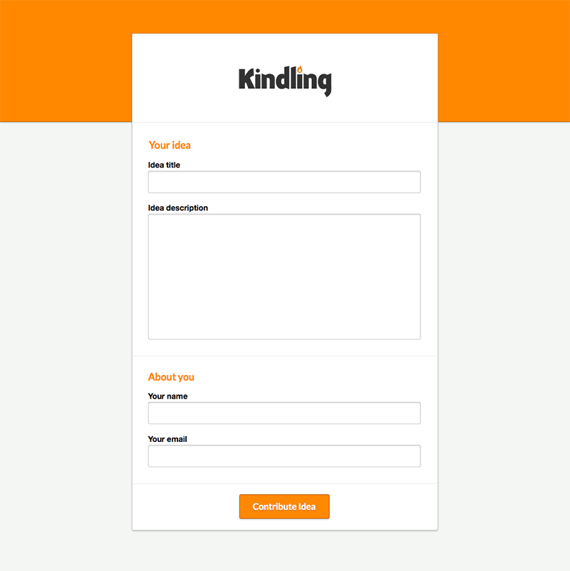
So, with this new found business opportunity, we resurrected the old idea poster. The design requirements came down to me as “style this thing for our demo account”. However, after looking at the existing idea poster and hearing about its purported future purpose, I realized it would need a little more love.

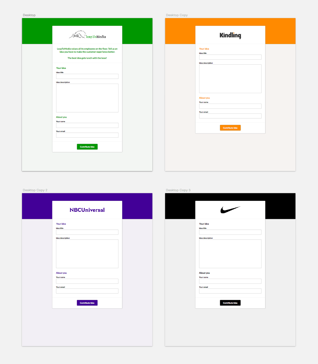
Knowing customer requests as I do, I anticipated that once customers started rolling out the idea poster within their organizations the first thing they would ask for would be the ability to customize and style it using their organization’s colors, logo, etc.. So, with that in mind, I tweaked the design requirements to allow for enhanced customizations and aesthetics. The new design allows for a single, strong brand color along with the organization’s logo.

The beauty of this new design is that it allows for easy customization across different customer deployments. We can set a company logo and color for each idea poster instance and boom a beautiful idea poster that customers are excited about because it feels like it was built just for them.

This project had a quick turnaround time because I was building on top of the existing idea poster (without introducing new functional changes). This presented a great set of constraints that allowed me to quickly prototype changes in Sketch and then style the new design with HTML/CSS. What a wonderful thing to have variables in CSS: with one simple change in color, the entire idea poster comes alive with customized branding—all based off a single variable used in conjuction with a variety of Sass color functions and Compass color helpers, like darken(), adjust-lightness(), and saturation().