Arc90 “Work” Page Design Updates
I’m going back in time on this post. Back in 2012, I moved to New York City and began working with some excellent folks at a small product shop named Arc90 (since acquired, but their github lives on). The client project I was initially hired to work on was cancelled about two weeks after I started. Fortunately, the good folks at Arc90 provided me some internal work to focus on until more client work came down the tube. So, as a way of documenting some of my first agency work, I write this post.
Product Showcase Graphics
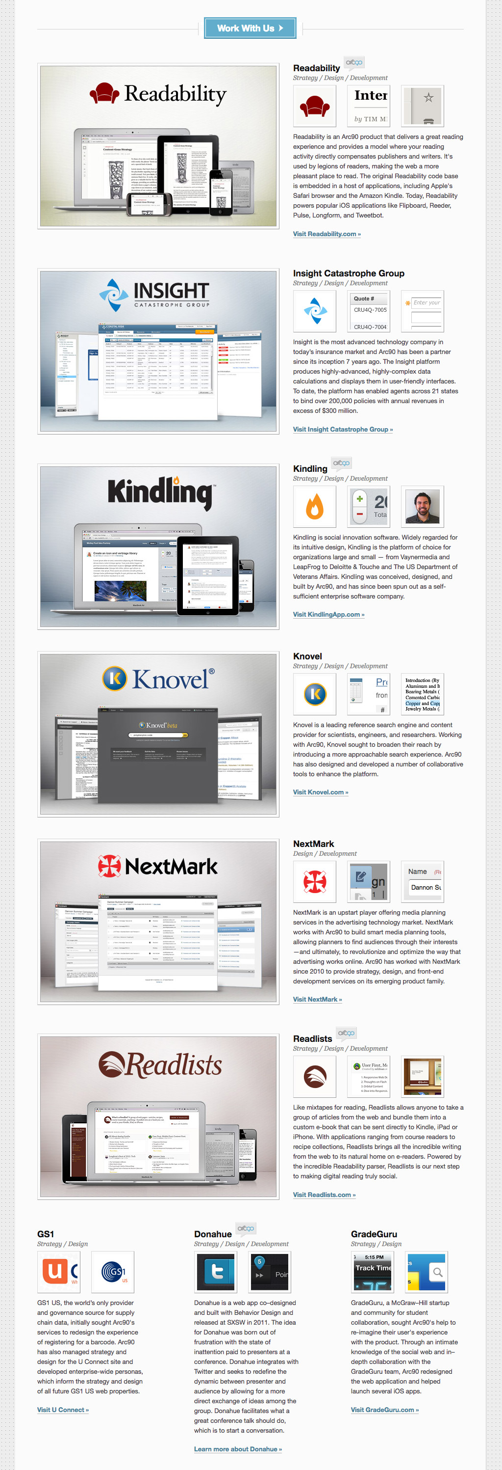
Arc90, being a product shop, had a “Work” page which showcased many of the products and projects they had worked on (both on internal and client-facing). When I was hired, the page already existed and looked like this:
The basic functionality here was to feature each product Arc90 had built along with screenshots. Clicking on the thumbnails on the right would reveal larger images on the left. My first job was to add new project sections and update the existing project sections with new copy, screenshots, and thumbnails to reflect a uniformity in presentation across the entire page.

For any of you that were around the web scene back in 2012, you’ll know skeuomorphic graphics with lots of detail were the “in” thing. Going with that aesthetic, I reworked all the images in the carousels to have a uniform presentation and aesthetic. Each product screenshot was presented in its natural form(s), whether a web browser or native application.
Technologies Interactive Graphic
The next part of the page I was tasked with designing was the “technologies we use” section.
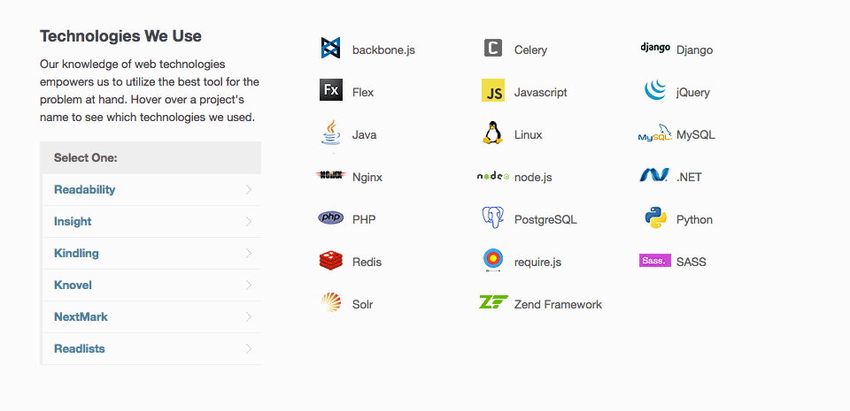
This part of the page was non-existent when I started, so it was left entirely up to me to design. The idea was to communicate what kind of technologies we excelled at using as a product shop (a question lots of potential clients had when visiting our website). So, I was given a list projects we had worked on along with the technologies each of those used and told to communicate that.
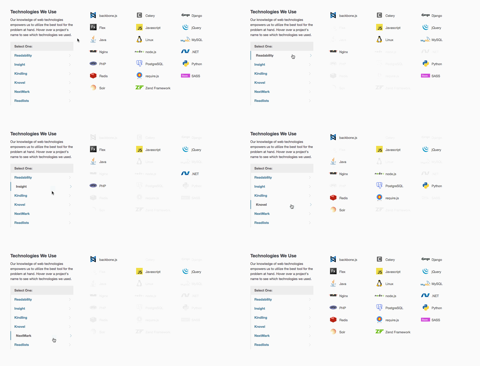
I realized that many of the technologies we used were shared across different projects, so I thought a presentation of all the technologies we used was appropriate along with a “live filtering” interaction that would narrow down which technologies were used on each project.

It was fun to go back and capture this work I did years ago (thank you Internet Archive). This always felt like my first “real” web design job at a “real” web design company, so now I’ve got it chronicled for posterity :)


