Designing and Engineering Color Usage in Agent Portal
One of my tasks at Insight has been to design (i.e. first make sense of, second improve) the visual language across the company, both in terms of brand and product design. The first step in designing is understanding the problem you’re solving. How can you design something you don’t understand?
So how do you begin to prescribe the elements of a visual language across a company and its product? A good place to start is “in the trenches”: in the mundane, everyday tasks that bring you into close proximity with all the facets of the company. For me at Insight, that meant bug tickets. Bugs provide concrete examples of how things fail. Upon examination, instead of merely fixing the apparent problem, there’s an opportunity to dig deeper and find the root sources of failure. Only then can more holistic solutions be considered.
For example, here was my bug ticket: “the styles here are broken”. So I started investigating. Why are they broken? Oh, because of a poorly named variable. Why is the variable named poorly? Oh look, there are like forty other poorly named variables. Why are there forty poorly named variables? Because there are two stylistic themes for the application. Upon closer examination, you can tell the styles architecture was built under the assumption that there wouldn’t be theming in the application — but there is definitely theming now and it’s obviously been implemented as an afterthought. There’s no systematic, architectural approach to it. So the question becomes: how can we implement a system for theming? The systematic solutions are the ones I am seeking. I could just rename the variable and the bug would be fixed, but the root problem would still remain and there would inevitably be more bugs down the road.
Getting Into the Trenches
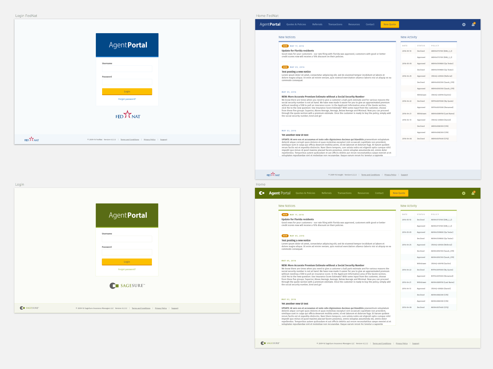
After arriving at the conclusion that a more systematic approach to theming the application is needed, I started with an obvious question: what are the designated colors of the application and each theme? Well, it turns out, the answers to those questions weren’t readily available.
I found out that there was no canonical source for prescribing the application’s colors. There was a .sketch file from a contractor which contained some mocks of the application and some color values. There were also some color values scattered across various .sass files. However the color values in the design assets and the color values in the code didn’t match entirely. So before setting up a cohesive approach to theming in the Sass/CSS, I needed to decide on definitive color values for the application and then document them.
I began by creating a .sketch file that could serve as the application’s design asset. Once UI mocks were in place, color variations could easily be paired down and refined. Additionally, any new feature designs could be built on top of this file. This source file gave me the flexibility I needed to make color choices around theming the application, but it also took on the role of becoming a canonical source for the application’s visual aesthetic.
Designing a Color Guide
Based on some previous contractor work that was available to me, I systematized and documented color usage for the application. Developing a guide for color usage helped provide a clear delineation between which colors were shared between application themes and which were unique on a theme-by-theme basis.


As you can see, by systematically designing color usage for the application, and documenting it, these color guides helped provide language around how to identify colors. This proved incredibly useful when implementing colors in code.
Front-end Code
As mentioned previously, I consolidated all the color usage and theming logic into the following groupings:
- Shared colors (shared by all themes)
- Custom colors (theme-by-theme basis)
Based on the design assets I had created, I then looked at refactoring the front-end Sass code. The goals were:
- Create a more consistent naming scheme
- Draw a distinct line between which variables are shared between themes and which are not
This kind of approach will help developers (and designers) be able to reason about how theming in the application is implemented and controlled. I removed existing color-specific variable names (i.e. $dark-green) and exclusively leveraged color-agnostic variable names (i.e. $brand-primary). This drastically improved the ability to comprehend how the application was styled and themed. It provided one master set of variables that could be configured on a theme-by-theme basis.
For example, here was the front-end code I initially encountered: two separate .scss files for each theme, each file containing all colors of the application, including the theme colors. This meant duplicate names, variable overwrites, unnecessary color mappings, and more.

Based on the previous color definitions I had devised in the color guides, I came up with a more logical approach to theming with variables. Notice in this screen shot how the theme files are the same for each instance, it's just the values that change:

I devised a single partial that defined the shared application colors which could be imported by each theme. By restructuring and renaming the application color variables, I came up with a solution that made reasoning about color usage and theming in the application simple. This served as a solid base around color usage and theming in application for the future.
Conclusion
As you can probably guess, the whole process was more nuanced than this simple post tries to describe. Other re-factors had to be made along the way. For example, hard-coded values were prevalent in the app. These had to be found and either replaced or reconciled with officially-chosen colors. To give one example: the overall page background was hard-coded to #fbfcf8 instead of using the already existing $background-sage (which was later re-factored to the color-agnostic variable name $background-light).
This was only the first baby step towards a more unified, cohesive design language. Having a concrete example to work on proved quite useful. I was able to bring a consistent, holistic approach to design from both perspectives of visual design and code.
The only remaining task is to do the same thing for the rest of the company and its products :)