Blog Redesign: Out with the Old, in with the Old
Why, are expectations so high?
Is it the bar I set?
Always in search of the design I haven’t made yet
Will this step just be another misstep?
The proportions have to be perfect, the aesthetics flawless
And it always feels like I'm hitting the mark
‘Til I let it sit for a bit, re-look, then pick it apart
Like, “this shit is garbage”
— Rephrased from Eminem’s “Walk on Water”
I know, I know. Yet another post in which someone is announcing a redesign. But you know what? I had an itch to redesign my blog and I can scratch that itch because, hey, it’s my blog and you can’t tell me what to do.
But before I get into writing my thoughts on my new “design”, let’s take a stroll down memory lane and see what some of my old blog designs looked like (cue sentimental music for a nostalgic slideshow).
A Graphic History of My Blog
One of the things that interested me when I started this redesign was how many times I’ve changed my blog design over the years. Thanks to the WayBack Machine I could find out. Allow me to take you on a tour:
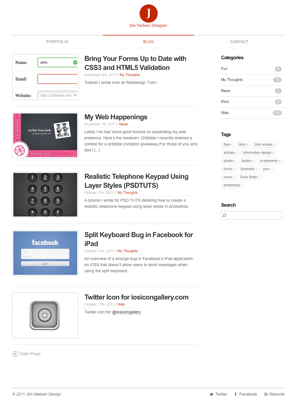
Circa November 2011: ah yes, probably the very first design of my blog. It very much fit the design of a Wordpress blog around the time: content feed on the left, blog categories and tags on the right, posts with featured images. And I had a search box because, hey, Wordpress gave me search for free. It all brings me back to a simpler time.
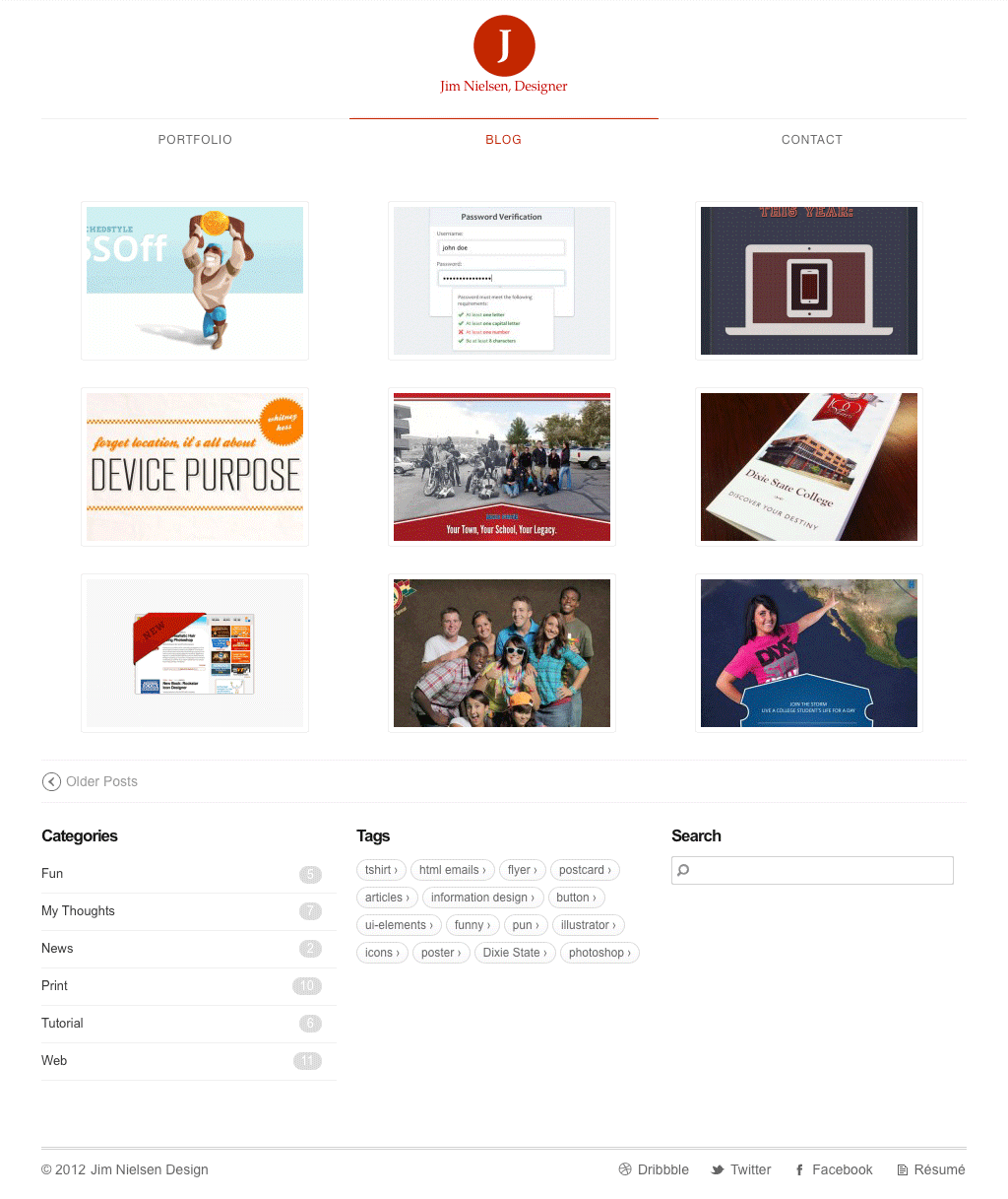
Circa June 2012: this looks like it was an at attempt at making my blog more “visual”. As you can see, the content previews for the post listings were removed in favor of showing only each post’s featured image. Ah young Jim, did you really think you were going to create a “featured image” for every single blog post? Who do you think you are, an online media company? I’m sure by the time I had three or four blog post drafts, I quickly realized I’d either be 1) rarely publishing anything, due to effort required to create a unique image with every post, or 2) redesigning my blog soon.
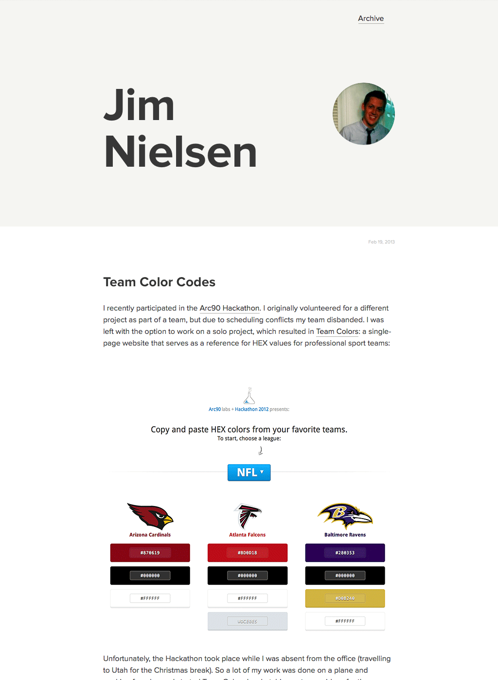
Circa March 2013: ahhh, I remember this. This was when I switched to the now-defunct service Scriptogram for hosting my blog. That service was pretty neat. You could publish markdown files to a folder on Dropbox and their service would build your blog for you. In a sense it was really great because I could edit a plain-text markdown file from anywhere and the edits would be live to my blog within a minute or so, all due to Dropbox’s file syncing platform. It was kind of like Jekyll but without the git-ness of Jekyll. You have a folder of markdown files representing posts (which take a certain format), we turn it into a blog. The service, however, was free so (as you can imagine) it wasn’t around long.
The particular screenshot you see above reflects the default theme Scriptogram applied to all their blogs. It was fine. It worked for me. Or rather, it worked for me until I had to the itch to roll my own design. Lucky for me, their service allowed such itch scratching, which leads me to my next screenshot.
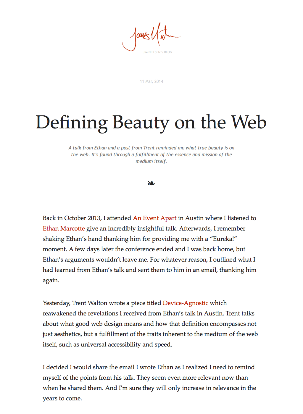
Circa March 2014: I actually had this design for a while. I remember thinking it was pretty good. It was a “theme” I developed first when my blog was hosted on Scriptogram. When that service went down, there was this thing called “Jekyll + Github Pages” I decided to give a try. I remember it being relatively easy to transfer all my posts and the site’s theme from scriptogram (markdown posts in dropbox + static CSS theme) to jekyll (markdown posts and HTML/CSS in Github). I think I kept this design longer than others, but eventually the itch to redesign struck again (as it always does).
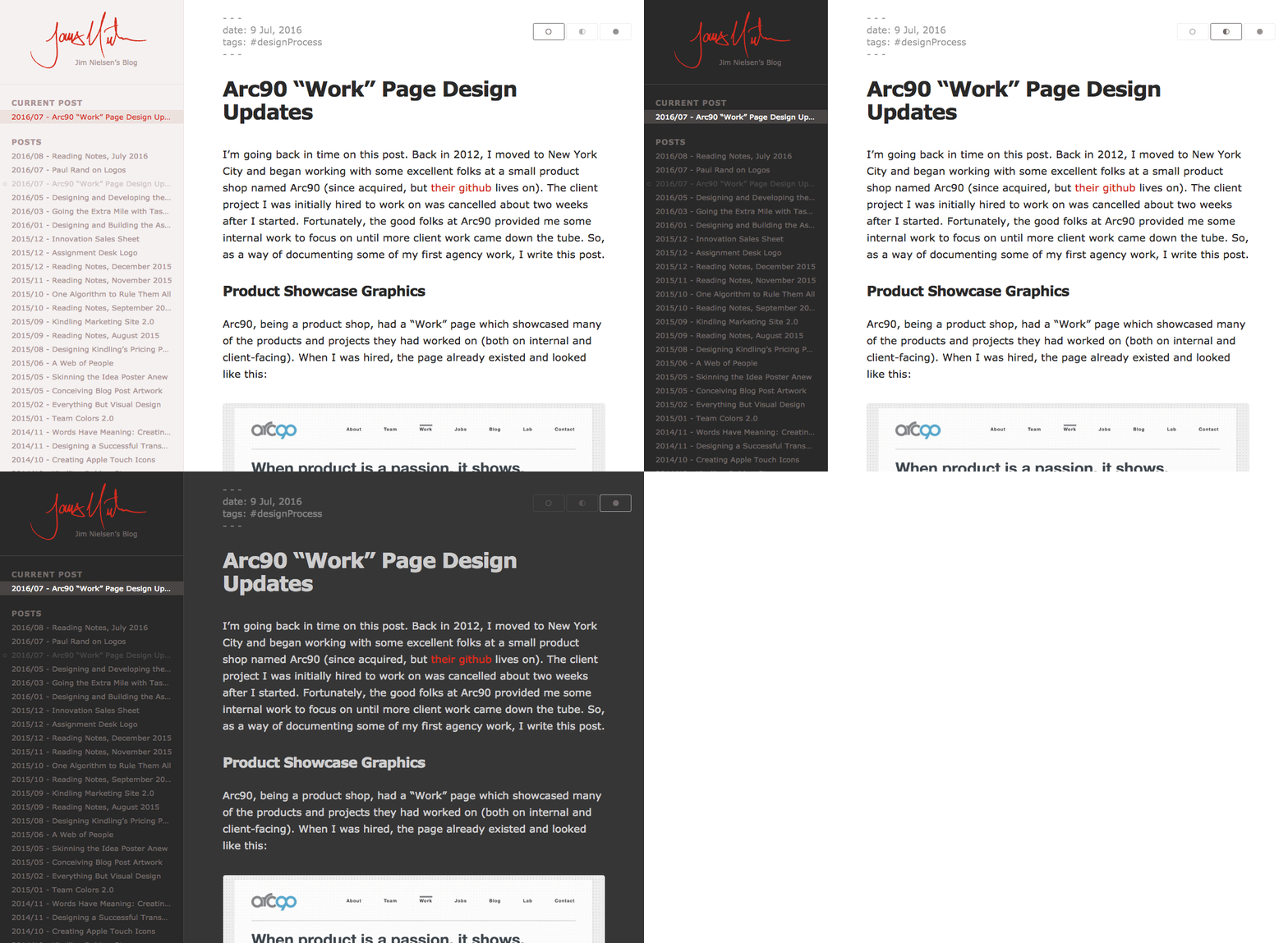
Circa August 2016: about this time, I began tracking my “redesigns” as tagged releases in Github. You could technically head over there to see them all, but I’ll continue posting the rest here for convenience sake.
This particular design came about because one day I was particularly enjoying the experience of navigating my blog and the _posts/ directory of jekyll in my code editor and I thought “what if this was the experience on the actual website?” Before I could even think if it was a good idea, I was coding because I wanted to see if it could be done and what it would feel like (as you can see, I even include theme variations of light/medium/dark). It only took a few months before I was on to my next “redesign”. To be honest, it was a decision made in the haste and excitement of something novel. But that’s ok, it’s my blog. I can do whatever I want.
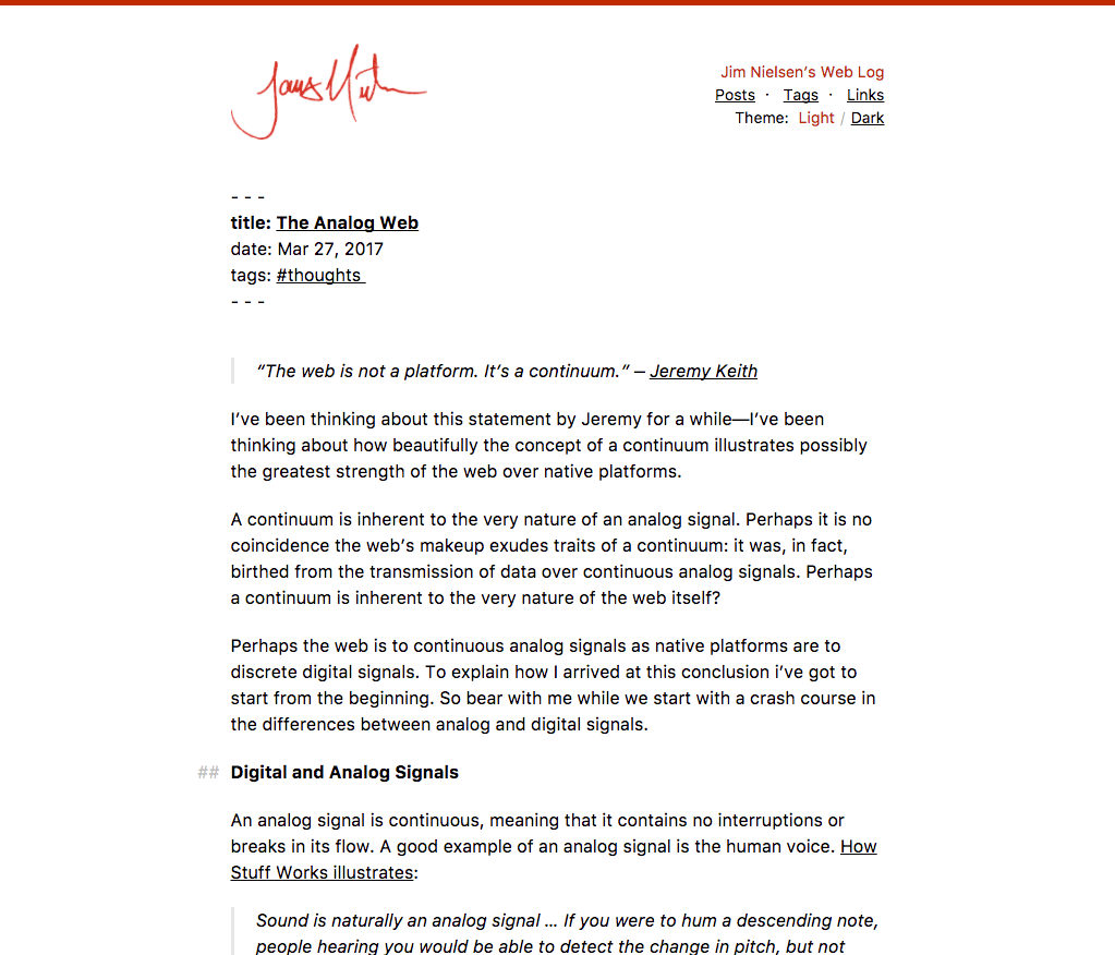
Circa April 2017: in a similar vein to the impulse described above (blog theme emulating an IDE), this was a foray into treating a post’s typography as if it were a plain text file with markdown syntax. I took this one to the extreme of having everything in a single font size. It was interesting. I kind of liked it for a while. But the novelty wore off and I was quickly on to the next thing.
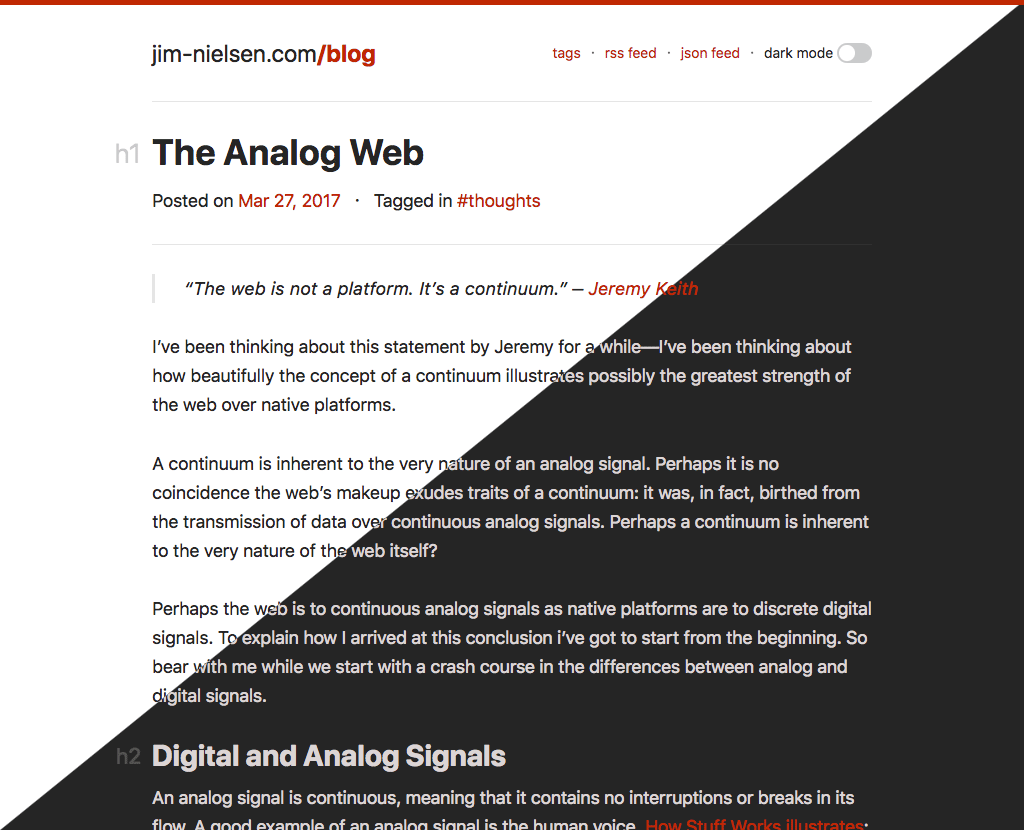
Circa August 2018: this was my most recent theme (before the new one you see today). It was the result of a more natural progression from the ones preceding it. It had a “dark theme” which was nice, but honestly I never used it. I thought about doing something fancy where I detect the time of the client and if it’s past like 10PM, automatically setting the theme as dark. But then I realized that I hate it when apps do that to me. If I want it dark, I’ll set it dark. So I removed that, though I wouldn’t be surprised if it makes it back someday.
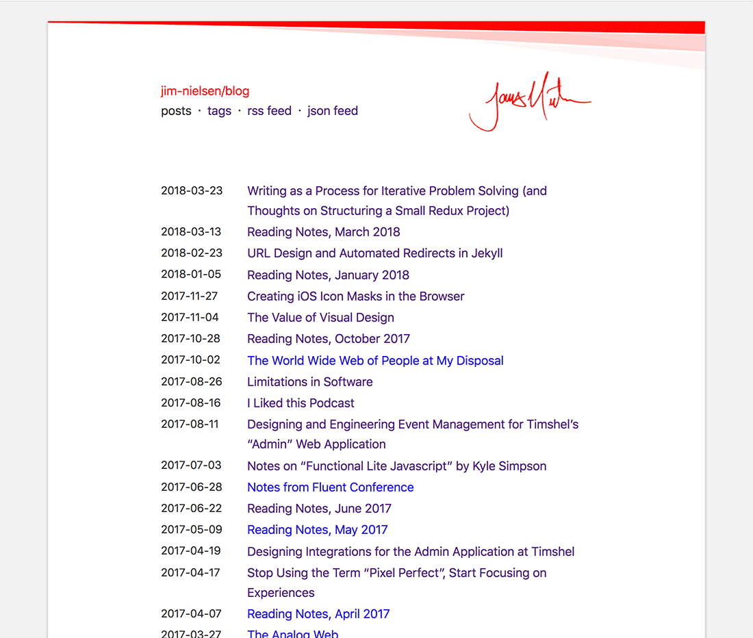
Circa February 2018: this was almost my most recent blog design. It all began one day with tweaking styles on the previous design, which led to me jumping into Sketch, which led to me saying “I’m just going to redesign the whole thing” which led me to this. I even coded it up. I found myself enjoying presenting the content as if it were on a piece of paper on screen. Plus it kind of tied into the design of jim-nielsen.com at the time (nothing wrong with a little design consistency, right?) But then my mood changed and I just wanted to throw it all in the garbage.
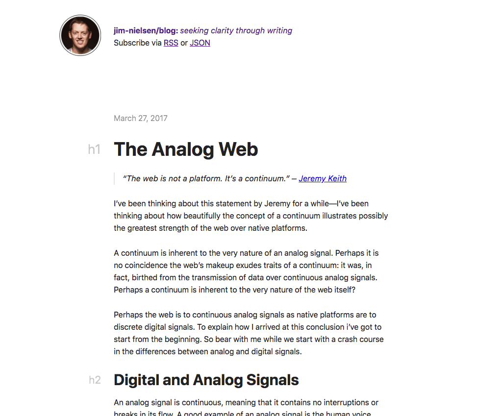
May 2018: ah yes, the redesign of 2018 where you wrote a blog post to go with the new design. What were you thinking back then...oh wait, this is my current design. I’m sure all my rationale (or rather impulse) for this design will be considered “silly” by Jim of 2020, but that’s ok. I’ve learned to live with myself.
The “New” Design
When you change the way you look at things, the things you look at change. — Dr. Wayne Dyer
The thing that moved me to redesign my blog was...well, to be honest it was in part due to fatigue. My blog is basically just a place for me to write about things I want to write about because they either interest me or because I want to learn more about them and writing helps me do that. And the more I read and write on the web, the more I wish I had some of those old-school web features, like usage of the :visted pseudo class in CSS. Why? Because then I could browse around and actually know what I’ve already looked at or read. But hardly anyone uses those things anymore. “Be the change you want to see in the world” right?
Lately I’ve been reading some of Tim Berners Lee’s notes on the web and have really enjoyed the content. What I find equally interesting about his writing is the delivery mechanism. The design around the content isn’t going to win any “design” awards, but the exprerience of reading from that site is actually quite nite. I believe that stems, at least in part, from the fact that its design uses basic ”web” styles: blue for links, purple for visited ones (this is actually prescribed in the spec). This made reading his stuff really easy. If it was purple, I’d already read it. I didn’t need an app to keep track of what I’ve read and what I have’t. It sounds so simple, but it was so nice. It's the small things you know?
While reading Tim’s notes, I thought “man, I should just make my blog basic HTML and CSS and just call it good.” Later, while chewing on that thought, I happened upon this quote from Frank Chimero that really resonated with me:
The old websites from the 90’s, they still work, their fonts just need to be a little bit bigger and they need to set a max width on their paragraph so it has a nice measure. Other than that, you go back and look at a bunch of the essays by Tim Berners-Lee and you’re like, “Actually, this still holds up.”
I decided this is precisely what I wanted to do with my blog: try to go back to basic “web” styles (“going with the grain of the web” as Frank calls it). There has been this nagging thought in my mind that most of my previous blog “designs” were more about being looked at than actually being used. And I’ve found myself “using” my blog a lot lately, almost like a personal notes archive, and the “basic web style” is just what I needed in terms of functional usage.
With that in mind, this new blog “design” is an exercise in bringing priority more to the content than to the look. I’m hoping this will make me focus more on the substance of what I write rather than the look of what I write. However, with all that said, here’s a note to future Jim reading this in five years: it’s very possible you already changed your mind about everything above and you’ve “redesigned” the blog again. And you know what? That’s ok. But right now there’s a part of me that hopes someday I can strip everything down such that the extent of my blog’s CSS would be:
body {
  max-width: 35rem;
  margin: 0 auto;
  line-height: 1.5;
}
In fact, that’s what my initial design exercise had me doing. Just stripping everything away. But the visual part of me begged for just a tiny bit more, so that’s how I ended up with what I have now. I also added a few more “enhancements” under the hood to this new design, like removing Google Analytics tracking. There’s been a lot of talk about that lately and I’m not going to write my thoughts about it other than I’m removing it. To be honest, I don’t need it. That should help me squeeze out just a tiny bit more improvement in terms of performance.
I could talk more about my tendencies these days towards “basic web” styles and technology, but I’m think I am going to save that for another blog post where I can flesh out my ideas a little more. For now, enjoy this “new” design. I know I will, at least for now.