Building a Progressively-Enhanced Site
I recently added the ability to search for icons (by name) on my icon gallery sites.

I even got it working on mobile.
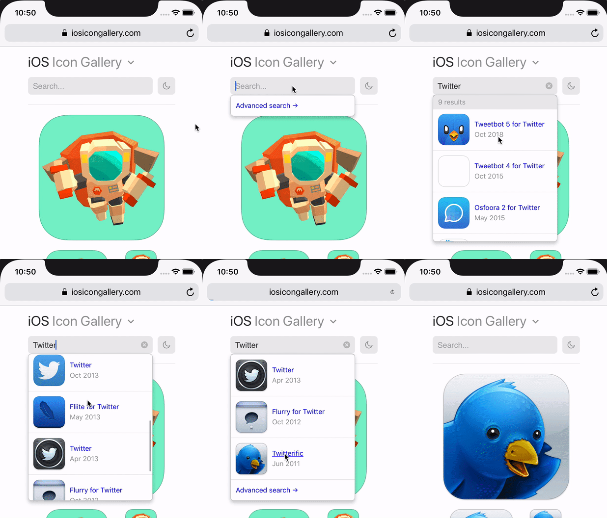
There are about a million ways I could’ve done this. However, one of the self-imposed engineering constraints with my icon gallery sites is accessibility. I like love the idea of building resilient web sites that’ll not only stand up to spotty networks or antiquated devices, but will have some longevity to them. Semantic HTML, enhanced with styles and JS interactivity, is a recipe for a website that could last a decade or two or three.
The longer I work on the web, the more I find myself coming back to writing my websites in the basics: HTML, CSS, and JavaScript. I’ve had quite a few projects where I’ll come back to them after a couple months (or years) and find myself tearing out abstractions I used on top of the core web technologies. Less Haml. Less Sass. Less CoffeeScript. Less Babel. Instead of tearing out the old and putting in whatever the new fashionable abstractions are, I now try engineering my sites with a baseline and consider everything else an enhancement. This allows me to pass on setting up sophisticated toolchains for transipiling, compiling, etc. The code I write ships as-is, and if a browser doesn’t support it, that’s ok. I’m trying to keep it simple.
So how do I go about such an endeavor? I’ll try to explain from the perspective of the most recent feature I shipped on my icon gallery sites.
HTML
First and foremost, my sites start with the HTML. I focus on trying to make my markup simple and semantic. I strive to write markup that describes the content, rather than markup that describes how I’ll style the content. That means describing content with the the appropriate tags, rather than making every container a <div>. It also means abstaining from superfluous elements, like <span>, just to create a stylish effect (::before and ::after in CSS make this way easier than it used to be). I strive to have every tag semantically describe not merely the content it’s wrapping, but the relationship between its children, parents, and siblings.
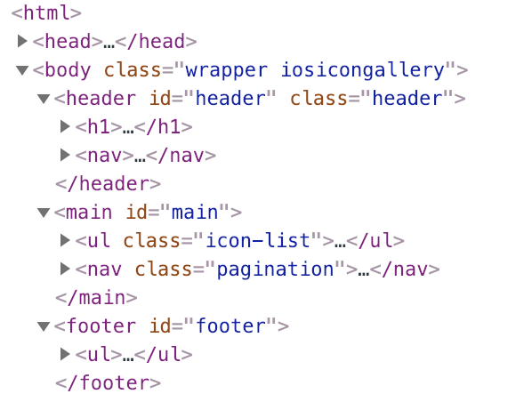
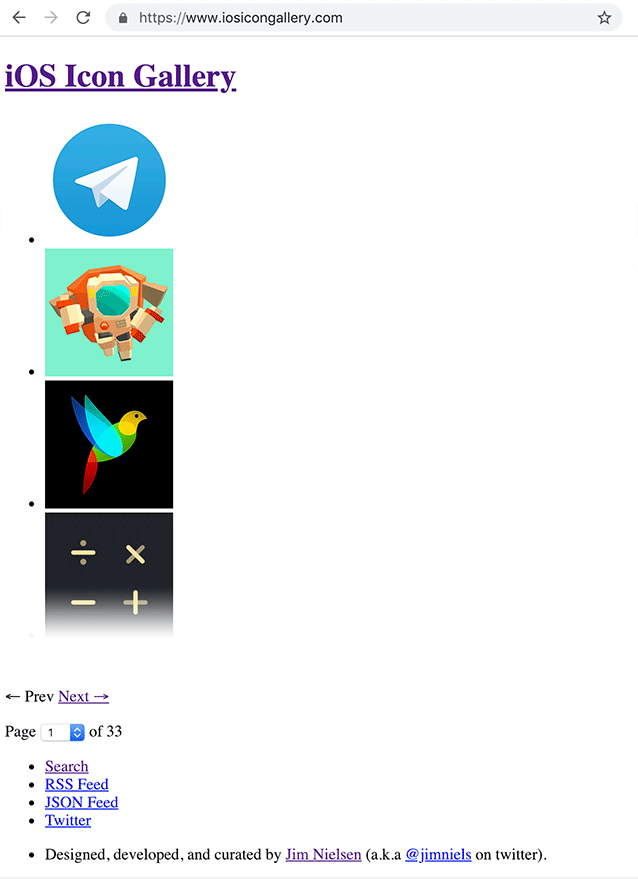
If you hit my site’s URL and the CSS or the JavaScript fails to load, you’ll still be able to navigate the site and view the content.
CSS
Next comes styling. For these particular sites, I revel in modern CSS layouts, using the likes of grid and flexbox. I like to try and think of my CSS as a suggestion to the browser on how to display the content. The browser might say “great I support all of these styles” and paint it just how I described. Or it might only support and paint 80% of my styles. Or 20%. Or it might never paint any of them. Either way, the content is still there so I don’t have to worry about users of my site never being able to see anything.
So if a user went to my website and the CSS loaded, but for some reason the JavaScript didn’t (or the user had JavaScript disabled), this is what they’d see:
JavaScript
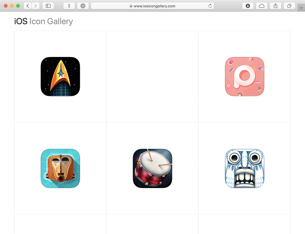
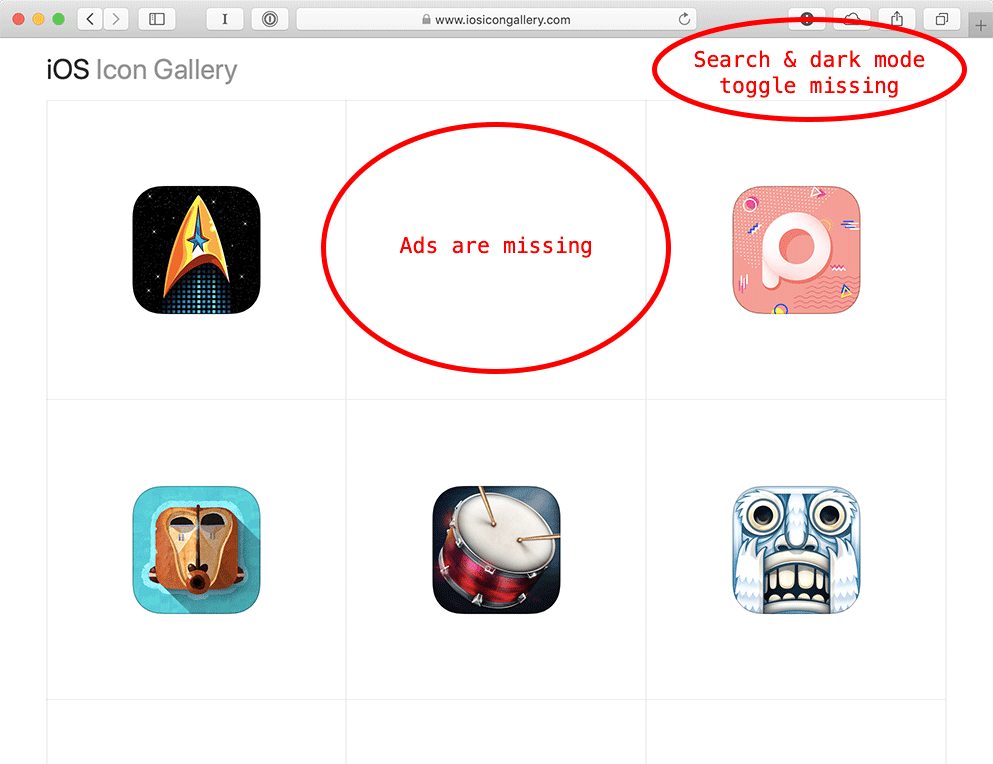
Now if the JavaScript did run (and the styles loaded), this is what a user might see:

Did you notice the difference?
Ads
The ads on my site are loaded through a third-party via JavaScript. That’s pretty much standard ad-tech these days.
Actually, that’s not entirely true. The ads for iosicongallery.com are loaded via JavaScript from third-party Carbon Ads. The ads for macosicongallery.com and watchosicongallery are actually “server-side” ads. They get generated at build time and built into the site’s HTML, so there’s no third-party assets (JavaScript, images, etc) for displaying them. It’s solely an affiliate link. I kind of like that setup. I’ll probably ditch Carbon Ads one day and either not have ads in general, or try and find someone who wants to pay me like $10/month and I’ll put up whatever they want in that spot. But that’s a discussion for another blog post another day.
Even as I write this, I’m thinking of a better way to handle this (“writing is nature’s way of letting you know how sloppy your thinking is”). As I review these screens with and without JavaScript, I can see that big gaping hole where the ad is supposed to be. I could improve upon this by adding a hidden attribute to the <li> of the ad’s containing <script> tag, then remove the hidden attribute via JavaScript if it loads. Or at least something like that, something to make the presence of the ad space not obvious if JavaScript is absent. [Issue filed with self.]
Search & Dark Mode Toggle
The search box (which I recently finished building) and the dark mode toggle (which I also recently finished and wrote about) are pieces of functionality that only work if JavaScript loads on the page. Therefore, if the JavaScript doesn’t execute (because a user has it disabled or the network fails for some reason) the user won’t see that functionality in the UI.
These sites are actually all built on top of a static site generator, which means there’s no server-side component. So I can’t do <form action="/action.php">. Instead, if JavaScript runs I fetch an index of content (that I generate at build time) and attach some events so that when the user enters keywords into an input, I can perform a search client-side.
Similarly, for the “dark mode” toggle, I don’t have a server that’s persisting the state of the dark mode toggle and writing the appropriate class names into the HTML between page requests. Rather, I use localStorage in JavaScript to persist the state of whether the user is in dark mode between page loads. Then I apply the appropriate class name early in the DOM so when you navigate between pages it looks like you’re “staying in dark mode” (you can read about how I did that in a previous post).
All this is to say, the site is progressively enhanced. If you’re browser supports certain features in JavaScript, you get extra feature sets in your UI. Otherwise, you get a basic experience of navigating between HTML pages.
Modern JavaScript
When I built this new search functionality, I had the option to do it in React (or some other framework) but opted not to. It seemed like a relatively simple feature that could be written in vanilla JavaScript and I could thus avoid shipping all of react and react-dom to the client.
I also didn’t want to bother setting up and maintaining – what often feels to me personally like – a rube goldberg machine of modern JavaScript applications (webpack, babel, etc). I wanted to write code and ship it, without an intermediary step. Simply a .js file I ship directly to the browser that powers my search functionality. The more I wrote the code to power the search, the more I found myself wanting to use the more-expressive syntax of modern JavaScript (using syntax like () => {}, const, let, and (`template ${strings}`). I also found myself wanting to break up my code into smaller, discrete modules, but again I didn’t want to setup a bundler/transpiler.
So, I opted to use <script type="module"> to load all my JavaScript. As module support in JavaScript landed relatively recently, I could ensure that any browser which supported ES modules also supported the syntactic sugar I craved (like arrow functions and template literals). This allowed me to write and ship modern JavaScript without first creating the universe.
As an example, in my footer, I had a script tag to load ES modules:
<script type="module" src="/assets/scripts/global.js"></script>
I wrote each discrete piece of JavaScript-powered functionality as a .js module. Then inside of global.js, I imported these pieces of functionality as functions and executed them:
import initDarkModeToggle from "/assets/scripts/init-dark-mode-toggle.js";
import initQuickSearch from "/assets/scripts/init-quick-search.js";

initDarkModeToggle();
initQuickSearch();
Inside of each of those modules was vanilla JavaScript that dealt with reaching into the DOM and progressively enhancing the page with extra feature sets. For example, the dark mode toggle looked something like:
const isDarkMode = () => {
  return localStorage.getItem("isDarkMode") === "true";
};

export default function addDarkModeToggle() {
  const $toggle = document.querySelector(".dark-mode-toggle");
  $toggle.removeAttribute("hidden");

  // If we're in dark mode, set the toggle as being so
  if (isDarkMode()) {
    $toggle.querySelector("input").setAttribute("checked", true);
  }

  $toggle.addEventListener("change", () => {
    document.documentElement.classList.toggle("is-dark-mode");
    localStorage.setItem("isDarkMode", !isDarkMode());
  });
}
I went back and forth on whether I should stick the markup for progressively-enhanced features in the original HTML, or in its respective JavaScript file. In the end, I chose to render the markup in the DOM (in part because I could easily leverage my templating engine for some of the markup). Each feature that was unavailable without JavaScript got a hidden attribute to hide it on screen (and from screen readers). For example, every HTML page has this bit of markup in it:
<label for="dark-mode-toggle" title="Toggle Dark Mode" hidden>
  <input type="checkbox" name="dark-mode-toggle" id="dark-mode-toggle" />
  <!-- An <svg> embedded here -->
</label>
If you look back at the JavaScript for the dark mode toggle, you’ll see that (if it loads) it’s essentially looking into the DOM for this piece of markup, removing the hidden attribute, and attaching some event listeners to make the whole thing interactive.
Final Notes
Most of the ideas and principles behind why you would want to build a site in this fashion are all courtesy of Jeremy Keith. Many thanks to him for his tireless efforts in advocating (and making accessible) this strategy of engineering websites. If you want to learn more, check out some of his thoughts on the matter.