Twitter Cards and Visually Representing That I’ve Got Stuff To Say
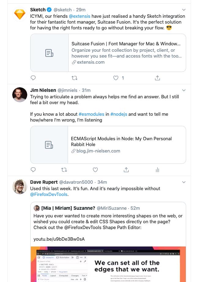
Have you ever noticed when you post a link on Twitter, it gives you that nice “Twitter card” preview? But if you haven’t setup your website to give hungry Twitter the data it feeds on, you’ll get a default image (and who likes a default image?)
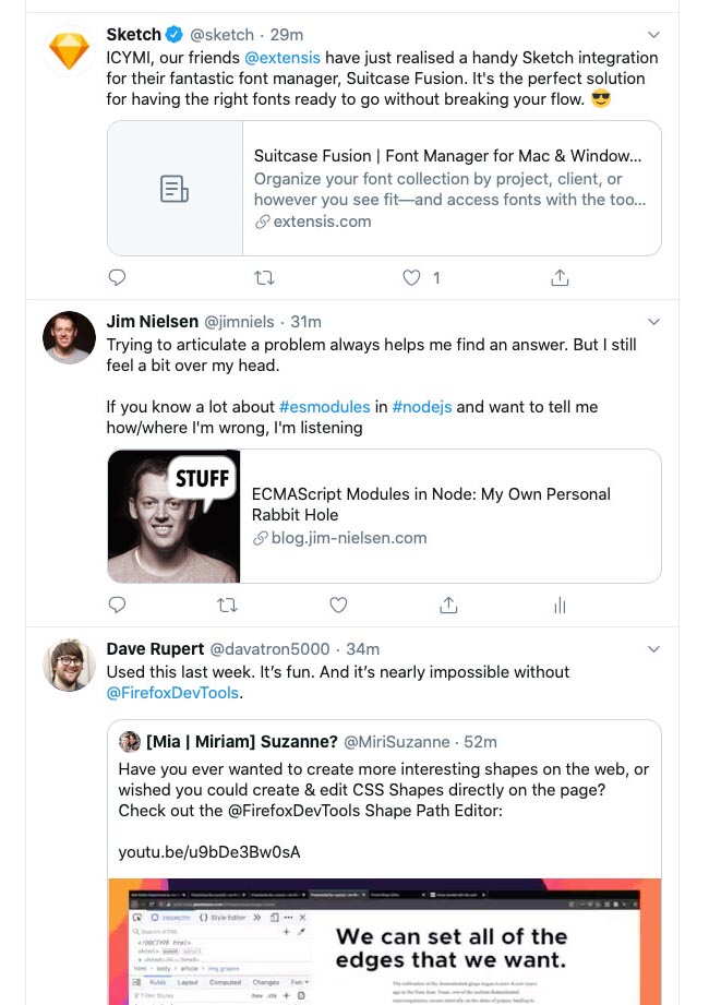
For example, check out Sketch and me in this screenshot from my timeline. Don’t we look like losers linking to garbage content that’s not tailored to Twitter sharing?

Well, I wasn’t about to have links to my website look so sad. I’ve got stuff to say! So I made an image to say as much:

Yeah, yeah I know. Twitter’s docs on the matter specifically state:
You should not use a generic image such as your website logo, author photo, or other image that spans multiple pages.
But you know what? Twitter is not the boss of me. I do what I want.