Don’t Forget the color-scheme Property
I’ve written elsewhere about dark mode and how I’ve approached it on some of my personal sites. It seemed like the entirety of the support was handled by a media query:
@media (prefers-color-scheme: dark) {
  /* custom dark mode styles here */
}
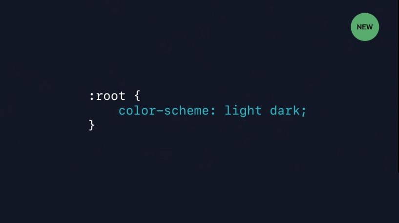
Then after watching the WWDC video “Supporting Dark Mode in Your Web Content” I learned that you can add an extra enhancement (in Safari) using color-scheme: light dark:

Why do this? From the video:
The main way to signal that your content supports dark mode is to adopt the new
color-schemestyle property, currently being specified for inclusion in the CSS standard. Specifying the valueslightanddarkon the:rootelement lets the rendering engine know both modes are supported by the document. This changes the default text and background colors of the page to match the current system appearance. Standard form controls, scroll bars, and other named system colors also change their look automatically.
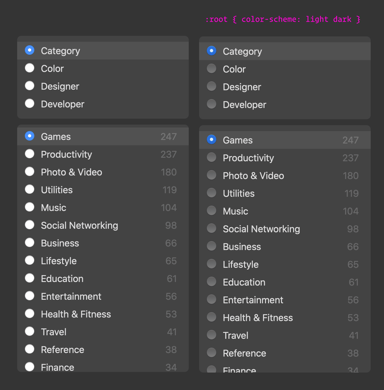
Allow me to illustrate how this changes things. I use prefers-color-scheme media query to conditionally change CSS color variables on my :root to the corresponding dark colors.

Cool. Dark mode is working. So what does color-scheme do? By adding this property, the system UI controls adapt their appearance to the OS-level “dark mode” style.

Note the difference? The appearance of the radio buttons changed to match the OS-level appearance of radio buttons in dark mode. No extra CSS required!

Pretty neat!
What's interesting is that if you don’t explicitly set color yourself in the document (i.e. body {color: #333}), the system will automatically change the font from white to black for you—along with a number of other things, as stated in the video:
[
color-scheme] changes the default text and background colors of the page to match the current system appearance. Standard form controls, scroll bars, and other named system colors also change their look automatically.
So next time you go dark mode, don’t forget to use color-scheme—right now it seems to only be supported in Safari, but it’s in the working draft.