CSS System Colors
In another episode of “I’ve been a web designer for how long and am only now learning about this?” let’s talk about CSS system colors.
Background
On my blog, I support light and dark mode which is all controlled by prefers-color-scheme in my stylesheet. However, the implementation might not be what you imagine.
A common pattern for doing light/dark mode is to use CSS custom properties for color values, then override the colors when the user agent is in dark mode.
As an example, here’s a common way to set the background color of a website based on the user’s preference:
:root {
  --color-bg: #fff;
}

@media (prefers-color-scheme: dark) {
  :root {
    --color-bg: #000;
  }
}

html {
  background-color: var(--color-bg);
}
On my blog, I’m not doing this. I’m not controlling the background color at all. There’s no variable in CSS for my site’s background color.
Instead, I am letting the browser dictate what the background color of the document is. This is done by using color-scheme: light dark, something I’ve touched on previously:
[color-scheme] changes the default text and background colors of the page to match the current system appearance. Standard form controls, scroll bars, and other named system colors also change their look automatically.
If your CSS says you support light and dark color modes but you don’t explicitly set a background-color on the document in each mode, the browser will set one for you. That means all I need to get dark text on a light background (light mode) and light text on a dark background (dark mode) is this:
:root {
  color-scheme: light dark;
}
This is what I’m doing on my blog. I don’t have to pick or define any colors. The user agent stylesheet is handling all the details. As such, users get a palette that more closely mimics their experience with other native apps in their operating system.
For example, without any hard-coded color values, my blog in Safari uses the same “system” shade of black as the Messages app on macOS.

In addition to the benefit of getting an experience that feels more closely native to the end user’s experience within their environment, not having to choose a black and a white, set them as variables, and then use them in multiple places saves me some lines of code and cognitive overhead.
The Problem
I started implementing a dropdown of sorts for my navigation. And, since I’m not explicitly setting the background color of elements, I ran into the problem where my dropdown’s background is—by default—transparent.

How to fix that? Traditionally you would set the dropdown’s background color to the same color you’re setting on the html or body element. But what if, as I described above, you’re not setting an explicit background color?
In my case, the browser is setting the background color for me. And that color varies between browsers and operating systems. For example, Chrome and Safari (on macOS) set different “blacks” for dark mode.

What I need is a way to say “hey browser, for my dropdown, use the same black (or white if in light mode) that you’re using for the background color of the document”. I need access to a variable of sorts that references the exact “black” the browser is using.
The Solution
I found this wonderful article by Thomas Steiner which introduced me to the concept of CSS system colors.
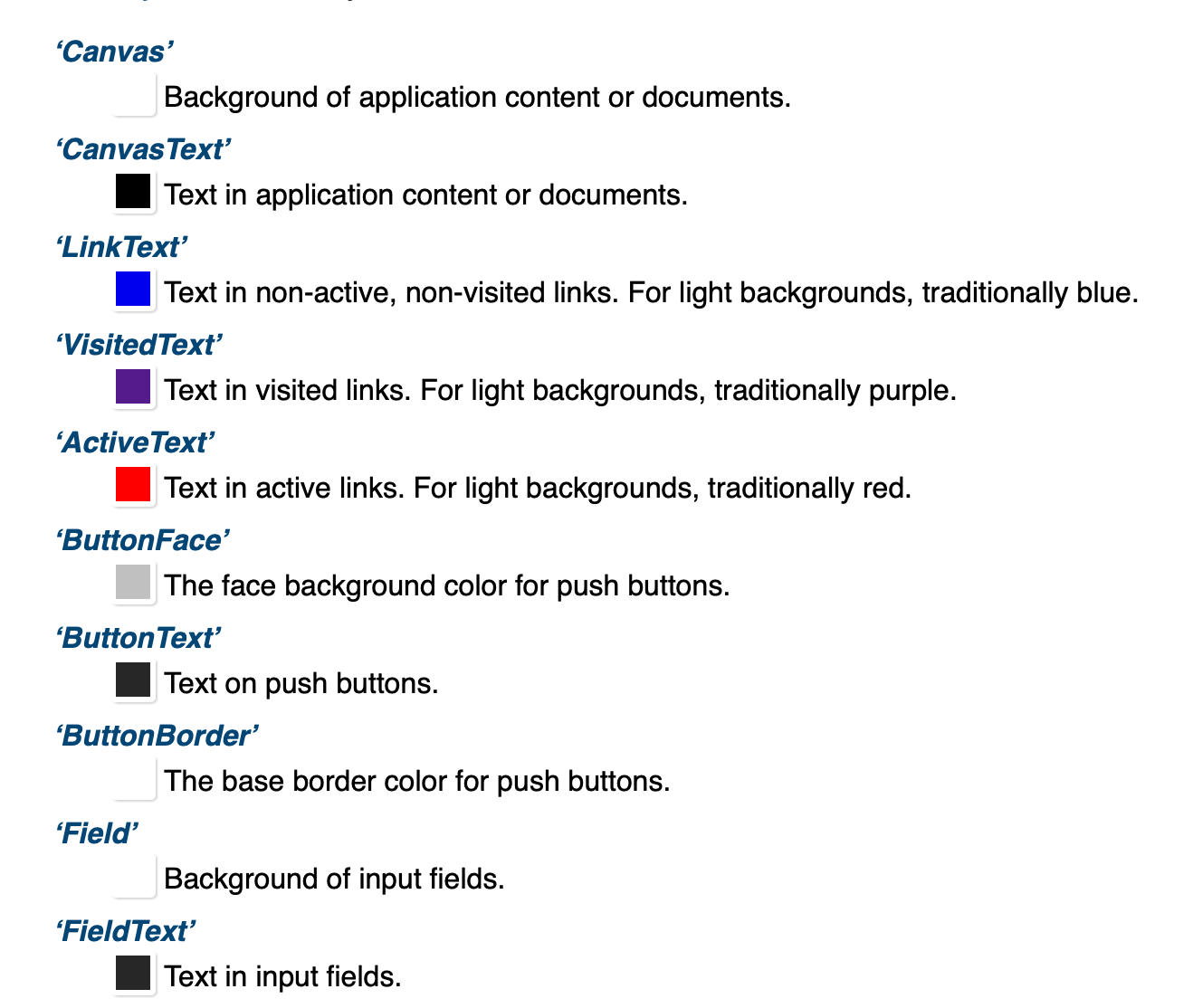
CSS has standardized semantic system colors. They are specified in CSS Color Module Level 4. For example, Canvas (not to be confused with the
<canvas>tag) is for the background of application content or documents, whereas CanvasText is for text in application content or documents.
Eureka!
Whereas hard-coding a background color value for the dropdown could result in a color mismatch depending on the end user’s browser or OS:

The CSS system color Canvas gave me exactly what I wanted: access to a named color value I can use in my own CSS that points to the same color value the browser is leveraging. I can now do this:
:root {
  color-scheme: light dark;
}

.dropdown {
  background-color: Canvas;
}
My document and dropdown background colors now match!

A Little More on System Colors
I knew we had named colors—red, yellow, rebeccapurple—in CSS, but I didn’t know we had system colors. So what are they?
the <system-color> keywords reflect default color choices made by the user, the browser, or the OS…
To maintain legibility, the <system-color> keywords also respond to light mode or dark mode changes.
Browsers get the chance to set their own defaults, which should conform to accessibility standards and will reflect the taste and sensibilities of the authors. But user overrides of those preferences take precedence:
When the values of <system-color> keywords come from the browser, (as opposed to being OS defaults or user choices) the browser should ensure that matching foreground/background pairs have a minimum of WCAG AA contrast. However, user preferences (for higher or lower contrast), whether set as a browser preference, a user stylesheet, or by altering the OS defaults, must take precedence over this requirement.
As stylesheet authors, we can use these named system colors in our CSS. However, the spec notes we should remember to use them in pairs, as cross-matching colors provides no guarantee over accessibility guidelines:
Authors may also use these keywords at any time, but should be careful to use the colors in matching background-foreground pairs to ensure appropriate contrast, as any particular contrast relationship across non-matching pairs (e.g. Canvas and ButtonText) is not guaranteed.
As a quick example, here’s a screenshot of some system colors defined in the spec:

Oh, and one last tidbit of information while we’re on the subject. There’s a whole list of deprecated CSS system color names including names like ActiveBorder, InactiveCaptionText, and ThreeDDarkShadow which we used to be able to access.
These color keywords have been deprecated, however, as they are insufficient for their original purpose (making website elements look like their native OS counterparts), represent a security risk by making it easier for a webpage to “spoof” a native OS dialog, and increase fingerprinting surface, compromising user privacy.
Fascinating!
Update 2021-06-11
Folks have mentioned the lack of cross-browser support for this feature. It’s true, this won’t work perfectly (at the time of this writing) across all modern browsers.
In my initial implementation, if Canvas wasn’t supported you’d get a nice big white dropdown in dark mode—looking at you Safari on iOS.
I was fine with this, as it doesn’t actually break anything. Where it’s supported, things look great! Where it’s not (yet) supported, things looks not as great but still function.
But that 2000’s era web developer in me couldn’t let go of trying to make it more uniform across browsers.
With a little extra CSS, you can detect support for system colors and use them accordingly. Granted, part of the entire rationale behind this approach (as I mention above) is to be able to take a “hands-off” approach to declaring colors yourself. However, if you want to go the extra mile something like this could get you started:
/* First, declare your dark mode colors */
:root {
  --c-bg: #fff;
  --c-text: #000;
}
@media (prefers-color-scheme: dark) {
  :root {
    --c-bg: #000;
    --c-text: #fff;
  }
}

/* For browsers that don’t support `color-scheme` and therefore
   don't handle system dark mode for you automatically
   (Firefox), handle it for them. */
@supports not (color-scheme: light dark) {
  html {
    background: var(--c-bg);
    color: var(--c-text);
  }
}

/* For browsers that support automatic dark/light mode
   As well as system colors, set those */
@supports (color-scheme: light dark)
  and (background-color: Canvas)
  and (color: CanvasText) {
  :root {
    --c-bg: Canvas;
    --c-text: CanvasText;
  }
}

/* For Safari on iOS. Hacky, but it works. */
@supports (background-color: -apple-system-control-background)
  and (color: text) {
  :root {
    --c-bg: -apple-system-control-background;
    --c-text: text;
  }
}
A couple little notes I found while digging on this cross-browser approach:
- Safari says it supports
Canvas, which it does on macOS but then doesn’t on iOS. I’m guessing this is a bug. To get around this, we can leverage webkit-specific color values (the same ones used in the UA stylesheet). - Firefox says it supports CSS system colors like
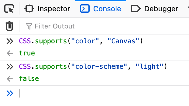
Canvasbut then doesn’t support thecolor-schemeproperty. So we handle it as a special case.

None of the above is perfect or a comprehensive solution. It’s what I’m using right now to accomplish the system-like style I have on my blog. It will change and evolve as browser support does. So, like all implicit disclaimers on a technical blog post, check this post’s date and consider further testing before your own implementation.