“Incomplete” Designs & Miscellaneous Thoughts
I read this post by Chris Coyier detailing the recent redesign of CSS-Tricks and something stood out to me.
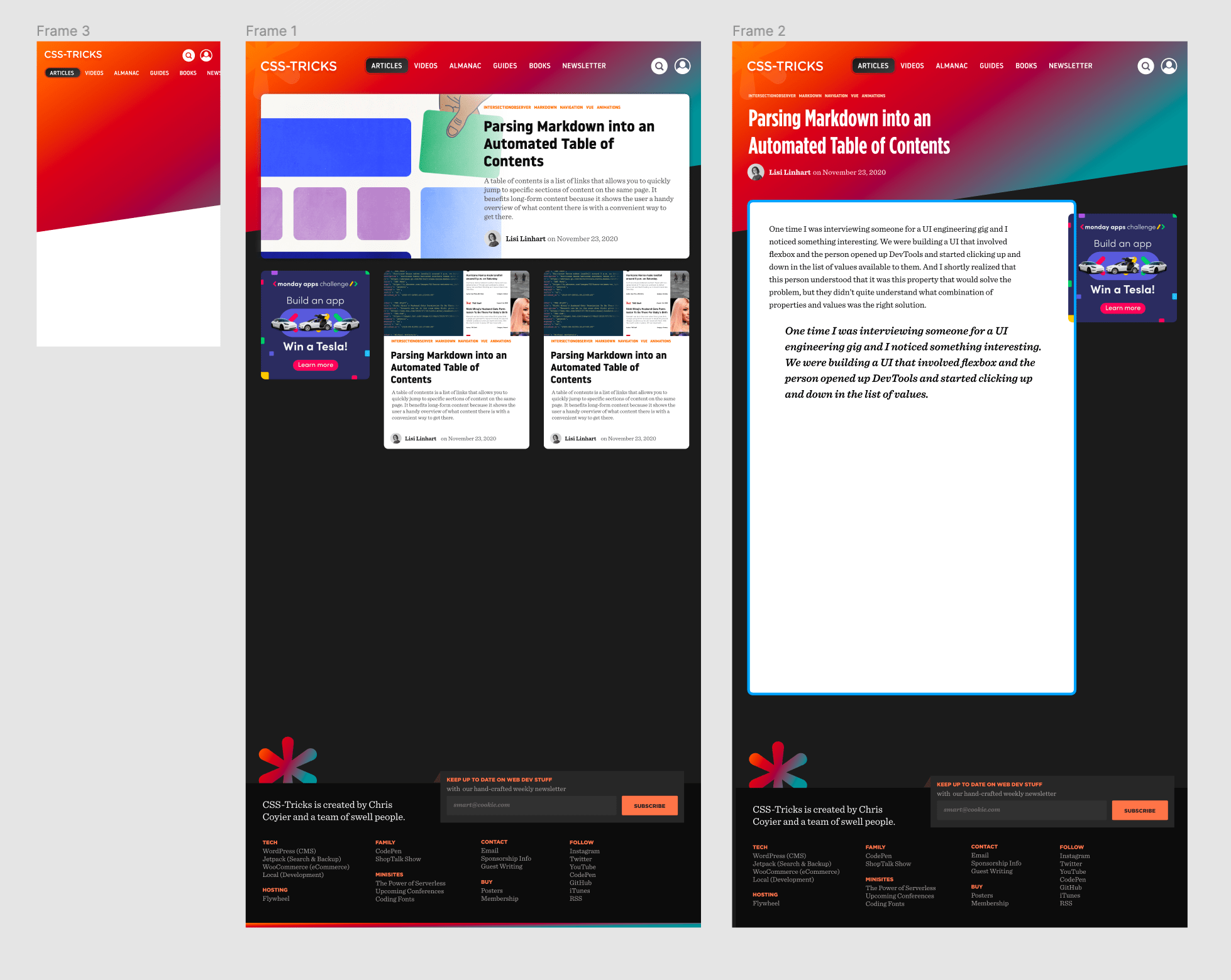
Chris says he doesn’t get to high-fidelity mocks for every widget and every page. Rather, he “pokes around” in a design tool and then after “3 or 4 passes in Figma” he gets to a place like this, which he uses as a springboard to start coding in the browser:

This resonates. For projects with which I am familiar, this is how I work.
Familiarity being the key point, meaning I understand and can hold in my head the scope of modules, pages, and patterns that constitute a site. This structure informs a vision in my head for what design needs to happen in a visual design tool in order to arrive at a tactical vision towards a redesign.
I use the design tool to understand a few micro pieces, then zoom out to the macro vision of the site. The entirety of the site lays summarized before me, helping me understand the range of individual components, their makeup, and how will they fit together in broad strokes.
At this point, I’m designing the relationship between things. This is where a design tool like Figma or Sketch really helps. Once I have a vision and relative clarity for the path forward, I leave the design tool jump into the browser. Chris does the same thing:
Once I’m relatively happy with what is happening visually, I jump ship and start coding, making all the final decisions there. The final product isn’t 1000 miles different than this, but it has quite a few differences (and required 10× more decisions).
I love this way of working.
However, day-to-day work involving collaboration with other people makes this way of working more difficult.
The conversation towards implementation no longer takes place exclusively in your head. It has to be articulated and communicated with others.
Executing on a vision without explicitly documenting every detail requires synergy. This, in part, is what makes highly-effective teams effective: they can move without communicating every detail. Things can go unspoken until they need to be spoken.
The more a team becomes unfamiliar with each other (because of size, lack of understanding, etc.) the more has to be explicitly stated. This is where waterfall-ish methods creep in: comprehensive upfront design, high-fidelity mocks to account for every detail, design-to-engineering “hand-offs”. Visual mocks often become the product, rather than an artifact in service of all talent involved in making the product.
For example: as a designer, engineers can’t read your mind. And you don’t necessarily perceive any given engineers’ talents, ability, and desire to “fill in the gaps” of visual artifacts. Visual mocks transform from being a communication medium to a specification medium, stunting the input and expertise of the those building the actual working software.
One spot where this is particularly tricky is responsive design. A designer might see, in their mind’s eye, how something transforms between viewport sizes. That doesn’t mean everyone else can, which means the designer has to take the time to explicitly document each of those details in order for everyone to be unified in vision. From there, implementation follows.
This can end up making mocks like legal contracts for product teams: you either abide by them to the letter, or fingers start pointing. “You, design, forgot to account for this edge case we uncovered in implementation!” Or, “you, engineering, didn’t pay close enough attention to these small details in the mock!’”
Nonetheless, as an individual, I find value in articulating your vision and not solely keeping it in your head in order to move fast. The process of articulating details can uncover invalid assumptions. It happens to me a lot. For example, I think I know how something will break down to mobile, but when I start engineering it in the browser I discover it’s not as simple as I supposed. This necessitates jumping back into a design tool like Sketch or Figma to work through the details before going back to the browser.
When doing design engineering work yourself, moving with a vision in mind is fun because you know your intentions and can move quickly with things unsaid. I find myself working like that a lot and seeing Chris do the same thing made me feel less like a weirdo for building production software off incomplete mocks.