Quibbles With Social Share Imagery
I’m going to vent for a moment. So let’s just make that clear up front. Just venting. Once I get this out, I’ll be over it…maybe.
I’ve had a draft of disparate notes on this topic for quite some time.
My first notes came from a 24ways article back in 2018 around automating the generation and deployment of social media imagery for web articles:
One of the best ways to grab attention with your posts or tweets is to include an image. There’s heaps of research that says that having images in your posts helps them stand out to followers. Reports I found showed figures from anything from 35% to 150% improvement from just having image in a post. Unfortunately, the details were surrounded with gross words like engagement and visual marketing assets and so I had to close the page before I started to hate myself too much.
What I find fascinating is how the author giveth and then taketh away in the very same paragraph: “images are great at grabbing attention, the research even says so! But also I feel yucky reading the research that supports my argument.”
Chris Coyier has written on the subject of social media images (“You know, the images that (can) show up when you share a link in places like Twitter, Facebook, or iMessage”) and it’s hard to disagree with his conclusion:
You’re essentially leaving money on the table without them, because they turn a regular post with a little ol’ link in it into a post with a big honkin’ attention grabbin’ image on it, with a massive clickable area.
I love images on social media when they are the human-curated center of content. But I feel like they’ve been hijacked by auto-generated computer imagery serving as attention-grabbing filler more than supportive expression.
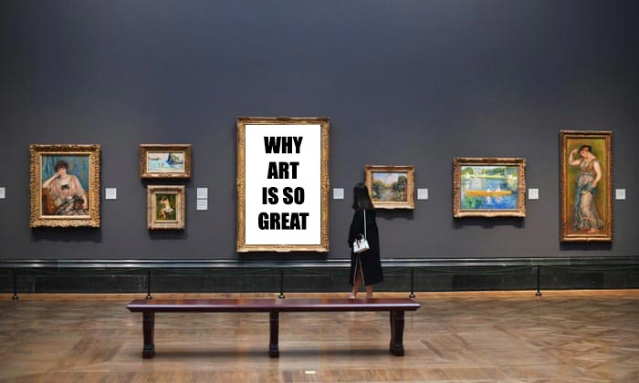
Allow me a terrible analogy. Imagine an art gallery where everyone gets a frame for free. It would be wonderful to meander through the halls, admiring the imagery-as-a-centerpiece. However, not everyone who gets a frame has imagery to share as the thrust of their communication. But they are still granted a frame and some space so they throw up a billboard for their stuff just because they can—“when all you have is a hammer, everything is a nail.”

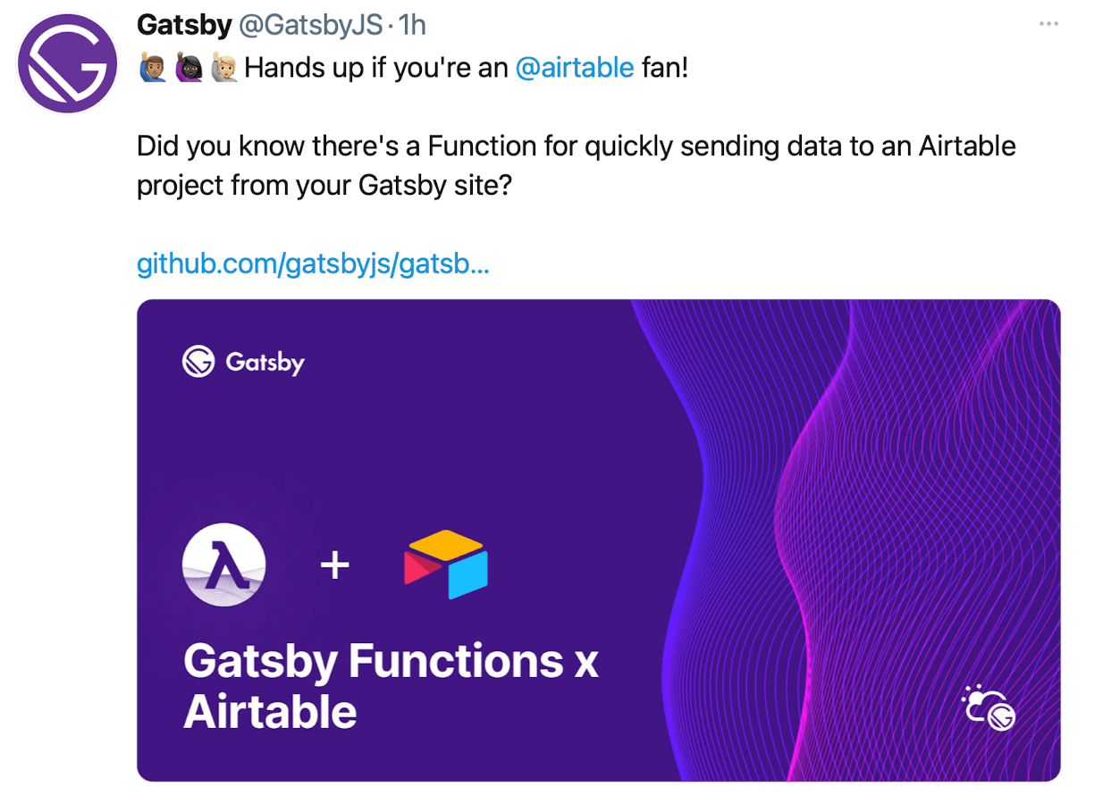
I don’t mean to pick on anyone specifically, but let me pull a recent example from my twitter feed:

Why is there an image for this message? Why is that giant thing—which is in my feed not because I follow @GatsbyJS but because someone I follow retweeted it—taking over my feed? Because it’s an advertisement for content and what better way to grab someone’s attention that a giant image, regardless of its necessity?
I love a good twitter feed filled with text. The thoughts of people I follow. If they share something that warrants an image, where the image is the thrust of their content/idea, I love the big space it takes up! But when it's just filler? When its “I can take advantage of this giant space and fill up anyone’s feed” then it grinds my gears.
It’s kind of wild, when I think about it, how much of my feed’s real estate is eaten up by social share imagery. I just want to see John and Jane’s thoughts, but instead I get yelled at by the thoughts of their retweets.

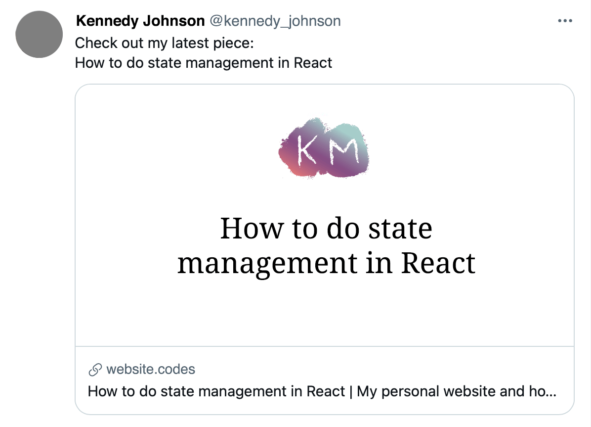
How many times have you seen this: “hey check out my latest article [name of article] [image with name of article]”.

I see the name of the article three times there. What is that image doing for me? Absolutely nothing. I could read it in the text. It’s purely an attention grabber.
Now I’m not running on online business. If I was, I would feel compelled to put these images out there. It would be “leaving money on the table”.
And that's the part that really strikes me: the compulsion of the thing.
The way people talk about using social share imagery, it's like FOMO. If I don't use images, I'm missing out. I must do it. My agency in the matter is gone. Social share images are not my decision, it's the social platform’s decision—and that's just how they would like it. They compel us to build for them. They dangle this giant carrot in our faces, prime real estate we can fill with any attention-grabbing imagery we like. It’s like we have no choice but to say “yes, I will wield imagery for you and your platform” where otherwise we normally wouldn’t.
It's kind of genius when you think about it. How do you get millions of third-party websites to start generating content for you so your platform feels more “engaging”? You make it front and center on the platform. The space is free, all it requires is your time (and soul if it makes you feel yucky).
“Use social share imagery to stand out—like everyone else.”
Stand out, but not because of a giant social media image that everyone else has. Stand out because you do things differently, because your voice is different than everyone else.
Disclaimer: I’ve been guilty of this. So what gives me the right to say anything? Nothing really, except I have my own blog where I can publish my own thoughts. I’m trying really hard right now to not have social share imagery. We’ll see how long I can hold out.
Update 2021-10-19
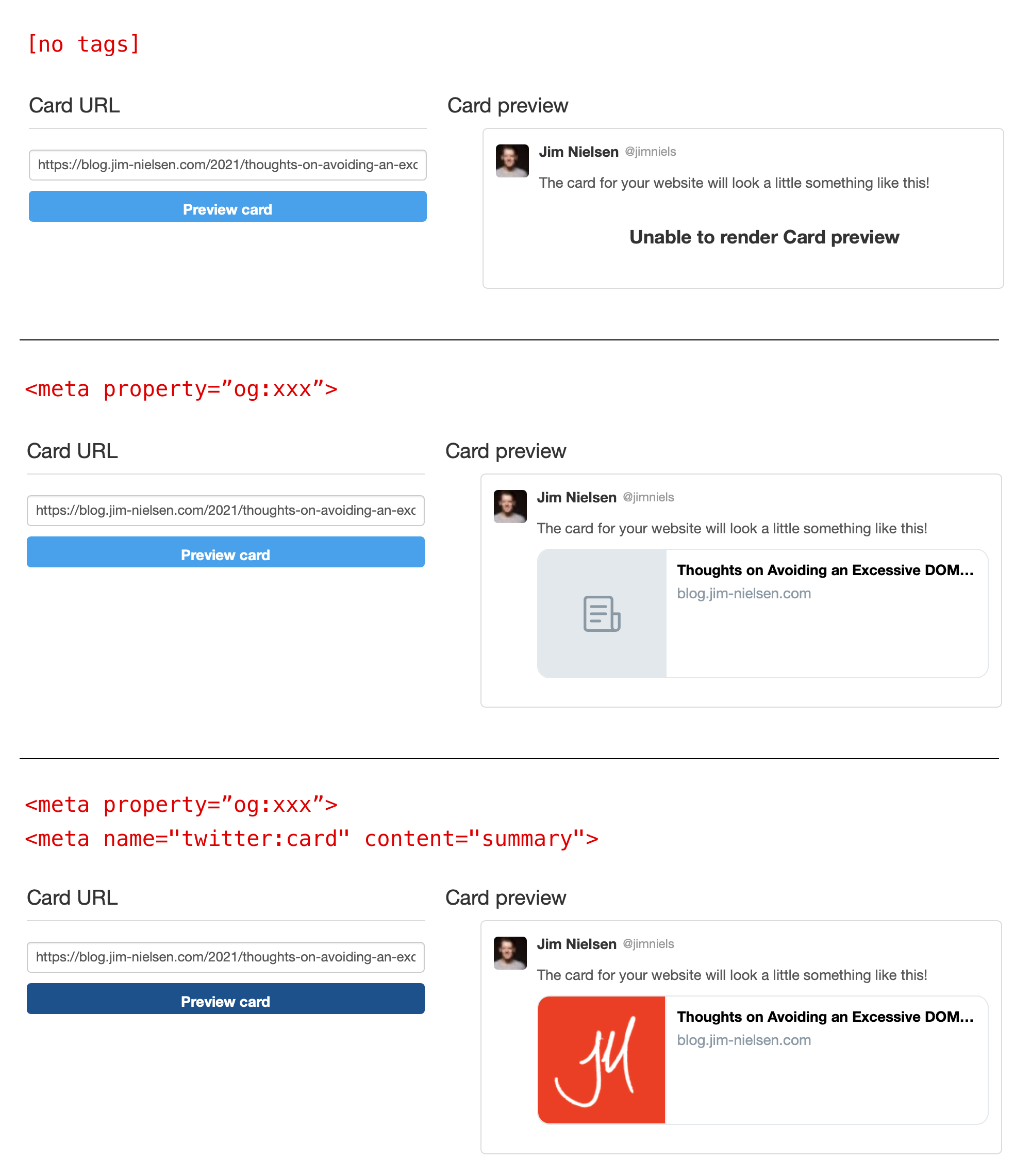
Twitter tries to turn a link into a preview image. This appears to be the logic:
- No meta tags? No card.
- Open graph meta tags? Use those and display a placeholder image.
- Twitter-specific meta tags? Use those (and your custom graphic if supplied, otherwise the placeholder).
You can see this all play out in the Twitter card validator.

If you’ve got open graph meta tags but not Twitter-specific meta tags, a “card” is still going to display. In that scenario, you may as well supply a custom graphic because a graphic is going to be displayed in a card either way—might as well have it be your own.
The only way, that I can tell, to have no preview at all is to have no open graph or twitter-specific meta info at all.

It seems like a shame to remove the tags entirely (which would be my preferred Twitter experience) because they can be very useful in other contexts. I’m having a hard time deciding which choice I want to opt for…