Things I Learned Reading Webkit’s UA Stylesheet
I browsed through Webkit’s user agent stylesheet for no other reason than curiosity (you can find via trac or GitHub).
A number of interesting things stood out to me, so I started taking notes. I figured it’d make for a good blog post.
Here are my notes.
@namespace
The very first thing I encounter, before any novel selectors, properties, or values, is this thing I’ve never seen or used in my life: @namespace.
My first reaction: “what the hell is this?”
Honestly, I dug around and never got to a point I where I feel like I can confidently say what it is and why you would use it.

The best example I could find for how/where you might use @namespace is from an O’Reilly book called Using SVG with CSS3 and HTML5. There’s a chapter about XML Namespaces in CSS describing how @namespace can help “when you want to distinguish between SVG and HTML elements with the same tag names”. As an example:
@namespace "http://www.w3.org/1999/xhtml";
@namespace svg "http://www.w3.org/2000/svg";

/* These rules would apply to any `a` elements. */
a {
    text-decoration: underline;
    color: purple;
}
/* These rules would apply to SVG `a` elements,
   but not HTML links. */
svg|a {
    stroke: purple;
}
/* These rules apply to all SVG-namespaced elements,
   but not HTML elements. */
svg|* {
    mix-blend-mode: multiply;
}
That sort-of makes sense, but having never had this problem, I can’t fully appreciate how helpful @namespace can be.
Anyhow, if novel things in CSS interest you and you’ve never heard of @namespace, you might want to read more from people who actually know what they’re talking about. FWIW: these links, in addition to the O’Reilly one above, were the most helpful to me:
If Statements
html {
  display: block;
#if defined(HAVE_OS_DARK_MODE_SUPPORT) && HAVE_OS_DARK_MODE_SUPPORT
  color: text;
#endif
}
Honestly, I’m not sure how these play out. It almost looks like they are executed/evaluated at runtime to apply conditional styling based on system-level configuration (update: some insider information reveals this is “done at compile-time by running the stylesheet through the C preprocessor”).
Here’s another example:
video {
  object-fit: contain;
#if defined(WTF_PLATFORM_IOS_FAMILY) && WTF_PLATFORM_IOS_FAMILY
  -webkit-tap-highlight-color: transparent;
#endif
}
It’s not anything us normal web developers can use in our stylesheets, but interesting to see how special styling considerations are taken into account based on the browser knowing about what OS it’s running on.
CSS Keywords
I saw a bunch of keywords. Some standard, others not. For example:
.some-selector {
  color: text;
  border: 1px solid ThreeDFace;
  border: border: 1px solid -webkit-control-background;
  background-color: -apple-system-opaque-tertiary-fill;
}
ThreeDFace is an example of a system color, which is part of the specification.
Whereas other values like text, -apple-, and -webkit- are specific to the browser or browser maker.
Curious about what values exist? Here’s a sampling from the 1,500+ lines in CSSValueKeywords.in:
-apple-system-blue
-apple-system-brown
-apple-system-gray
-apple-system-green
-apple-system-orange
-apple-system-pink
-apple-system-purple
-apple-system-red
-apple-system-yellow
-apple-system-app-highlight-background
-webkit-control-background
A bunch of the values appear to map to Apple’s OS-level color variables, presumably allowing developers of Safari to imbue browser controls with system-level appearance configurations from the OS.
Handling Legacy Quirks
1__qem was another one of those “what the hell is this thing?” Here’s an example pulled from the UA stylesheet:
blockquote {
  -webkit-margin-before: 1__qem;
}
Apparently this unit of measurement is webkit magic for handling legacy functionality related to quirks mode (“qem” stands for “quirky em”).
I don’t think it will surprise you to learn that handling legacy browser quirks is a common theme in the UA stylesheet. There’s a number of places where browser-specific values are leveraged to treat legacy quirks. Here’s another example from the code:
center {
  display: block;
  /* special centering to be able to emulate the html4/netscape behaviour */
  text-align: -webkit-center;
}
Webkit “Extensions”
There are a whole bunch of non-standard properties, values, and pseudo elements specific to Webkit. Take a look at these examples pulled from the code:
/* values */
center {
  text-align: -webkit-center;
}
/* properties */
hr {
  -webkit-margin-before: 0.5em;
}
/* pseudo elements */
body:-webkit-full-page-media {
  background-color: rgb(38, 38, 38);
}
MDN even has a giant reference of CSS “extensions” for Webkit but not everything in the UA stylesheet is documented on MDN.
If you really want to dive deeper, you can look at the CSS value keywords file and guess at what these non-standard values do when listed alongside their standardized siblings. For example, -webkit-match-parent appears to have something to do with aligning elements.
//
// CSS_PROP_TEXT_ALIGN:
// The order here must match the order of the TextAlignMode enum in RenderStyleConstants.h.
//
-webkit-auto
left
right
center
justify
-webkit-left
-webkit-right
-webkit-center
-webkit-match-parent
Custom Form Element Graphics
You know those little icons you see in specific browsers which hint at browser-injected functionality? For example, this credentials autofill UI:
![]()
Note the little key icon with a dropdown? Webkit appears to implement UI details like that as webkit-specific pseudo elements. The key/dropdown graphic is implemented as an inline SVG in the UA stylesheet. Example:
input::-webkit-credentials-auto-fill-button {
  -webkit-mask-image: url('data:image/svg+xml,<svg>...</svg>');
}
If you were to extract that <svg>...</svg> code from the inline data URL in the UA stylesheet and put it in the browser, you’d see the same graphic:
![]()
System Font Keyword
font: message-box
Once again: what the hell is this? According to MDN
The
fontproperty may be specified as either a single keyword, which will select a system font, or as a shorthand for various font-related properties.
I’m familiar with the shorthand:
p { font: 12px/14px sans-serif }
But a single keyword?
p { font: message-box }
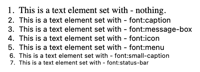
Apparently there are system font keywords. Example from MDN:
caption: The system font used for captioned controls (e.g., buttons, drop-downs, etc.).
icon: The system font used to label icons.
menu: The system font used in menus (e.g., dropdown menus and menu lists).
This lets you do some crazy stuff I didn’t know you could—nor can I think of why you would. Nonetheless, it exists. Checkout the codepen

Appears to be another one of those system things.
Strangely Specific z-index Values
It’s pretty common that, when you want a high z-index, you do something like z-index: 9999999.
Interestingly, there are only three z-index values in Webkit’s UA stylesheet. All three of them are high, strangely-specific numbers:
- 2147483644
- 2147483645
- 2147483647
I figured this had to be something to do with programmers infusing some kind of joke or meaning into the number rather than just an arbitrarily high number.
I found a site called numbermatics.com which lets you punch in a number and discover its unique traits. Here’s what I found:
- 2147483644 - composite of four primes multiplied together
- 2147483645 - composite of three primes multiplied together
- 2147483647 - is not only a prime number but is “the maximum positive value for a 32-bit signed binary integer in computing. It is therefore the maximum value for variables declared as integers…in many programming languages” (Wikipedia)
I don’t think you can get a much higher z-index than that—UA stylesheet trumps all!
Crazy Selectors
There are some crazy selectors in the UA stylesheet, like this for handling H1 tags nested five levels deep under any given combination of four different elements:
:is(article, aside, nav, section)
  :is(article, aside, nav, section)
  :is(article, aside, nav, section)
  :is(article, aside, nav, section)
  :is(article, aside, nav, section)
  h1 {
  font-size: 0.67em;
}
The :is selector is pretty damn cool. Given the combinatorial nature of these groupings, writing something like this in CSS before :is would’ve been insane:
article article article article article h1,
article article article article section h1,
article article article section article h1,
article article section article article h1,
article section article article article h1,
section article article article article h1,
article article article section section h1,
article article section section article h1,
article section section article article h1,
section section article article article h1,
/* keep going _forever_ */ {
  font-size: .67em;
}
Conclusion
Reading the user agent stylesheet was intriguing. Maybe next I should compare and contrast those of Chrome and Firefox and see what I find!