Rationale for a Browser-Level Color Scheme Preference
If you automatically switch your blog theme to dark colors using @.prefers-color-scheme, please please provide a way to switch to a light theme. Reading light text on a dark background is not easier on everyone's eyes.
And followed that up with:
It's unreasonable IMO to expect me or any user to change our OS settings just to read an article comfortably, and then have to change the setting back after we're done.
My first reaction was: yes, agree 100%!
Having dealt with implementing dark mode myself, my second reaction was: wait, this should be part of the browser! “As a user, I want to override my color scheme preference for the website I’m looking at but not be required to do it via the OS-level preference.”
In Sarah’s replies, somebody opined as much:
Browsers should have a simple button to override prefers-color-scheme on a per-website basis; it would save web developers a ton of work reinventing managing this user preference, in many cases even removing the need for controlling any part of the color scheme with JS entirely.
I know Šime has been beating this drum for a while, and it sounds and looks like this could be coming to Safari soon.
But in case it doesn’t, I want to note my thoughts on the matter and why I think the ability to toggle dark mode should exist on a site-by-site basis as a user-level preference controllable in the browser.
Prior Art
There are existing solutions that allow you to toggle light/dark mode via some kind of mechanism in the browser itself.
- Browser plugins, like Dark Mode for Safari or an extension in Chrome, will force websites to dark mode. Since these are not first-party solutions from a website’s owner, mileage will vary in terms of quality and accessibility.
- Chrome is working on forcing sites to dark if that’s your preference (regardless of whether the website owner has crafted styles for it). For reasons akin to the plugin solution, your mileage will vary.
- Browser developer tools let you emulate a site-level preference for dark or light mode.

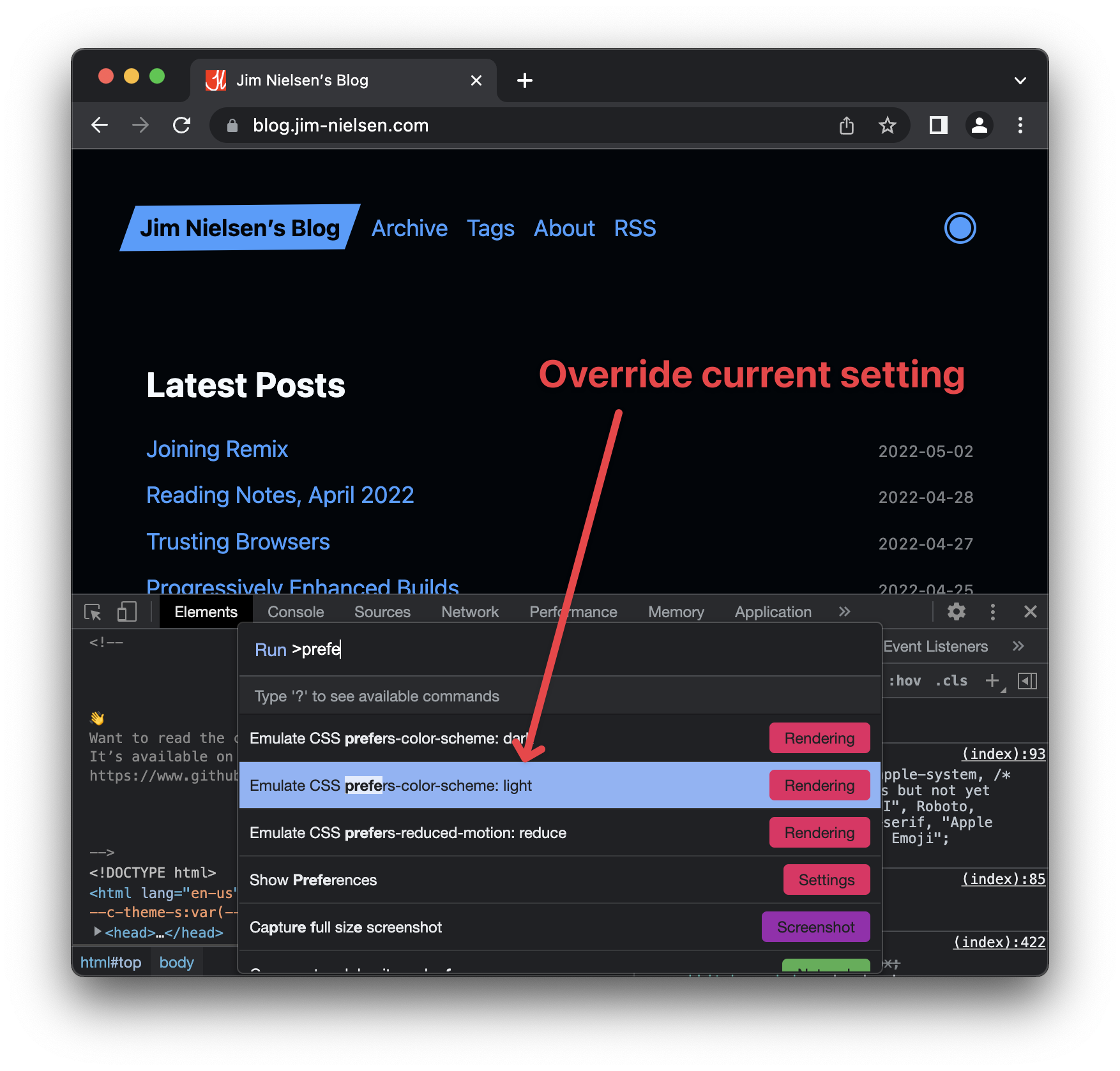
Current State
To Sarah’s point, the problem today is that if you support @prefers-color-scheme and somebody visits your website with their device in “dark mode”, they’re going to get your dark mode styles. And if they don’t want to see your website that way? They have to toggle their OS-level preference for dark mode, or they have to find a custom site-level override that you, as a website owner, provide in your UI somewhere.
You can probably imagine the problems associated with every website in the world having to come up with their own bespoke solution to the same fundamental user problem.
A few examples on how sites might vary in their custom implementations to override the OS-level preference for prefers-color-scheme:
- Preference display
- Maybe it’s an icon, but what icon? A moon and sun? A candle and light bulb? An outlined circle and a filled circle?
- Maybe it’s text, but what’s the label? “Light” and “Dark”? “Black” and “White”? “Night” and “Day”?
- Preference location
- Maybe it’s in the “User Preferences” section of an app. Maybe it’s in a slide-out navigation drawer. Maybe it’s in a header (and maybe that header is sticky so it’s always on page). Maybe it’s in the footer.
Just to illustrate a few quick examples, here’s a site that uses an icon in the header as a toggle for overriding the color scheme preference:
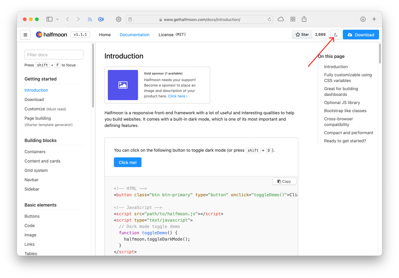
And here’s one that uses a textual link in the footer:

And here’s another that uses radio inputs inside the application’s user settings.

As you can see, the implementations for toggling light/dark mode on a site-by-site basis become infinitely variable which puts a burden on users due to conflicting or inconsistent UI patterns across websites.
Why It Should Be a Site-Level Preference in the Browser
@prefers-color-scheme is a user-level preference at the OS-level that the browser can surface to website developers for individual sites. For a given OS/device, this preference is controllable in a uniform, consistent way.
If a user wants to override that preference at the browser level on a site-by-site basis, I believe that preference should live at the level of the browser such that it’s usable and accessible in a consistent and uniform way across websites.
Precedent exists in browsers for site-level preferences, so this isn’t necessarily a novel idea. For example, Safari already has site-level preferences available via the “website preferences” toggle in the toolbar. Imagine if there was one more item in that dropdown for setting your color mode preference. Example:
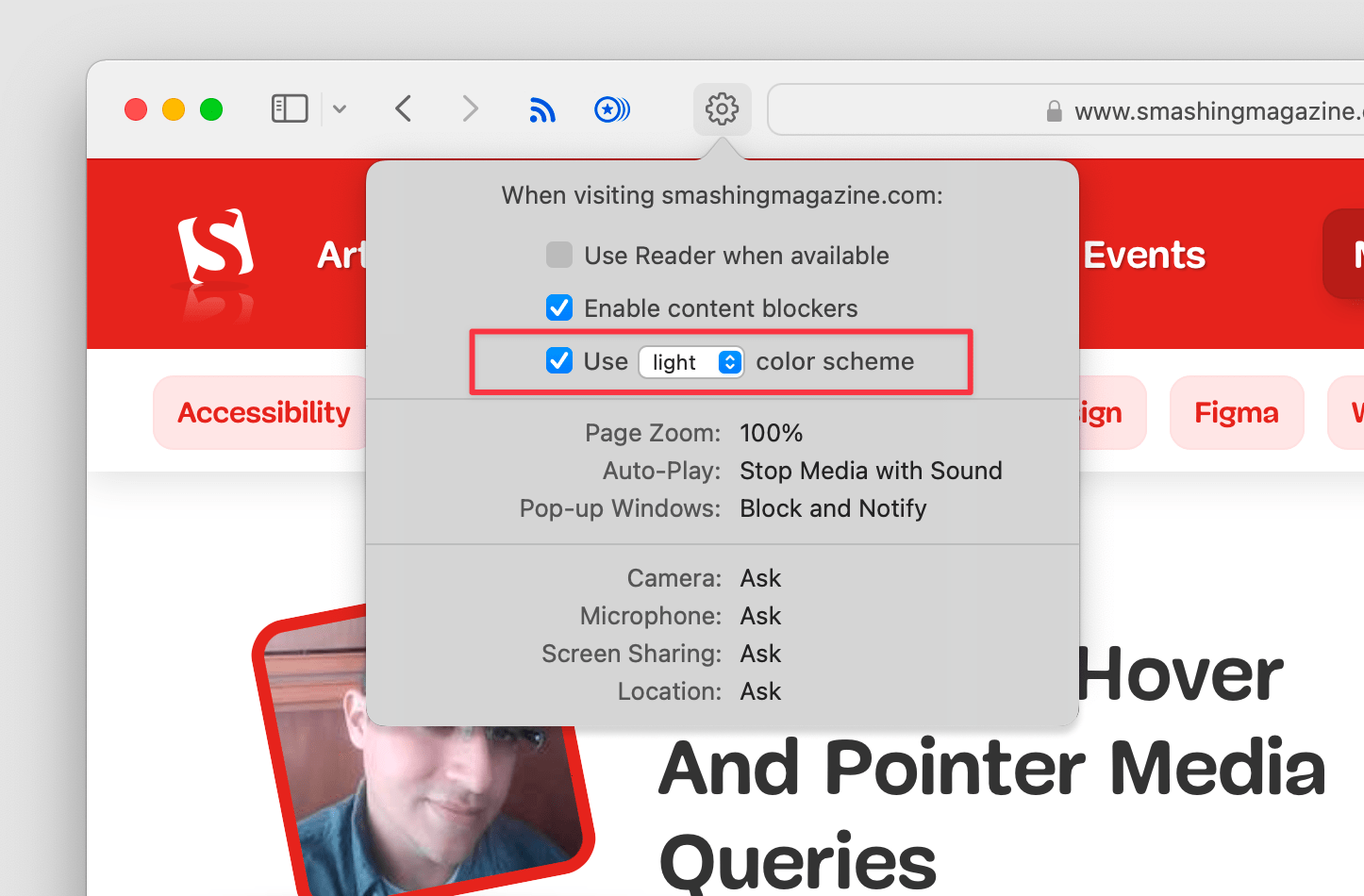
Today, the burden is placed on site owners to give users the ability to customize their color scheme preference on a site-by-site basis. Every website in the world has to:
- Design a UI for toggling between light/dark mode,
- implement that UI interaction in the browser, and
- persist the user’s choice across requests.
If the browser provides this control, it saves countless hours of developer time while also making the user’s experience of controlling their color scheme preferences more consistent and predictable across all the sites on the web.
A Simple Use Case Today
Imagine, for a moment, a really basic web experience like a static webpage whose content is the same for all users on the web — like my blog. Persisting a site-level user preference across page requests is tricky. I don’t have authentication or control a server that sets cookies for user preferences in a session. That’s overkill. So if I want to implement dark mode with a user-level override of their current system’s preference, I have to use JavaScript.
First I have to design and create the UI for the override. And then with JavaScript I can persist the user’s choice across page requests, but the implementation details are complex. I have to use local or session storage to persist the preference and then I have to put a blocking <script> tag near the top of each page that checks for the preference and sets the appropriate CSS to style the page accordingly (without a blocking script tag, I’ll get a flash of light to dark as the page loads).
All of this work would has to be done by every site owner on the internet who has uniform content for all users but still wants to provide this kind of user-level customization on their website. A browser-level preference (and I’m not saying it’s easy, there’s probably a lot of privacy concerns here) could obviate the need for additional complexity for site owners while also providing a more consistent experience for users.
A Cascade of User Preferences
Really what I’m talking about is a series of cascading user preferences, from generic to specific, as it relates to their preferred color scheme in a given context.
In an insightful post, Sarah pointed out that this is already happening with apps.
When the app you’re using opens an in-app browser window and A) the app has dark mode turned on, but B) the OS has dark mode turned off, what does the browser show? More specifically, what is the result of (prefers-color-scheme) in that scenario?
There’s a cascading set of user preferences happening in a situation like this.
- System-level
- App-level (i.e. an RSS reader with a built-in browser)
In a scenario like this, preferences might override each other. For example:
- System-level preference: light; App-level preference: [not set]
@prefers-color-schemefor the active site: light
- System-level preference: light; App-level preference: dark
@prefers-color-schemefor the active site: dark
So a proposal might be to add another layer (or actually two) in this cascade of user preferences:
- System-level
- App-level (RSS reader w/built-in browser)
- Browser-level (Browser)
- Site-level (Webpage)
So, for example: if the OS preference is dark mode, the app preference is dark mode, and the browser knows that origin example.com has a preference for light mode, then @prefers-color-scheme would be light in that case.
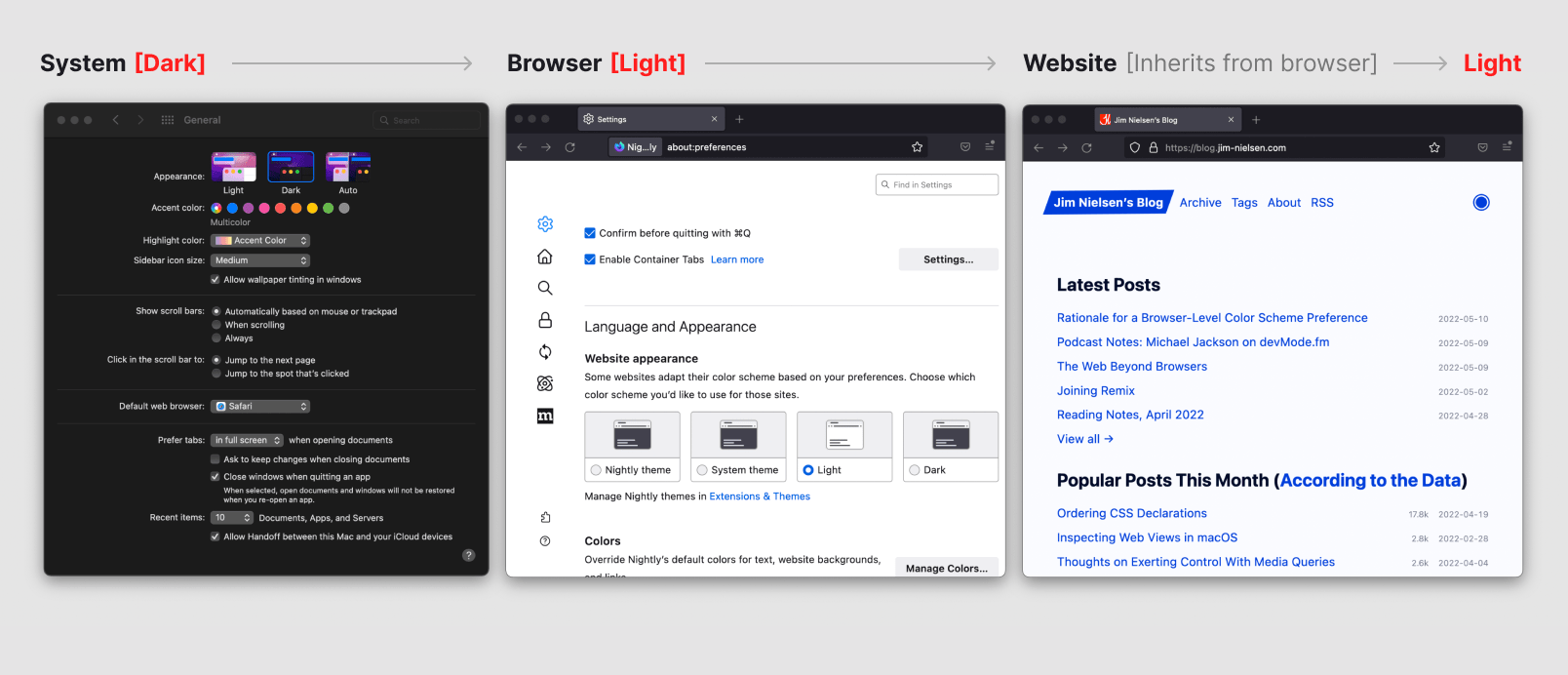
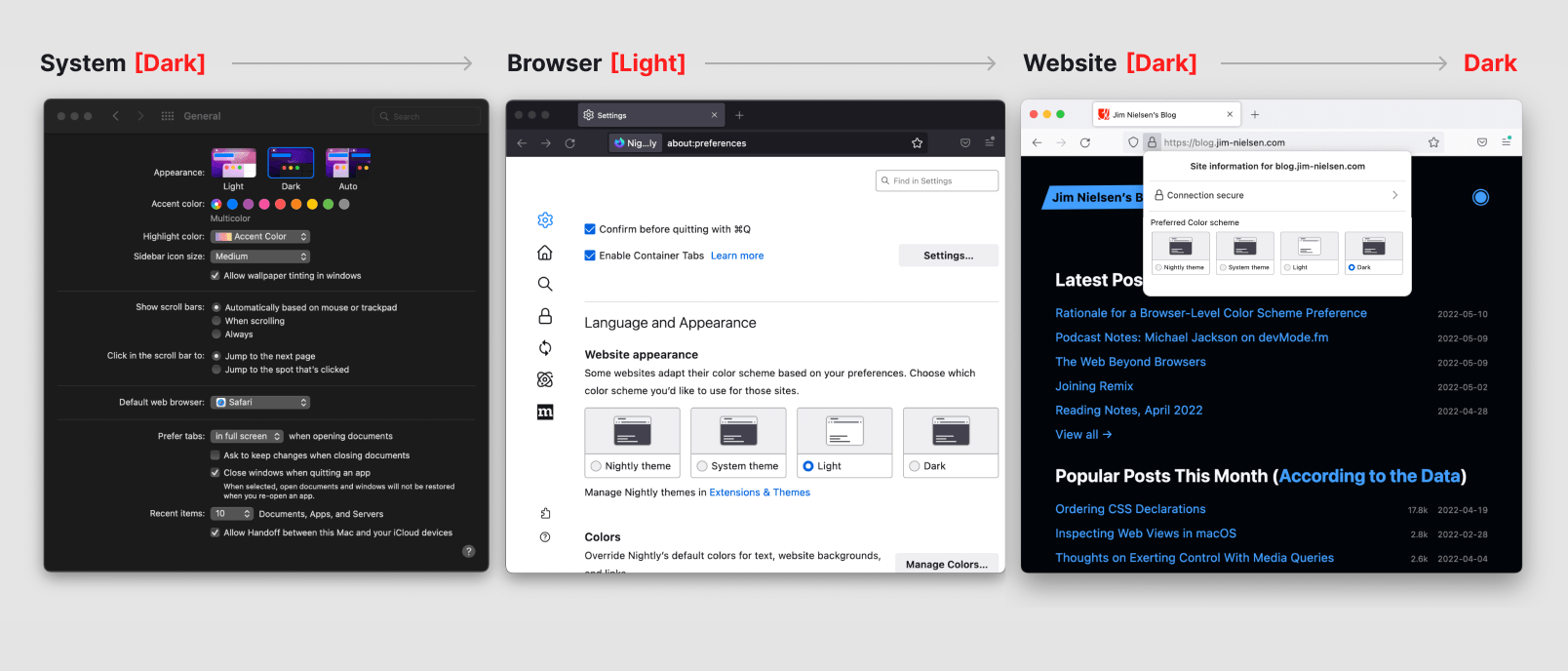
This is probably easier to visualize, so I put together these graphics using Firefox Nightly, which already implements a browser-level preference (and to simplify, I combined the preference tiers of “App” and “Browser” into one, because when your app is the browser, those preferences are one and the same).
First, there’s the color scheme set to light mode at the system level, which everything else inherits from.
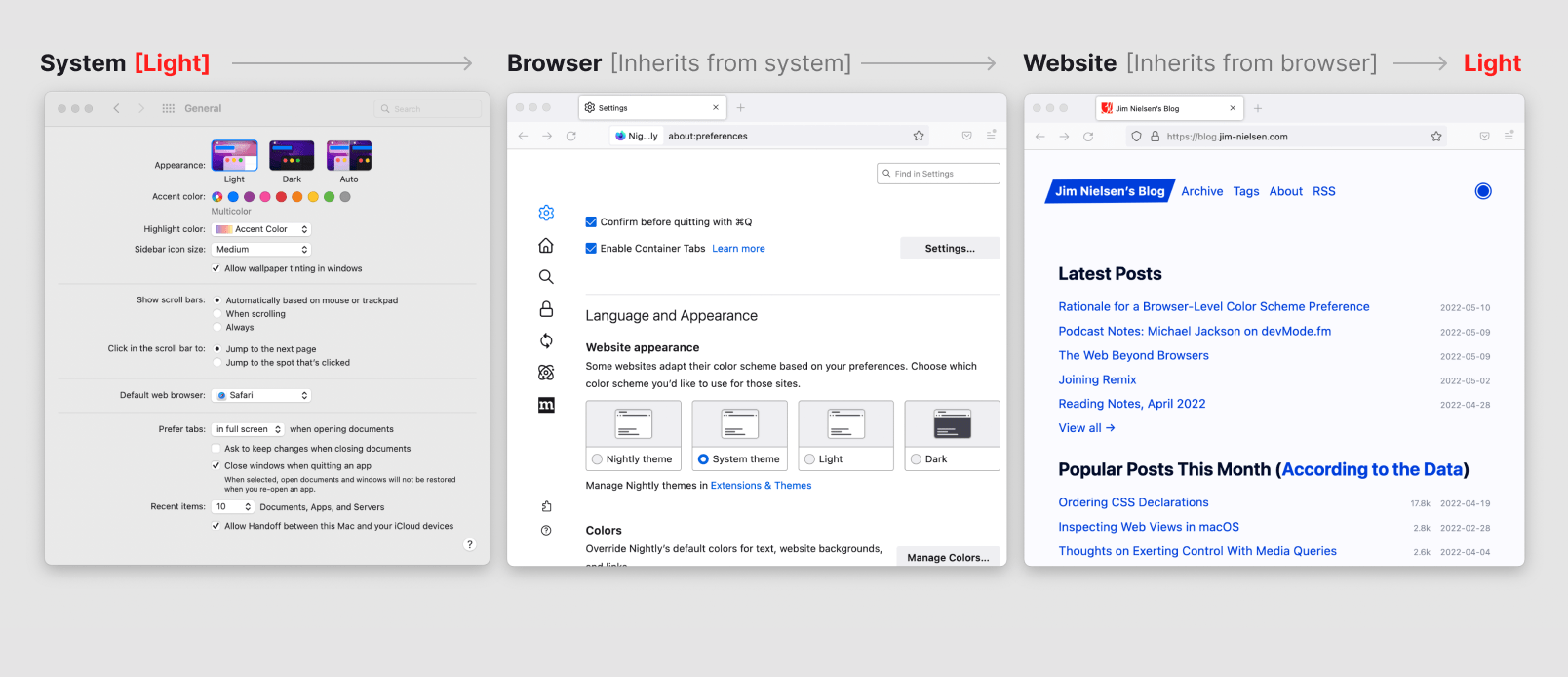
Then you change the color scheme preference at the system level to dark, and again, everything inherits from that.
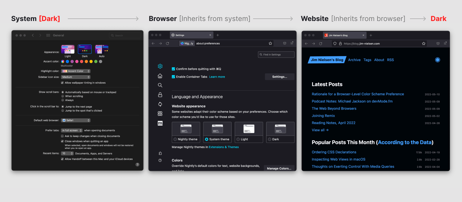
Then you change the color scheme preference at the app/browser level to light, so now all websites in the browser inherit from that setting rather than the system one which remains in dark.
Then, last of all and theoretically, you change the color scheme preference at the website level to dark and it overrides the app/browser preference as well as the system preference.
But What About…
I get it, there are outliers that support more than just light or dark mode, like Twitter.
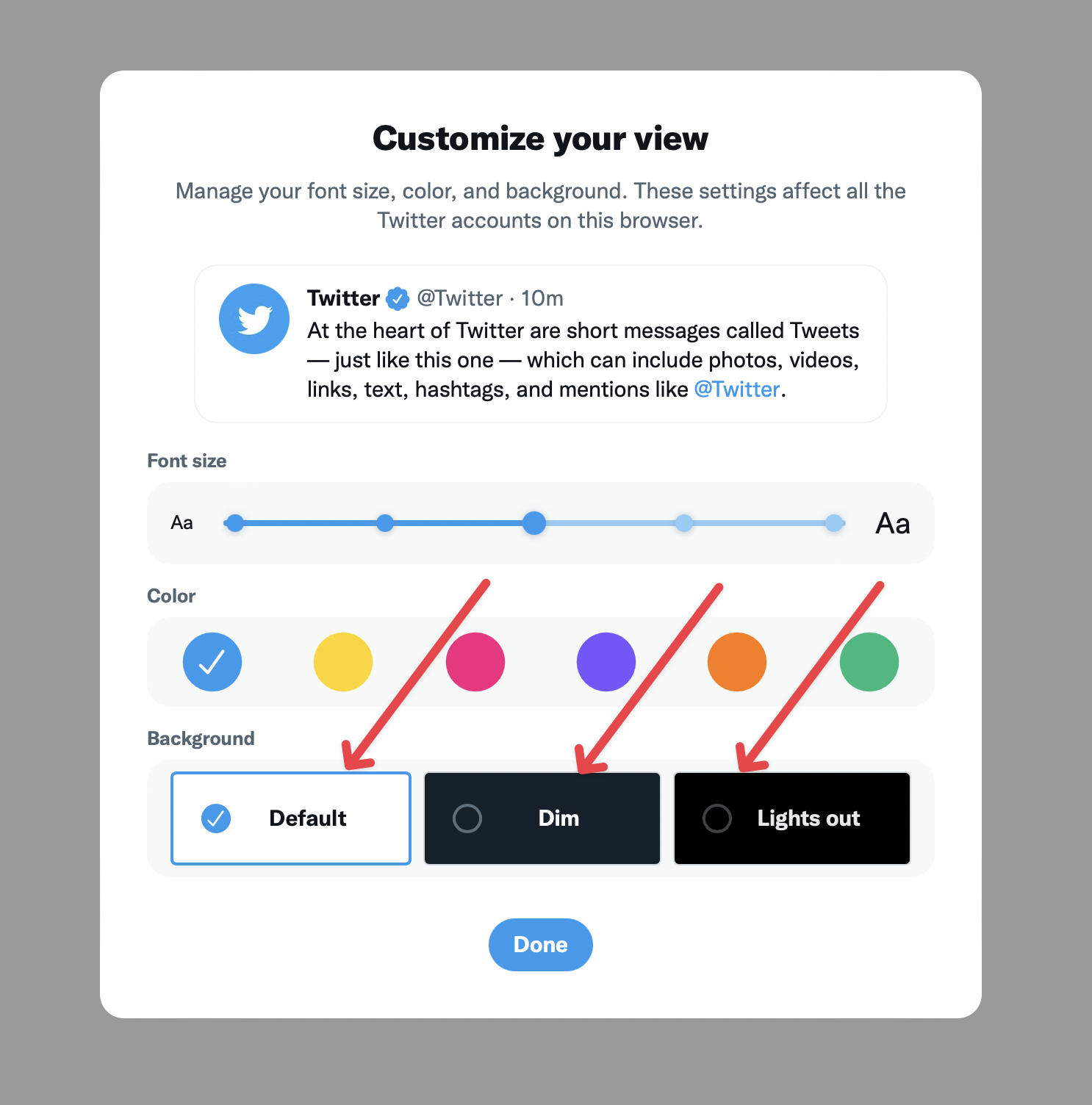
And those sites will have to continue to do it their way. The idea of a cascading set of preferences isn’t negated there:
- System-level (a preference in the OS somewhere)
- App-level (a preference in the app somewhere)
- Browser-level (a preference in the browser)
- Site-level (a preference in the browser for an individual website somewhere)
- Brand-level (a preference in the website UI somewhere)
It all seems logical to me, but I’m sure it’s more complicated than I imagine. However, I had some thoughts for this kind of browser-level choice (and it sounds like I’m not the only one), so I decided to just publish ’em.
Update 2022-05-12
I added some extra visuals throughout the post to try and better explain visually what I’m talking about textually. I also tried to clarify the distinction between a browser-level color scheme preferences, and a website-level color scheme preference within the browser.
I also learned that the browser-level preference is available in Firefox Nightly.
@sergiodxa also pointed out that, perhaps, a good way to think of the more complex appearance settings, like Twitter, is to think of a distinction between a “theme” (default, high contrast, etc.) and then color scheme preferences (light/dark) within each theme.
I think what they need are themes, so they could have the default, high contrast, etc and make each one support light and dark, so the user choose the theme within the app, and scheme at browser or OS
An interesting distinction indeed!
Also: bram.us goes into even more technical detail as to why this is a problem today and why we should have browser- and site-level presences built in.