Website Fidelity: Browser Perspective
I’m super intrigued by this idea of website fidelity, which I wrote about previously, and I have more I want to say about it, so here we go.
One thought I had while writing the original post was: if we’re going to start supporting this idea of website fidelity now, wouldn’t forking a web browser be the most intriguing prototype to build?[1]
Website owners aren’t necessarily incentivized to start stripping stuff out of their websites in order to support lower fidelities (including a fidelity of zero JavaScript). What you need is like an agent: somebody who works on your behalf as a user and can do for you what site owners won’t — a user agent if you will 🥁.
Imagine forking a browser and doing nothing else except building one new feature: a website “fidelity” control. For illustration’s sake, imagine a little slider in the browser’s chrome.
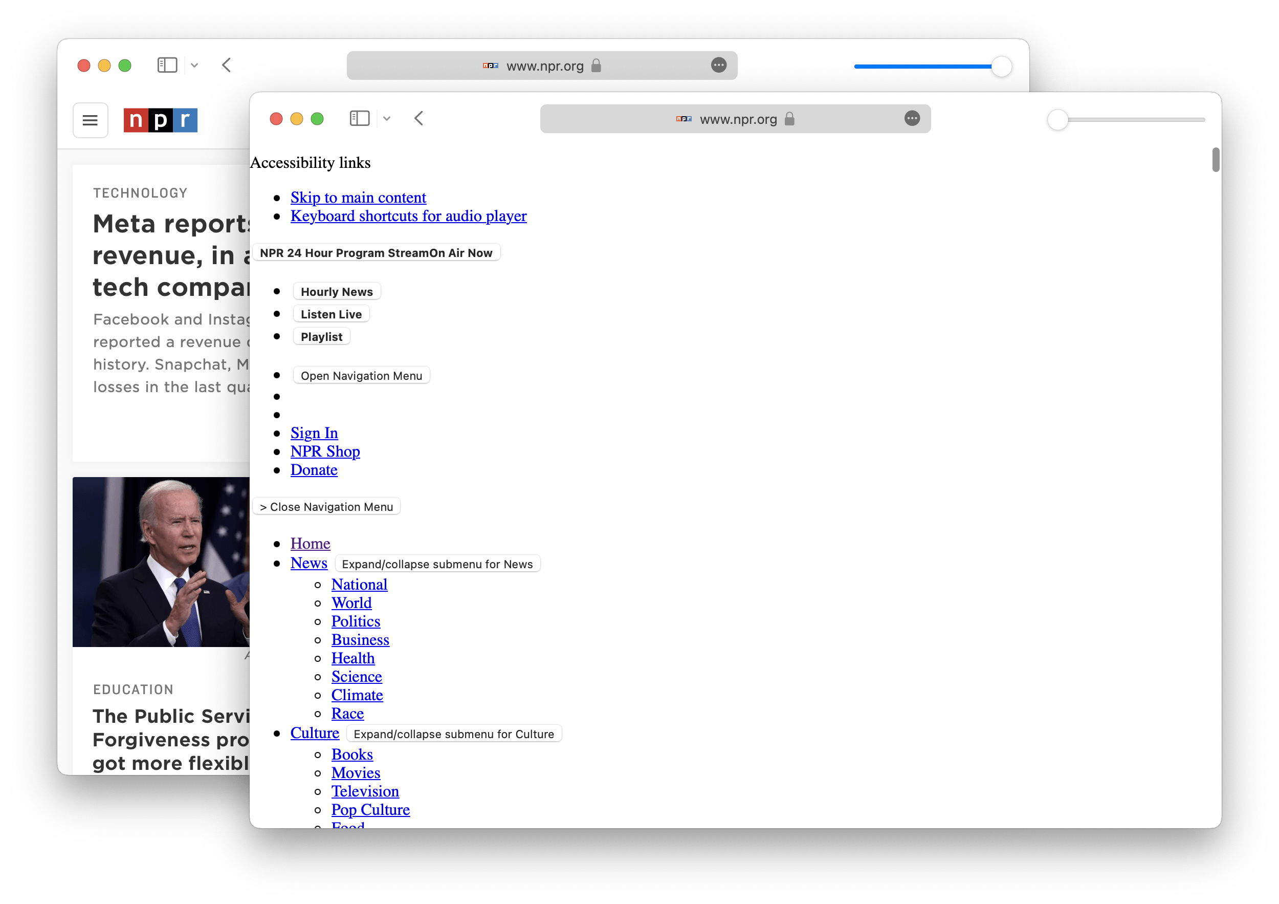
How would it work?
Imagine a scale of fidelity, from 0 to 1 and you set the fidelity to 1. When you make a request, for example to npr.org, the browser would fetch all necessary resources and render everything exactly as the website owner intended.
However if you then turned the fidelity down, for example to 0, and requested npr.org again, the browser would fetch the initial HTML resource but in the act of parsing it would begin to ignore (or transform) external resources.
<link rel=stylsheet>tags would be ignored and not fetched.<script>tags would be ignored, with inline scripts not executed and external scripts not fetched.<img>tags would be transformed to links (<a href=imgSrc>alt text</a>) so the image isn’t fetched and displayed inline but remains accessible (same for things like<video>).- Inline
styleattributes would be stripped so only the default UA styles apply.
The browser would do everything it could to remove anything but the most basic HTML and, in doing so, skip fetching, parsing, and rendering loads of external resources (while still preserving access to content, just not directly inline).
Granted, this might break the website you visit. If the site owner has built their site from a posture of progressive enhancement, stripping out resources should still leave the site functional as these kinds of resources are designed to work as additive enhancements to the page. However, without a posture of progressive enhancement, the site will likely break as these kinds of resources are designed as critical dependencies to the page.
This is where having website owners provide different fidelities would prove to be a better, more customized experience as it improves the chances a website’s experience being free of bugs. However, gaining adoption from website authors could be a difficult problem to tackle especially since we’re talking about a technological feature that favors the needs and preferences of website users over website authors (an ethos built into the web itself, mind you).
Building a browser (or extension[1]) that does this would be a much more practical approach in the here and now. For example, if thousands (or even millions) of users started expressing a preference for lower fidelity websites in order to decrease bandwidth usage, save battery power, increase privacy, decrease clutter, simplify UI/UX, or even just accommodate a personal preference, it might help drive adoption of website fidelity by site owners as they’d want control to provide a more customized (functioning) experience for their users.
Examples
To contrast these two different approaches, imagine a scenario where “website fidelity” is a browser feature. Website authors only provide one experience, so the browser controls fidelity based on the user’s preference.
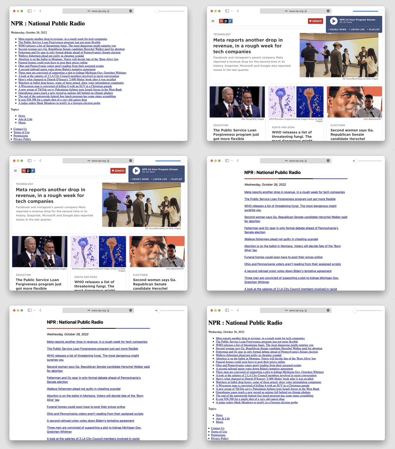
Taking NPR as an example, here’s their current website today (full fidelity of 1):

Now, if the browser took that same HTML and stripped out styles, didn’t run scripts, swapped out images, etc., you might get something like this:
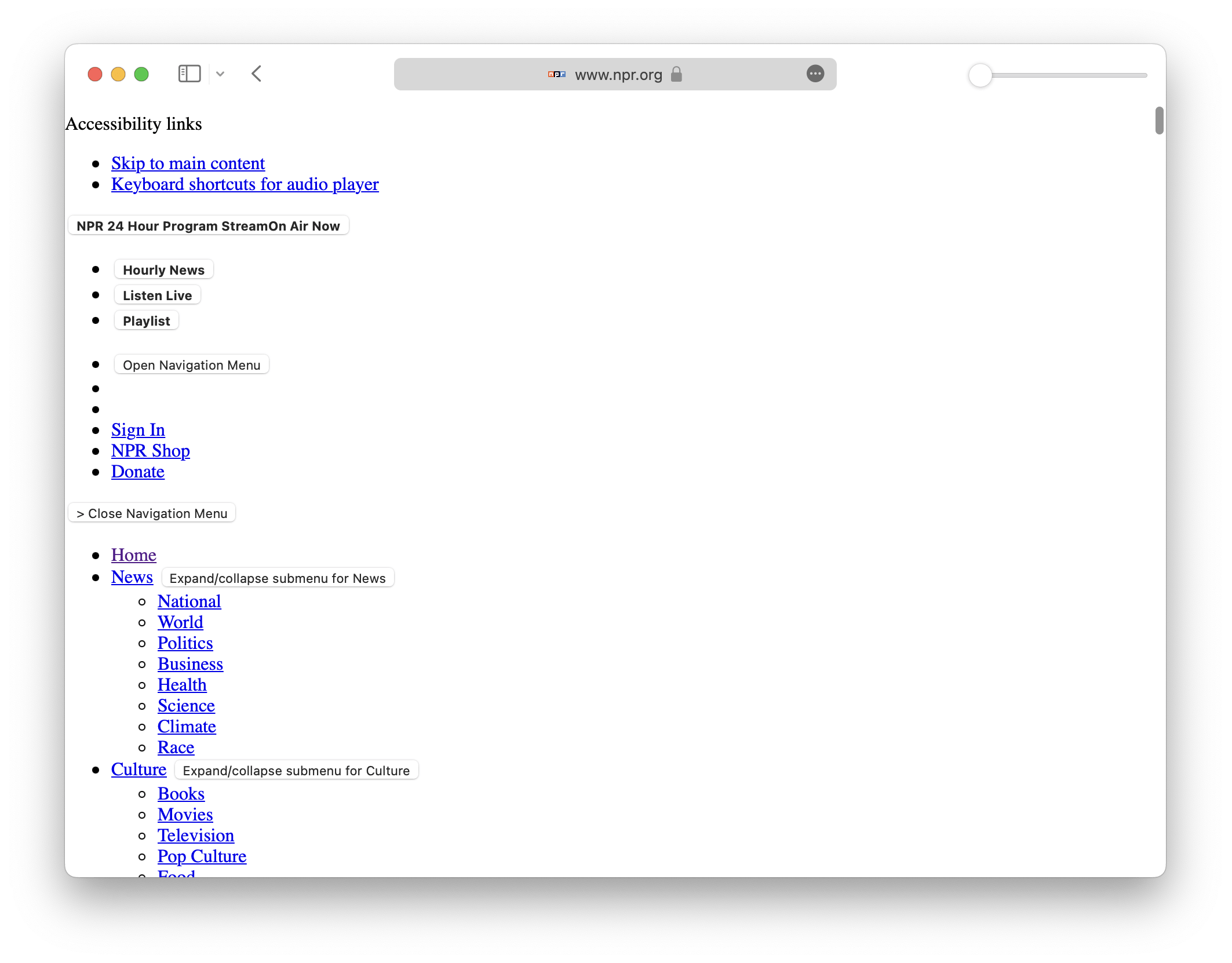
Less than ideal, to be sure, but it would preserve the user’s preference for a lower fidelity experience (and thus use less bandwidth, less battery, less compute, etc.).
Now, imagine a website owner that provided varied experiences based on the user’s preference (communicated via, for example, a request header). At full fidelity (1.0), you’d have NPR’s current experience:

At a lower fidelity (0.1), you’d have an experience more akin to NPR’s current “text-only” version of their site.
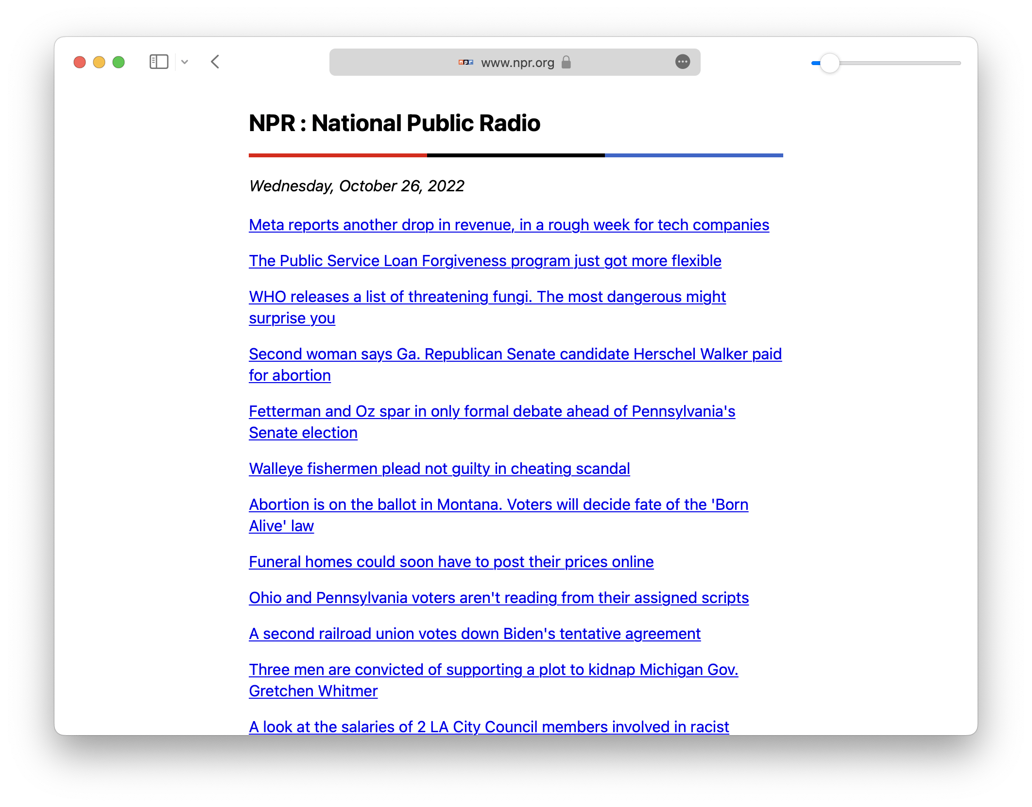
And at the lowest fidelity (0), you’d have an experience akin to the “text-only” version, but with all author styles removed and only the default user agent styles applicable.
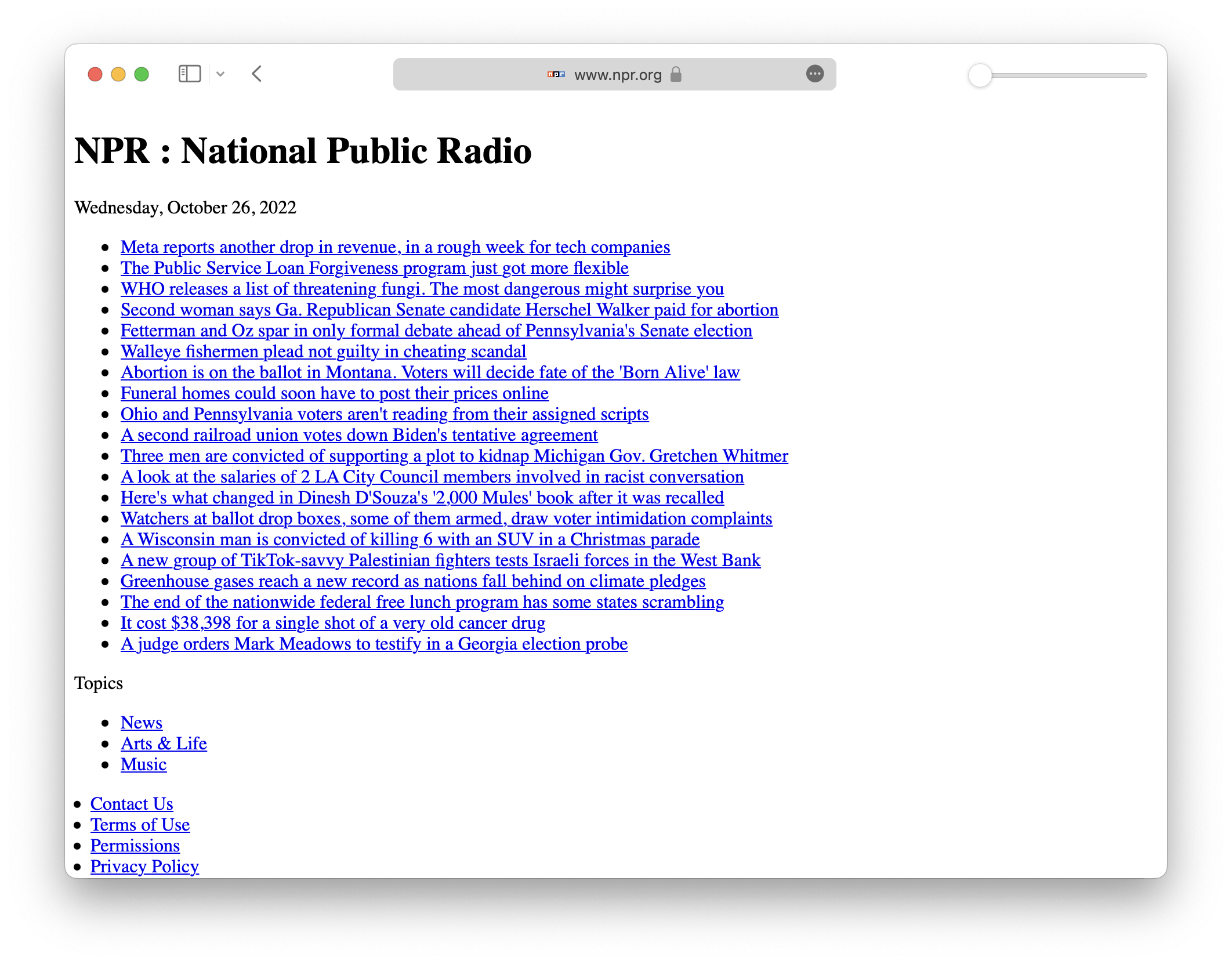
Together these would constitute a sliding scale of fidelities provided by NPR that cater to the varied needs and preferences of website users.
(And, of course, you’d want to provide this feature across devices, like mobile.)
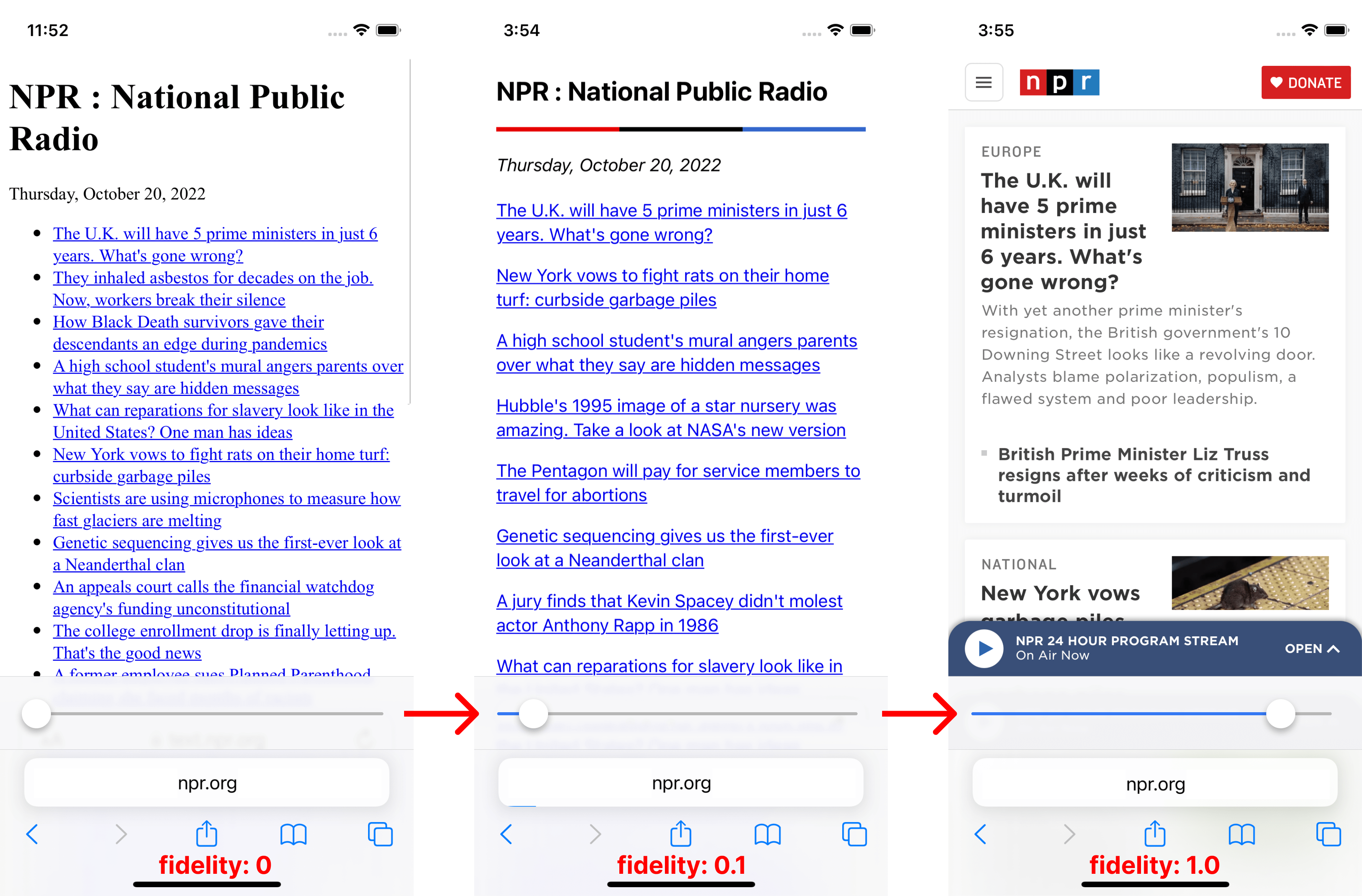
Note that “fidelity” in this case is not solely a control over the appearance and functionality of the website, but the actual content of the site itself. For example, at full fidelity on a news site you might have an image, title, byline, and short description for each article whereas at low fidelity you might only have the title for each.
I want to stress this point: I see the promise of website “fidelity” not just as a preference for less JavaScript and CSS but content itself. Providing users this kind of control would require website owners be involved, as I’m not sure you could do that well solely as a browser feature or extension.
The Fidelity Scale
After publishing my initial post on this topic, Vladimir Prelovac reached out to me saying browsers can absolutely force lower fidelity preference for the user. He notes that the Orion browser on iOS has a “Data Saver Mode” which effectively does this to a degree by blocking the loading of images, scripts, and web fonts.
He went on to formulate a website fidelity scale. I had imagined one in my mind, but not formulated it and written it down. Vladimir’s first stab is illustrative of how a browser feature like this could work, so I share it here for illustration purposes:
0HTML + Browser CSS.1Simple CSS (e.g. classless CSS libs).2On-page CSS.3Images.4Web Fonts.5JavaScript.6Cookies + localStorage.7Ads/Trackers
There’s a lot more to work out here, but this is good for illustrating an idea.
Closing Thoughts
While getting websites authors to support numerous versions of their websites in varying degrees of fidelity would be ideal — as it could include content in the definition of “fidelity” — it likely won’t happen unless its value can be shown as essential to users. In that case, a browser-level fidelity feature seems the most practical place to start.
In addition, persuading website authors to build their sites in a progressively-enhanced fashion would allow a browser-level fidelity feature to be much more effective. Why? Because it could strip out features and functionality from a website without breaking it, as the site would designed from the ground up to function at the equivalent of fidelity 0 with all enhancements layered in.