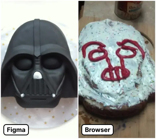
The Figma to Browser Chasm
I’ve seen some amazing Figma files.
Incredibly complex, sophisticated plugins that enhance Figma’s native capabilities. Tricks that mimic browser functionality. Beautiful aesthetics packed with minute details you could explore for hours.
It’s pretty amazing what people can do in Figma — a lot of which I’m sure Figma’s own creators never imagined.
But sometimes a Figma mock is too easily conflated with the end product. As noted by Derek Briggs, “Users don’t see your Figma files, so they’re only as good as their implementations.”
If you can’t translate all the hours and talent being sunk into a Figma file to working code in the browser, you’re throwing away time and money.[1]
It feels analogous to those “Pinterest fail” memes which comically (and painfully) illustrate the attempt to translate a beautiful abstraction of an idea into the manifestation of the idea itself.


You only capture the full value of a talented designer if you have an equally talented engineer capable of discerning and implementing their Figma skills into code.
Or, if you’re lucky, you’ve got a design engineer who can do both.