Thoughts from “Meet Safari for Spatial Computing”
I just watched Apple’s “Meet Safari for Spatial Computing” where they talk about how Safari works on the new visionOS and what you can do to make your web pages look great on Apple’s new device.
tl;dr just keeping doing what responsive web design and accessibility experts have advocated for years.
A few quick thoughts:
- It’s kind of amazing you can create a whole new platform/device and everything on the web “Just Works”.
- pointer
coarsewas a good name for a media feature because it covers both “touch” input (iOS) and “gesture” input (visionOS), while mouse pointers remain “fine”. - So many of web’s best practices continue to prove vitally important. Responsive images, media queries, vector graphics, these all make it possible to scale a “virtual” website to the size of a room and have it still look good!
- What even is a “pixel” when your screen is projected onto the wall in a virtual space? Even more reason to move away from
pxand use resolution-agnostic units likerem.- What does it mean to go “full screen” in the world of VR? As the presenter notes, a view can become larger than the reported screen dimensions!
Lastly, let’s talk about :hover for a moment.
It’s interesting that :hover effects aren’t triggered on visionOS in Safari — unless you have bluetooth mouse/keyboard in use, then I believe they are?
In other words, Safari will ignore your CSS :hover rules in visionOS (proving, again, the powerful idea of thinking of your CSS as suggestions for the browser rather than instructions — something I first heard from Jeremy quoting Eric).
But, the idea of “hover” as an interaction paradigm is still present in the OS because of its usefulness as a feedback mechanism for eye position and navigation affordances.
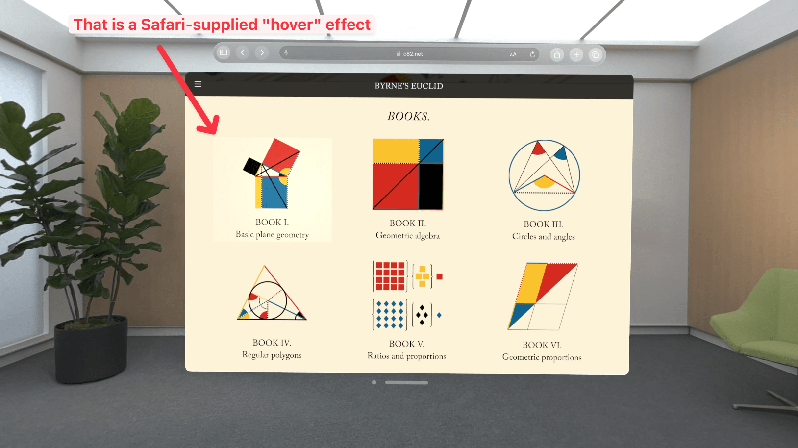
So what does Safari do? It ignores developer-supplied hover rules and provides its own hover effects on top of web pages.

From the presentation:
While you're looking at a link, Safari will give it a gentle highlight to help you confidently navigate.
But to do this, Safari needs to know where the user is looking and what constitutes an interactive target. So how does it do that?
By taking hints from your markup!
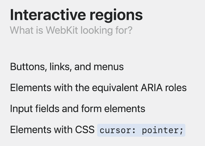
Safari (I should say Webkit) determines what constitutes an “interactive region” by looking for:
- Buttons, links, and menus
- Elements with equivalent ARIA roles
- Input fields and form elements
- Elements with CSS
cursor: pointer
Here’s a screenshot from the presentation:

It’s 2023 and would you look at that: semantic, accessible HTML is still as important as ever. HTML isn’t just for old beige tower computers connected to cathode-ray tube monitors. It’s being relied on by the most technologically advanced AR/VR consumer device in 2023.
I feel like debugging “interactive regions” for Safari in the visionOS simulator is probably going to become a thing for developers soon — which ain’t so bad because most of the “fixes” will likely involve writing better HTML.
In this way, I appreciate how new platforms and devices which lean on standards become a kind of instant QA tool for finding non-standard implementations. They immediately surface overlooked problems on long-standing device experiences. Diversity breeds resilience.