The Case For Design Engineers, Pt. II
Previously: The Case For Design Engineers, Pt. I.
You’re given a design with a note: the dividing line between these two containers should be interactive so the user can drag to resize the respective containers on either side.

Perhaps that note is all you get.
Or perhaps the designer gives you a little more detail, like some mocks depicting an “interaction state” that shows how thick and what color the border should be when the interaction takes place. Maybe they even specify using an appropriate cursor.

Or maybe they don’t tell you any of that and you have to figure it out yourself.
Either way, it’s not everything.
Assuming we’re talking exclusively about a desktop device with fine-grained input like a mouse, many questions remain. For example:
- Does the interaction have a resize affordance?
- How does it happen (e.g. on mouse in or mouse down)?
- When does it happen (e.g. immediately or on a delay)?
- Where does it happen? Directly on the line itself, or in a target area? How big is the target?
- Is there some kind of snapping involved?
I recently worked on a feature like this, where there were so many tiny details like symmetrically balancing where the resizing affordance happens between two boundaries.
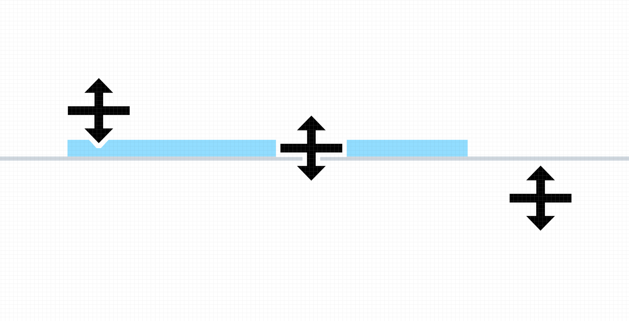
If you zoomed in super close, this is what was happening:

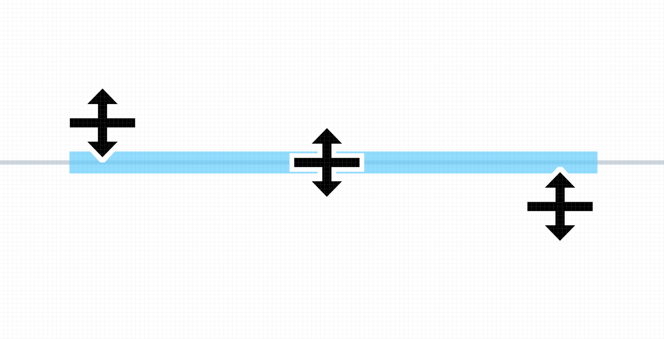
And it felt off. Why? Because the area that triggered the showing and hiding of the resizing affordance was asymmetrical. You moved your mouse in from one side and the affordance triggered, but if you came in from the same side of the other container it didn’t.
This is what we wanted:

It’s hard to even articulate this scenario with words and pictures. Sometimes you just have to feel it, use it, to understand the nuances.
This all might seem obvious — but the obvious is not always implemented. Sometimes it’s not as obvious as you might think. And sometimes the obvious is just too much work, so it gets skipped.
The point is: look and feel is hard to design, let alone spec, in a design tool. You need someone who understands what’s possible in the medium (and I mean the medium you’ll deliver the interaction in, not the medium you’ll design it in — those can be different).
You need someone who can do design work with code.
That's right: design work with code.
Pixels of an interface from a GUI tool are a static representations of a dynamic form. It’s the difference between a picture of me and the living, breathing, moving me.
Design engineers don’t just push pixels around in a GUI tool, they do it in a web browser — the medium of delivery — designing not just the visuals but the interactions that make sense for a living, breathing, moving interface.
This approach to design — designing with code — doesn’t result in one artifact that approximates the final deliverable to drive consensus, then requires a translation to the deliverable artifact itself.
Instead, the artifact is the deliverable — just in embryonic form.
It may seem obvious, but a designer’s deliverable is not a customer’s product.
Going back to the resizing example, building the micro interactions in the browser is design work. The “design review” is building something, sending people links, and saying, “What do you think?” Collecting feedback, then iterating again.
The value of this “design critique” is that it takes place on the actual artifact you put into the hands of your customers, not some faux interaction that must be later implemented in the final medium. It’s not the approximation of an idea but the idea itself, implemented iteratively.
And you need either 1) a person who understands and can work in both forms, or 2) two people who can work closely together to nail down all these details and make decisions along the way until you have something that feels right, that feels intentional, that feels designed all the way through — not “designed” then “implemented”.